
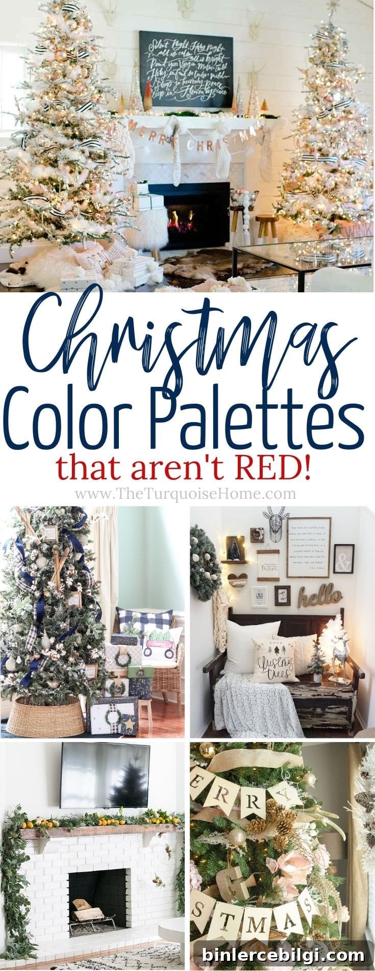
These Christmas color palettes break away from the classic red, white, and green. Try one of these modern holiday palettes this season for a fresh, stylish twist on traditional Christmas decor.
With the holidays approaching, it’s the perfect time to plan your decor. I like to choose a color scheme early so I can coordinate wrapping paper, ribbon, and tree accessories around a single vision. While I’ll still use occasional touches of red, it’s never been my favorite. This year I’m excited to share a collection of festive color schemes that skip the traditional red and offer a fresh, modern take on holiday decorating.
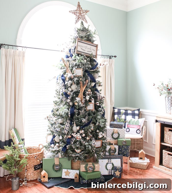
Christmas Color Schemes That Don’t Include Classic Red
There are many great reasons to avoid the usual red-and-green combo. Above all, other colors deserve attention: they can create calmer, more sophisticated spaces and make your home feel peaceful during a busy season. Below are inspiring palettes to help you rethink your holiday look.
Wintery Blues
A blue-and-white palette with accents of gold or brass creates a serene and elegant holiday atmosphere. This palette works especially well in homes that already favor cooler tones or neutral decor—it’s a beautiful alternative for anyone who prefers not to use bright reds. Layer various shades of blue with crisp white ornaments, metallic accents, and warm lighting to keep the scheme cozy and inviting.
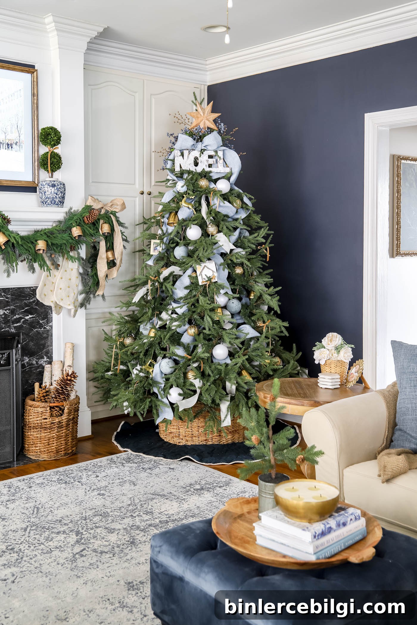
Mix textured ribbons, matte and shiny ornaments, and brass or gold elements to add depth. This look feels fresh, composed, and festive without leaning on traditional holiday hues.
Copper and Blush
Blush pink paired with copper and white brings a warm, modern romance to holiday decor. Textural contrasts—velvet cushions, shiny metallic ornaments, and soft floral accents—help this palette feel luxurious without being overly formal. Use two well-placed trees or large focal pieces in generous rooms to showcase the palette and maintain a balanced, layered look throughout the space.
The Allure of Winter Whites
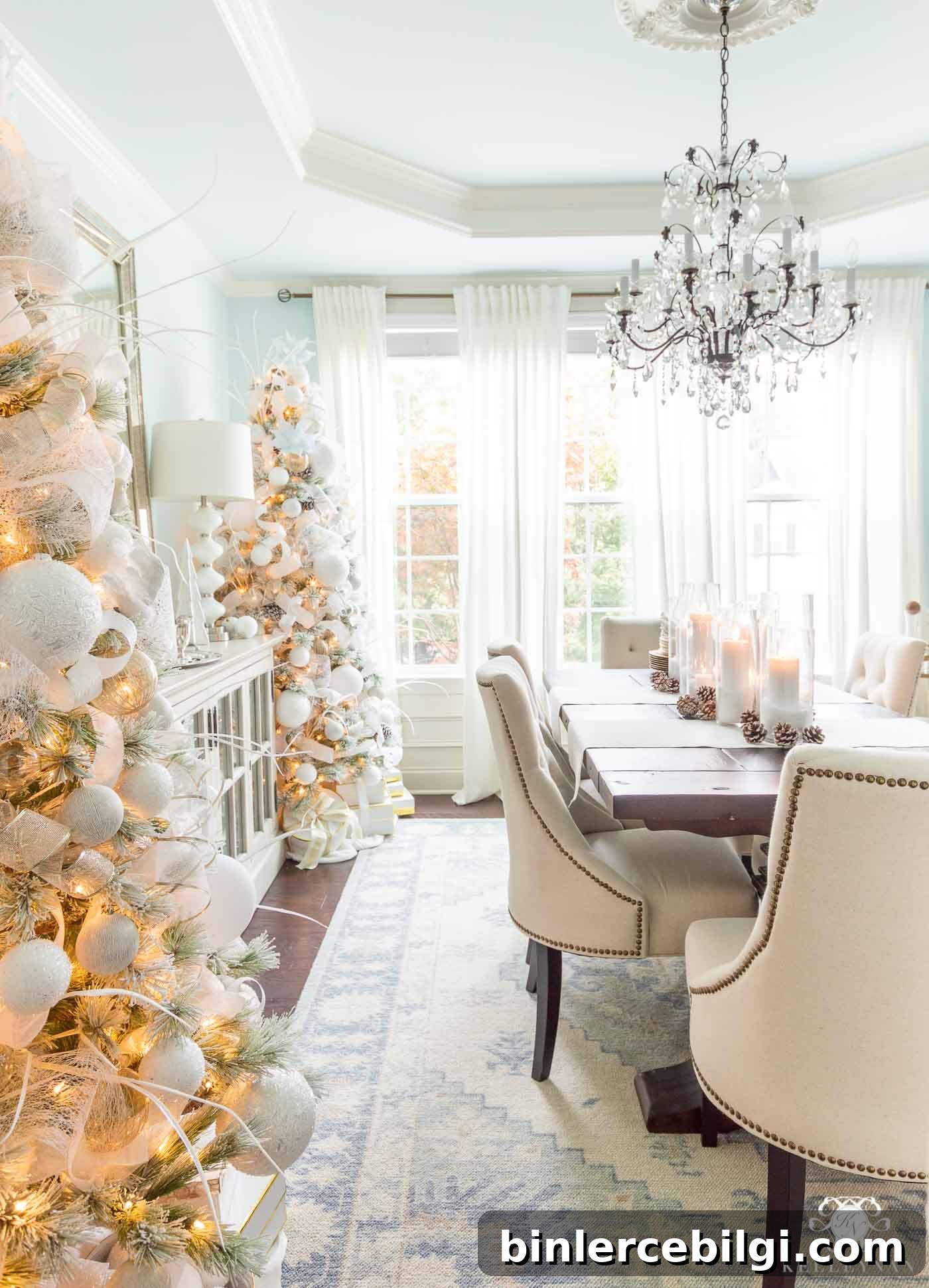
Winter white creates a calm, sophisticated backdrop that emphasizes shape, texture, and light. A predominantly white scheme allows interesting accents—like icy ribbons, glass ornaments, or subtle blue undertones—to become focal points. When paired with simple candles and natural elements, winter whites can feel both minimalist and utterly festive.
Black and White with Gold Accents
Black and white is a surprisingly dramatic choice for holiday decor. The strong contrast feels modern and timeless, and gold or silver accents introduce a luxurious glow. This palette works well in spaces that already favor graphic or monochrome interiors—use elegant ribbons, mixed metallic ornaments, and frosted greenery for a refined, welcoming look.
Jewel Tones for a Luxurious Look
Jewel tones—think emerald, sapphire, amethyst, and deep ruby—bring richness and drama to holiday styling. These saturated hues create a sumptuous, festive mood that’s perfect for entertaining. Stick with a few complementary jewel shades or lean into a more monochromatic approach (for example, mostly blues and teals) for a bold and sophisticated tree or mantel display.
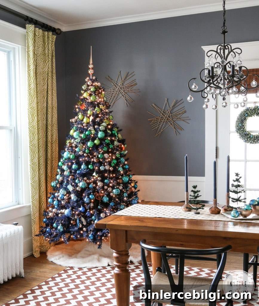
Greenery and Pops of Color
Bringing natural elements into your holiday palette—eucalyptus, pinecones, and fresh greenery—provides an organic base that pairs beautifully with unexpected pops of color. Bright orange, citrus tones, or vibrant accents contrast beautifully with lush green garlands. Natural textures soften the overall feel and lend a very approachable, handmade charm to the space.
Playful Pink for a Whimsical Twist
Soft pinks and pastels are perfect for a whimsical, feminine holiday look. Large floral picks, metallic ribbons, and pale-hued ornaments create a delicate and cheerful tree. Mixing in natural textures (pinecones, twine) and warm white lights keeps the scheme balanced and prevents the pastel palette from feeling too saccharine.
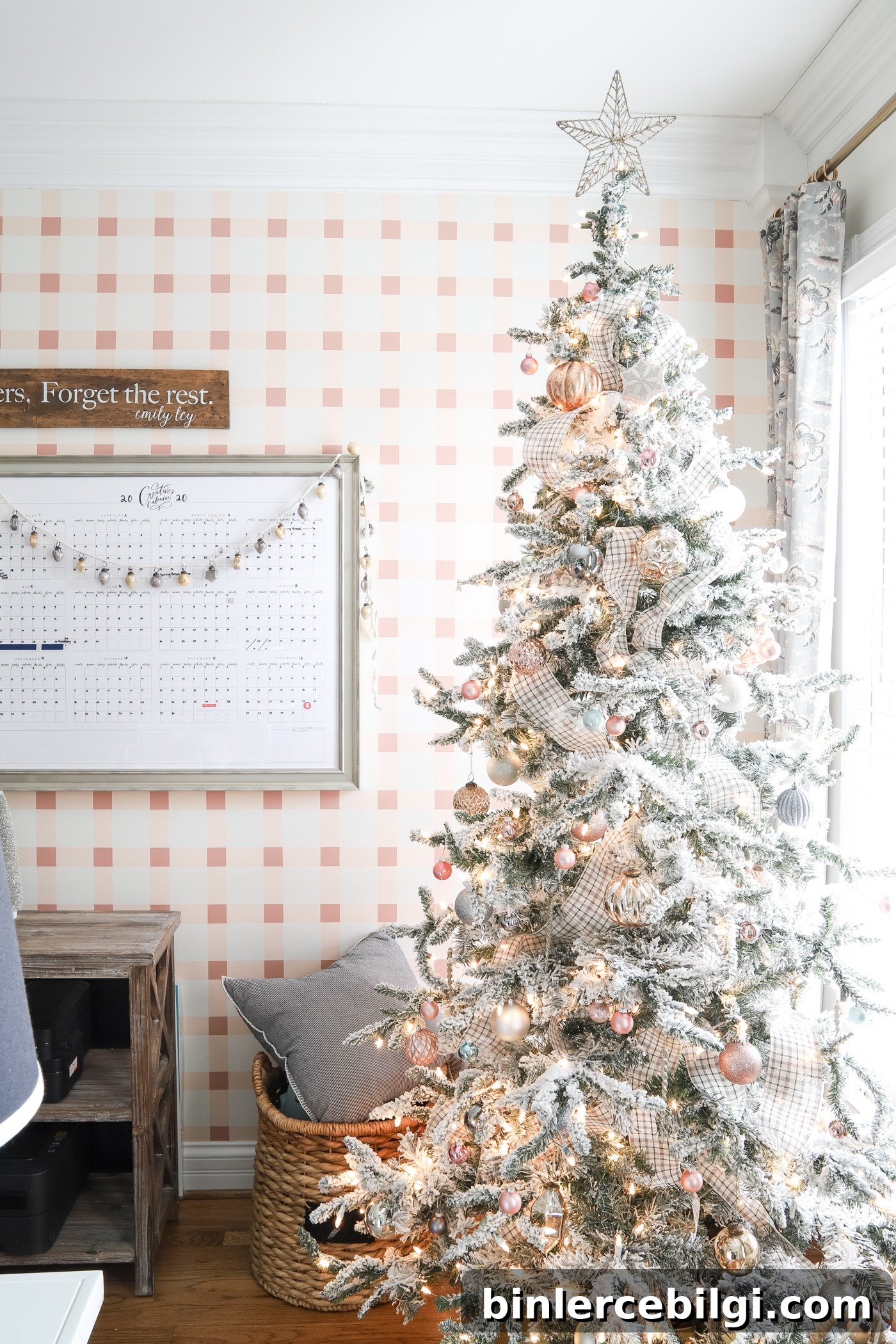
Try Blue and Silver Decorations
Blue and silver is a classic yet non-traditional holiday palette that feels cool and elegant. Pale blues and metallic silvers pair well with rustic elements or modern interiors alike. Use varying shades of blue, mirrored or metallic touches, and soft lighting to create a cohesive, tranquil holiday scene.
These examples show how diverse and expressive your holiday palette can be. Whether you prefer understated elegance or bold, dramatic color, there are countless ways to make your home feel festive without relying on red.
Final Thoughts
Whether you gravitate toward winter whites, jewel tones, or playful pastels, there’s a holiday palette to suit every style. Choose colors that resonate with you, then layer texture, metallics, and natural elements to create a cohesive and memorable look. Above all, have fun with the process—your holiday decor should reflect your personality and bring joy to your home.
More Posts You Will Love:
- How to Put Lights on a Christmas Tree (so it glows!)
- How to Decorate the Kitchen for Christmas (3-Step Formula)
- The Best Artificial Christmas Trees
- Christmas Bedroom Decor Ideas & Inspiration
- How to Organize Christmas Decorations