
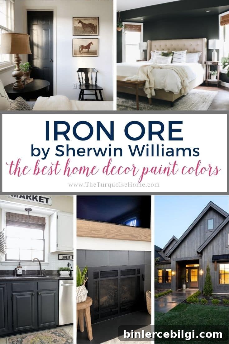
If you want a moody, dramatic color but aren’t ready to commit to pure black, Sherwin Williams Iron Ore offers a compelling middle ground. Below is a clear, practical guide to what this rich charcoal looks like, how light affects it, and the best ways to use it in your home.
Iron Ore (SW 1069) reads as a very dark gray—so deep it can appear nearly black in low light but reveal gray undertones in brighter conditions. It’s a dramatic neutral that adds depth and sophistication wherever it’s used. Because it sits close to black on the spectrum, Iron Ore is best for confident designs and spaces where you want a strong, moody presence without the starkness of true black.
Pro Tip
Always test real paint samples in your actual space before painting an entire wall. Peel-and-stick samples or small painted boards let you observe how the color changes throughout the day under natural and artificial light.
Undertones of Sherwin Williams Iron Ore
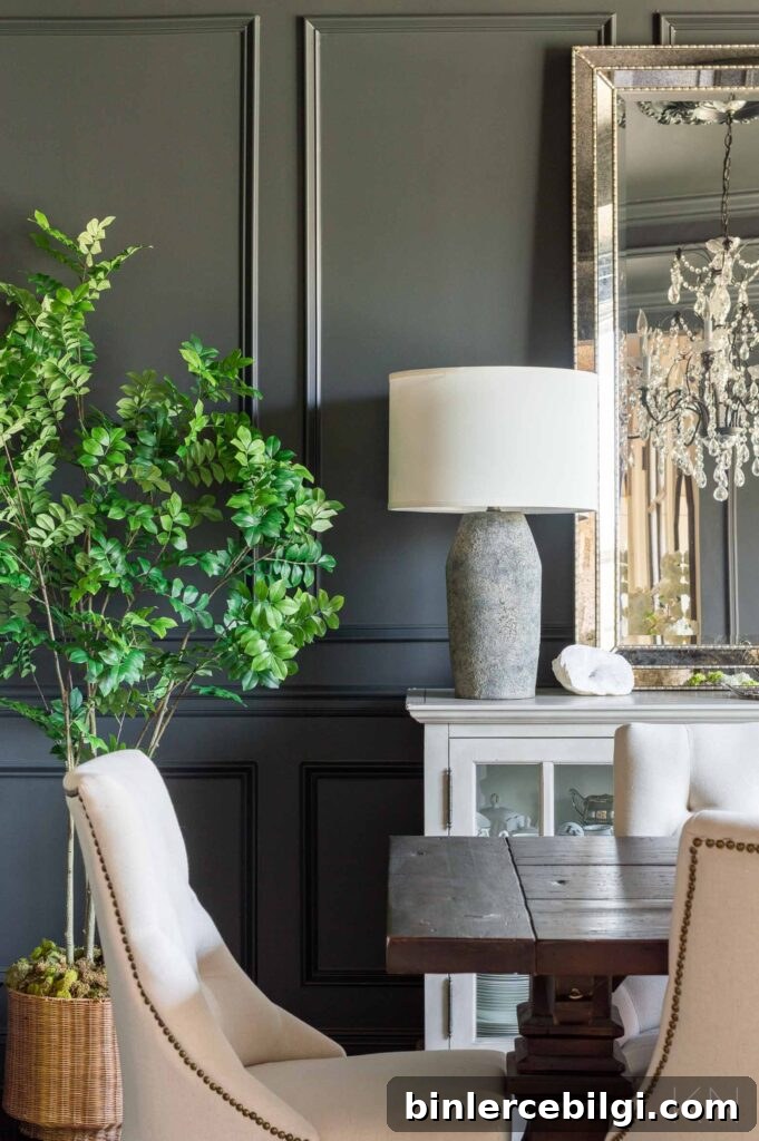
Although many people perceive Iron Ore as black, it is technically a very dark gray with subtle undertones. In most lighting it reads as a cool gray with blue-gray hints. Depending on the light and surrounding finishes, you might also notice fleeting whispers of purple, brown, or even green. These undertones are subtle, but they influence how the color pairs with fabrics, wood tones, and metals.
Because Iron Ore tends toward the cool side, it won’t bring warmth to a room on its own. Instead, use it as a statement color and balance it with warmer accents—light wood, brass hardware, or warmer white trims help prevent the space from feeling too cold while preserving the paint’s dramatic edge.
Light Reflectance Value (LRV) of Iron Ore
Light Reflectance Value (LRV) measures how much light a paint reflects on a scale from 0 to 100: 0 is pure black and 100 is pure white. Iron Ore has a low LRV of 6, which places it very close to black. Expect it to absorb most light rather than reflect it.
Because of its low LRV, Iron Ore performs best in rooms with ample natural light or a thoughtful lighting plan. In bright daylight the blue-gray undertones become more apparent; in dim or artificial light, the color will feel much darker and more enveloping.
Complementary Colors and Pairings
Dark grays and near-blacks often benefit from crisp contrast. White trim, ceilings, and furniture create a clean balance and let Iron Ore read as charcoal rather than overwhelming black. If pure white feels too stark, choose a warm white to soften the contrast and counterbalance the paint’s cool undertones—this helps warm the overall palette without diluting the dramatic effect.
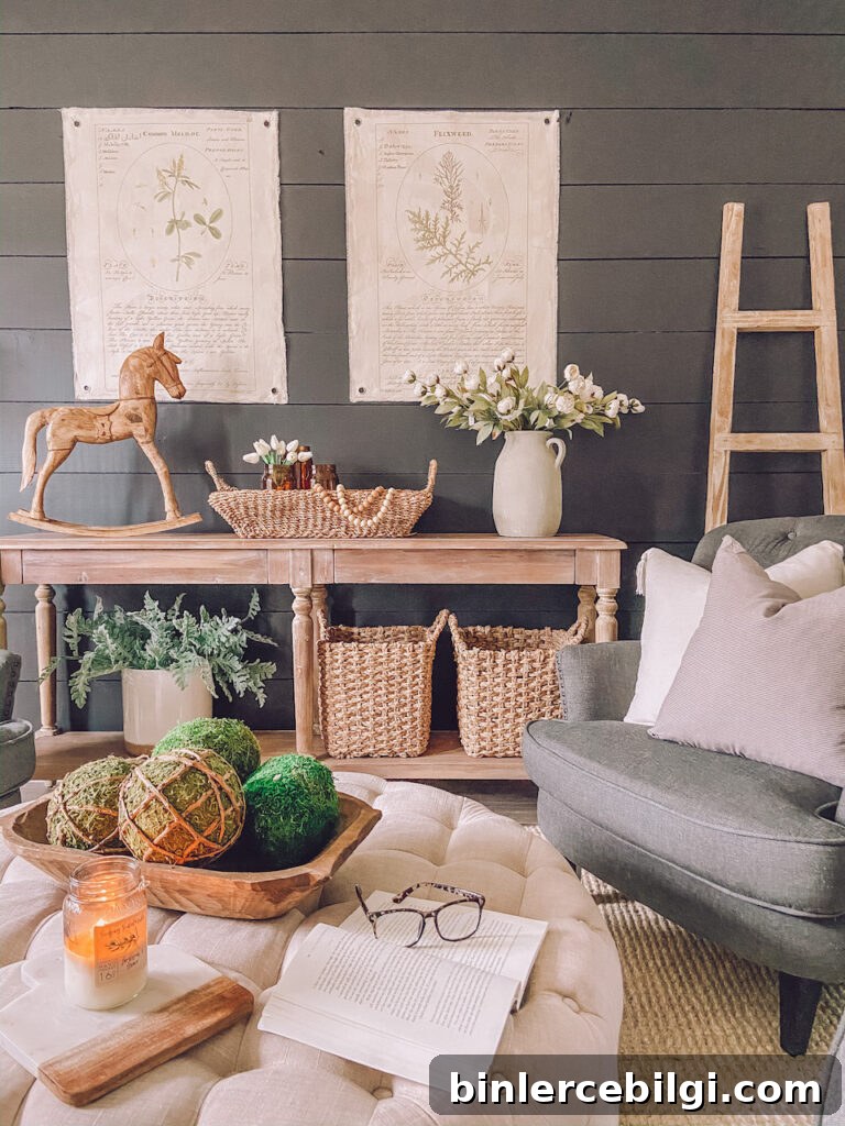
Light, warm wood finishes are another excellent pairing; they bring warmth and texture that keep the room from feeling austere. For hardware and accents, brass, gold, or warm metals add a touch of luxury against the deep gray.
If you’re exploring nearby shades, Sherwin Williams Tricorn Black is a touch darker than Iron Ore, while Peppercorn is slightly lighter. These options let you fine-tune how close to black you want to go.
Using Sherwin Williams Iron Ore in the Home
Iron Ore is versatile in application—used selectively it can be sophisticated and surprising. Below are common, successful ways designers and homeowners use this shade.
Exterior
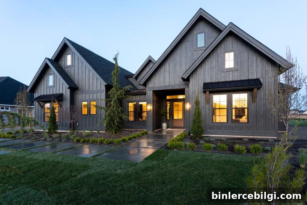
Iron Ore is a popular choice for exteriors because natural light softens and reveals its charcoal qualities. When exposed to sunlight, it can appear warmer and more nuanced than a flat black. Homeowners use it for full facades, siding, shutters, trim, and porches to achieve a modern, grounded look.
Cabinets
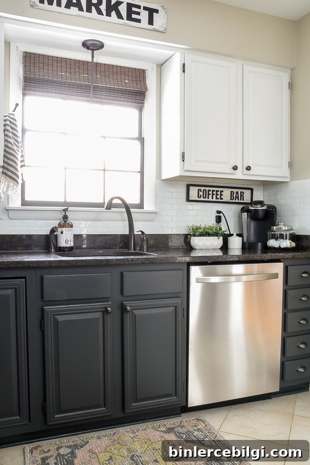
Iron Ore is an excellent alternative to black for kitchen and bathroom cabinets. In bright kitchens it creates a dramatic contrast with light counters and backsplashes. Smaller pieces—bathroom vanities or built-ins—look elegant in Iron Ore, especially when paired with warm wood counters or brass hardware.
Accent Walls
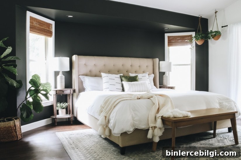
A single Iron Ore accent wall can add mood and depth to a living room, bedroom, or den. Because the color is powerful, limiting it to one wall or a smaller area is often the most successful approach. For bolder designers, full dark rooms can create an intimate, dramatic atmosphere when executed with the right lighting and furnishings.
Doors
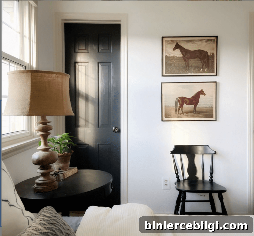
Painting interior doors in Iron Ore is a simple way to introduce contrast and personality. Dark doors add visual depth to hallways and entryways and make modest spaces feel more composed and intentional.
Fireplace
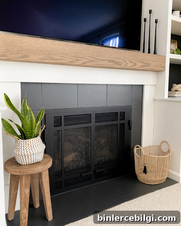
Painting a mantel, surround, or the entire fireplace in Iron Ore creates a striking focal point. The dark finish highlights textures and architectural details while lending a cozy, dramatic feel to the hearth area.
Iron Ore is a bold, flexible neutral that can elevate interiors and exteriors alike. Test samples in your space, consider light and contrast, and pair the color with warm woods and trim to keep the look rich and inviting.
More posts you might like: