

Repose Gray by Sherwin Williams is one of the most popular gray shades for a reason: it works almost anywhere. Whether your home is modern or traditional, bright or dim, Repose Gray creates a calm, polished backdrop that complements many styles and accents.
Sherwin Williams Repose Gray
Repose Gray is a very livable neutral that avoids feeling cold or clinical. It’s a soft, slightly warm gray with subtle taupe undertones that keep it from reading as a flat, true gray. Like any paint, the shade will shift depending on the room’s lighting, surrounding finishes, and the time of day—but overall it’s consistently flattering and versatile.

In north-facing rooms or spaces that look out on a lot of greenery, Repose Gray can pick up slight greenish hints from the outdoor light. In other situations you might detect faint purple or mauve undertones—these subtle shifts are part of what gives the color its cozy, lived-in feel.
Note: this post contains affiliate links for convenience.
What Colors Go with Repose Gray?
Repose Gray pairs well with a wide range of colors. Sherwin Williams highlights a few coordinating options that work especially nicely alongside it:
- Elder White SW 7014
- Pavestone SW 7642
- Coral Clay SW 9005
Repose Gray vs. Revere Pewter
Repose Gray and Revere Pewter are two of the most popular greige choices for interiors. Both are excellent for whole-home palettes and staging because they appeal to many tastes and work with both warm and cool accents. However, they are distinct: Repose Gray leans more gray, while Revere Pewter leans more toward greige with noticeable taupe undertones. Many designers recommend one of these two when aiming for a neutral, cohesive look throughout a home.
Personal preference and lighting should guide your choice. If you want a truer gray, Repose Gray is the better pick; if you prefer a warmer, slightly beige look, Revere Pewter is worth considering.
Repose Gray Room Examples
Seeing Repose Gray in real rooms helps you imagine how it might read in your own home. Below are a few examples where Repose Gray performs well as a wall color, cabinet finish, or trim shade. Remember: sampling the paint in your space is always the best way to confirm the look.
Kitchens with Repose Gray
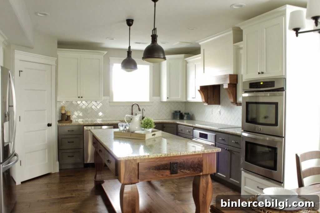
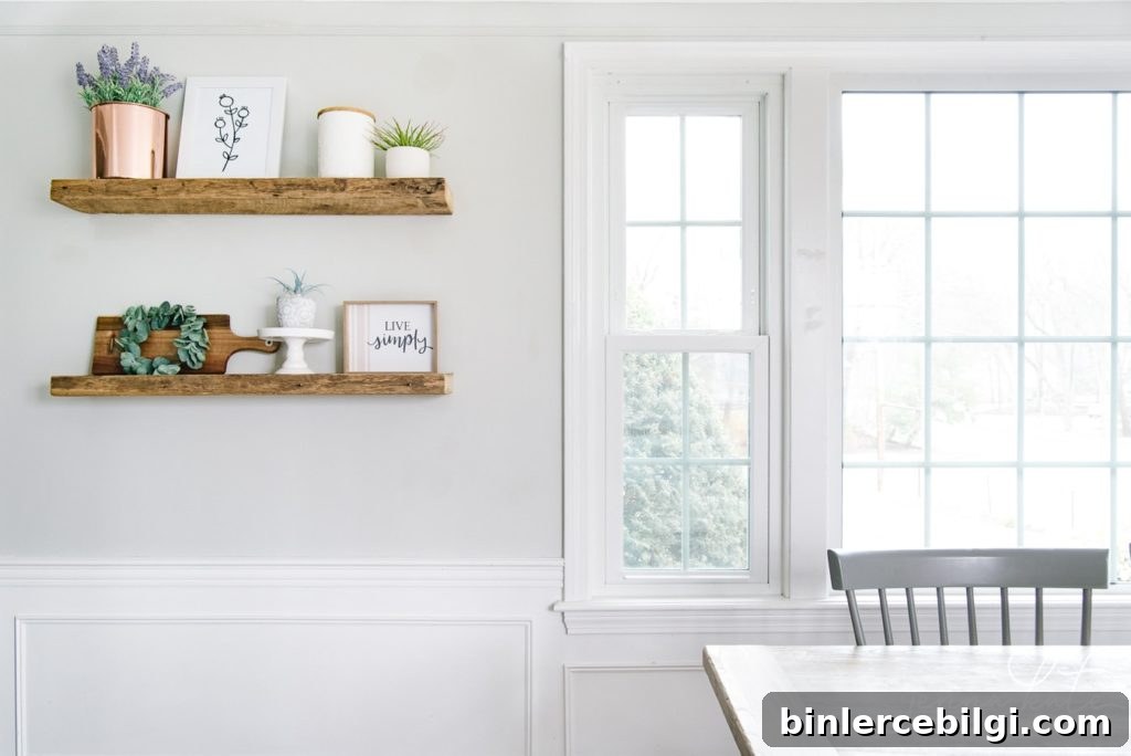
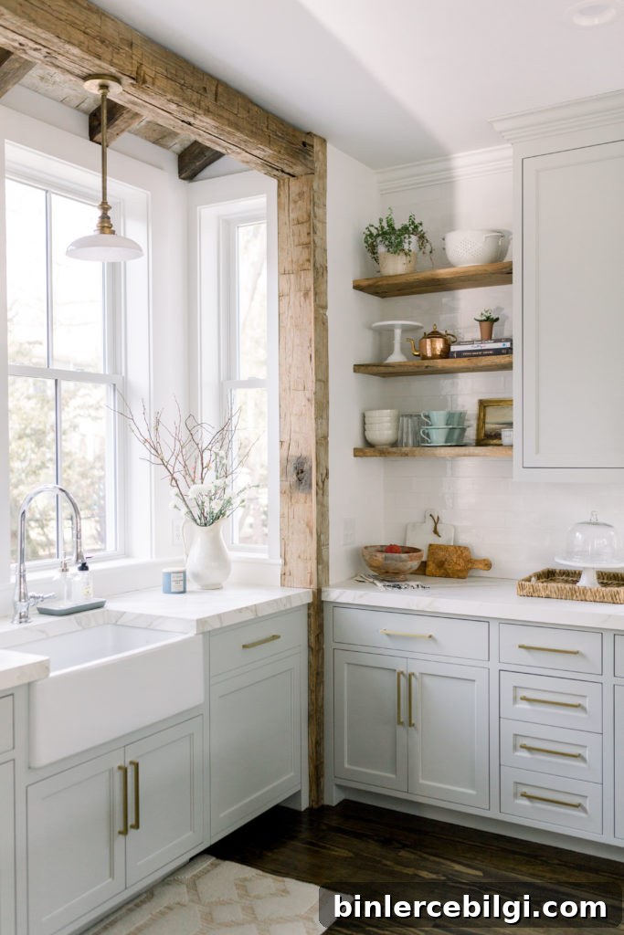
Repose Gray is one of the rare neutrals that can function beautifully on walls, cabinets, and trim. In kitchens it often makes white cabinets pop and provides a warm, inviting backdrop—especially when extended up to the ceiling. It pairs wonderfully with natural wood accents and marble countertops, making it a top choice for kitchen remodels or refreshes.
Repose Gray in Living Rooms
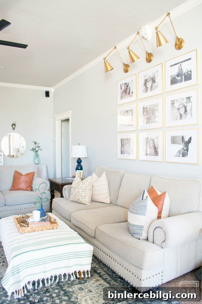
Repose Gray works particularly well in open floor plans and can serve as a comfortable whole-home color. It reads as light and airy while still offering enough depth to create visual interest. In some living spaces you may notice a touch of green undertone—this is normal and can add dimension. The color also pairs nicely with a variety of metallic accents and textiles, including both cool and warm tones.
Repose Gray in Bedrooms
Bedrooms benefit from neutral, calming paint colors, and Repose Gray is an ideal choice. It creates a peaceful atmosphere that supports a wide range of bedding and accessory colors without competing for attention. Because of its subtle warmth, Repose Gray works as a soft backdrop for both light and layered decor schemes.
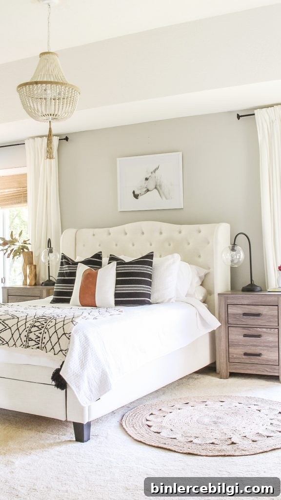
A major advantage of Repose Gray is its flexibility—choose nearly any accent color, from cool blues to warm terracottas, and it will work. If you’re uncertain, try a few peel-and-stick real paint samples or paint a swatch on multiple walls to see how it shifts with your light.
More Great Neutral Paints
- Agreeable Gray
- Sea Salt
- Hale Navy
- Revere Pewter
- Gray Owl
- Wythe Blue
- White Dove
Tips for Painting a Room Yourself
If you plan to paint a room yourself, preparation and the right tools make the job smoother and yield better results. Start by testing the paint in your home and viewing samples at different times of day. Here are a few practical tools and supplies that help when painting:
- Quality paint brush – A good brush delivers a smoother finish and will last for years if cleaned properly.
- Painter’s tape – Essential for clean edges, especially if you don’t have a very steady hand.
- Drop cloths – Protect floors and furniture while you work.
- Paint cup or paint cup with magnetic brush rest – Keeps your brush accessible and reduces wrist strain.
- Roller tray and liners – Makes rolling faster and cleanup easier; liners are a simple way to avoid scrubbing trays.
Final thought: Repose Gray is a reliable, flexible neutral that performs well across rooms and styles. Before committing, sample it on your walls and observe it throughout the day—once you see how it responds to your home’s light, you’ll know whether it’s the right neutral for your space.