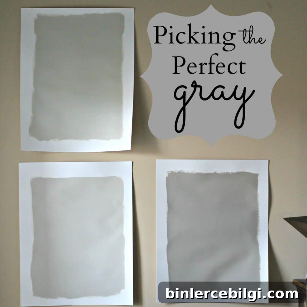
Revere Pewter is a light gray with warm undertones; this classic shade creates a comfortably sophisticated look that soothes and restores.
After a long search, I finally chose the perfect color for my open living areas and hallways: a warm, versatile gray. Before I reveal the exact shade, here’s a quick guide to how I evaluated grays and why I picked the one I did. If you love gray, these tips will help you narrow down your choices and get confident about painting large, connected spaces.
This post contains affiliate links for your convenience. See my full disclosure policy.
Gray is the go-to neutral right now—trendy, adaptable, and surprisingly warm when you pick the right undertone. I’d used beige in my previous home and liked it, but for this house I wanted to try something different. Beige (I previously used a shade called Latte) worked well with bold accents like a red couch and turquoise accessories. The new home came with a neutral beige paint, but it was a flat finish with no spare paint for touch-ups and a small child who loves sticky fingers—so repainting felt necessary.

Want to Save This?
Enter your email below and I’ll send a quick summary of my color picks and pairing suggestions directly to your inbox.
I decided to go with gray because I wanted to try a look I hadn’t used before. Paint is temporary and changeable; if I tire of it in a couple of years, I can always switch back to beige or choose another hue. The important part was being deliberate this time—testing samples and evaluating them in different light throughout the day.
Revere Pewter can look different depending on light. In some photos it reads slightly washed out in bright morning light, but in most interiors it reads as a warm, neutral gray that pairs well with both cool and warm accents.
To narrow down the options, I studied many gray swatches, visited paint stores, and tested samples. I settled on four Benjamin Moore colors to test on large poster boards: Rockport Gray, Revere Pewter, Grant Beige, and Hazy Skies. I love Benjamin Moore’s palette, particularly their historical colors, and I keep returning to them for reliable undertones.
Grant Beige was my greige contender—a mix of gray and beige—but it leaned too beige for the mood I wanted. Although I considered greige to accommodate my husband’s preference for beige, it ultimately didn’t satisfy either of us. Hazy Skies and Revere Pewter were very close; Hazy Skies has a hint more green, while Revere Pewter reads as a balanced, warm gray. Rockport Gray was a favorite for its depth, but it felt too dark for an entire connected living area.
So which one did I choose? Drumroll please—Revere Pewter.
I had been leaning toward Revere Pewter from the start, but testing several options gave me confidence. I painted swatches on poster board and moved them to different rooms to observe how the color changed with morning, afternoon, and evening light. I kept a white border around each sample so the new color wouldn’t sit directly against the original wall color, which helped me see the true effect of each shade.
Once I committed, I realized choosing paint often triggers a domino effect of other design decisions. In my living room I plan to install board and batten—so I need to determine the top and bottom paint application and whether to paint the top gray and the bottom white before installing the trim. That approach reduces the amount of trim painting later and gives a cleaner finish. I’m also exploring built-ins, so sequencing these projects correctly matters to avoid repetitive work.
A few practical tips from my process:
- Choose several favorite colors, then get sample pots and paint them on poster board large enough to read at a distance.
- Move the boards around the room and into different rooms so you can view the colors under varying light conditions.
- Leave a white border around each sample to avoid color contamination from the current wall color.
- Test deeper or darker options—like Rockport Gray—on a small area to be sure you want that intensity across an entire space.
After painting my living area in Revere Pewter, I grew even more fond of the color. It’s warm enough to feel inviting, neutral enough to let furniture and decor shine, and flexible enough to work in bedrooms and living areas alike. I’ve since used it in my primary bedroom and love how it creates a calm, cohesive backdrop for layered textures and seasonal decor.
Below are a few photos of rooms painted in Revere Pewter from over the years—each illustrates how the color adapts across spaces and light conditions.
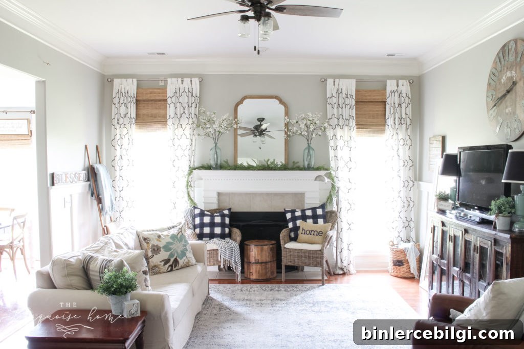
Quick & Simple Coastal Summer Mantel Decor
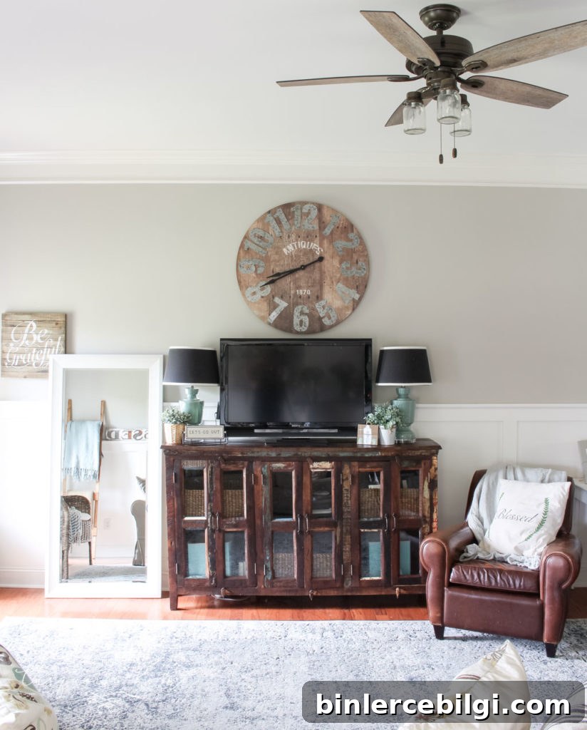
We later moved and I painted our primary bedroom Revere Pewter as well; it provides a soothing neutral backdrop that works beautifully with ivory linens and natural textures.
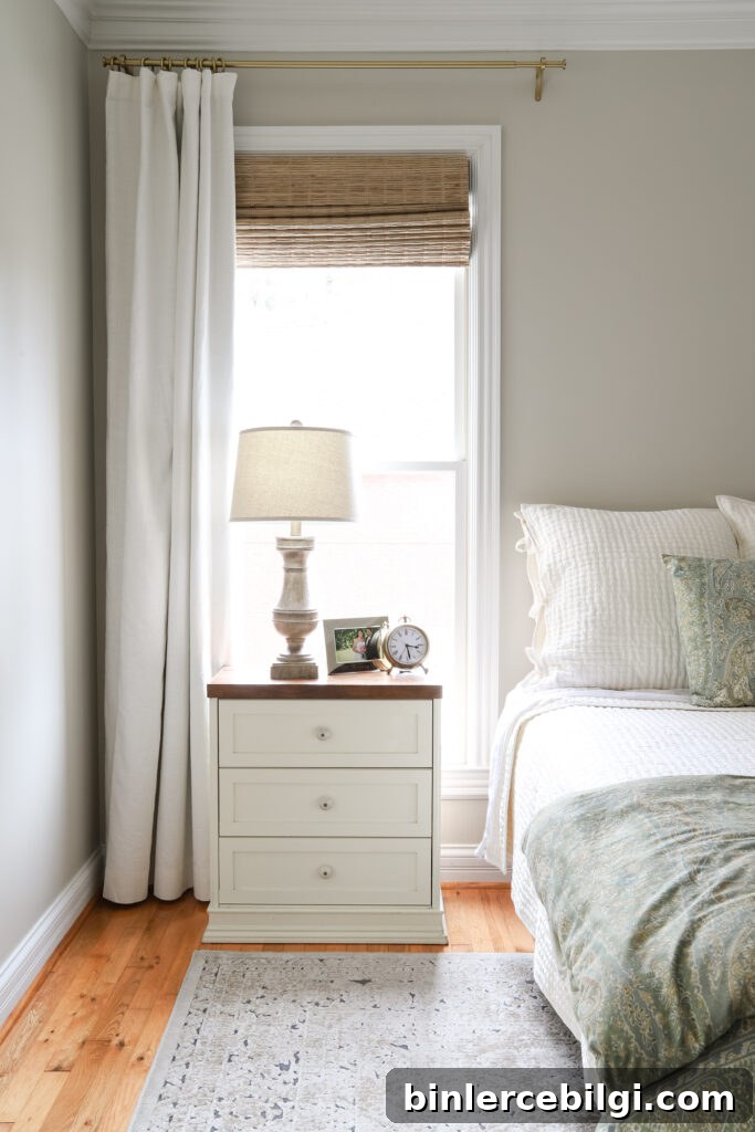
Our Current Bedroom painted in Revere Pewter
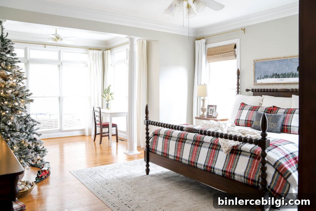
Our Primary Bedroom Decorated for Christmas
More Posts You Will Love:
- The Best Green Paint Colors For Your Home
- Best Living Room Paint Colors
- The Best Bedroom Paint Colors
- Sherwin Williams Extra White (SW 7006)
- Benjamin Moore Stonington Gray