
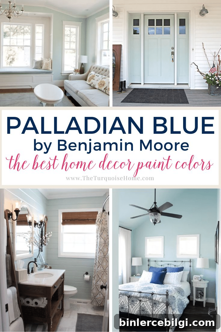
Benjamin Moore Palladian Blue is a beloved muted blue-green paint that brings a calm, restful feeling to a room. This soft, versatile shade works in many styles of homes and adds a gentle, sophisticated pop of color without feeling overpowering.
Palladian Blue (Benjamin Moore HC-144) leans cool, blending blue and green with subtle gray undertones that keep it crisp without becoming icy. It’s lighter than some blue-greens but still has enough depth to read clearly as a color rather than appearing washed out.
If you’re looking for a breezy, elegant hue that adapts to lighting and decor, Palladian Blue is a strong contender. Many homeowners compare it to other popular blue-greens—some seeing more blue in cooler light and more green in warmer light—so sampling it in your own space is essential before committing.
What color is Benjamin Moore Palladian Blue?
Quick highlights to know about this shade:
- Cool-leaning blue-green with gray undertones
- Light to medium shade with an LRV (Light Reflectance Value) of 60.4
- Popular for walls, kitchen cabinets, doors, and accent pieces
- Versatile and neutral enough to coordinate with many decor styles
- Creates a calm, spa-like ambiance in a room
Palladian Blue Undertones
Palladian Blue is a balanced blend of blue and green with gray mixed in, which gives it flexibility. In cool, north-facing light it can read bluer and more muted; in warm, sunlit spaces it often reveals more green. Because of these shifting undertones, avoid pairing it with colors that have strong purple or magenta undertones—those can clash. The best approach is to test real paint samples on your walls and observe them at different times of day.
LRV of BM Palladian Blue
Light Reflectance Value (LRV) measures how much light a paint color reflects. The scale runs from 0 (pure black) to 100 (pure white). Palladian Blue has an LRV of 60.4, placing it in the light-to-medium range. It reflects a fair amount of light, so it can help brighten a room while still remaining clearly colored rather than appearing like a pale off-white.
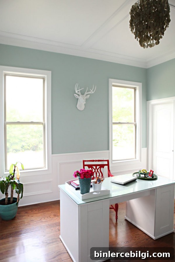
Coordinating Colors for Benjamin Moore Palladian Blue
Palladian Blue pairs well with a wide variety of tones. Benjamin Moore suggests combinations such as soft whites, warm neutrals, and muted browns. In practice, Palladian Blue looks lovely with creams, greiges, grays, dark browns, corals, and deeper blues. Some commonly chosen pairings include:
- Clean whites for trim, such as Chantilly Lace or White Dove
- Medium-to-dark blues like Hale Navy for contrast
- Soft warm grays such as Revere Pewter
- Greens in the same muted family, like Beach Glass or Storm
- Deeper charcoal tones for grounding accents
What trim colors should I use with Palladian Blue?
For crisp contrast, a clean white trim works beautifully with Palladian Blue. Benjamin Moore Chantilly Lace or White Dove are popular choices that brighten edges and create a classic, tailored look.
Palladian Blue vs. Similar Colors
Comparing Palladian Blue to nearby shades helps determine the best fit for your space:
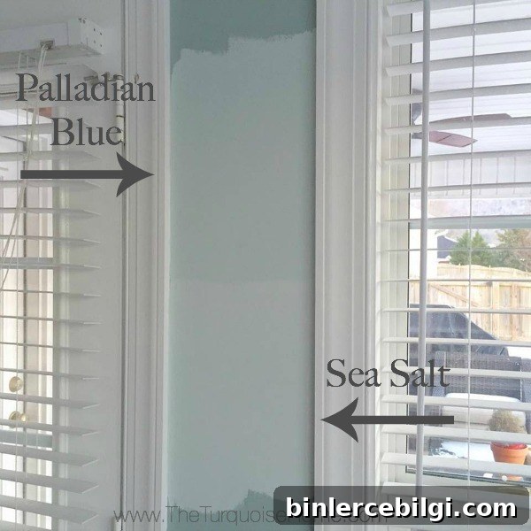
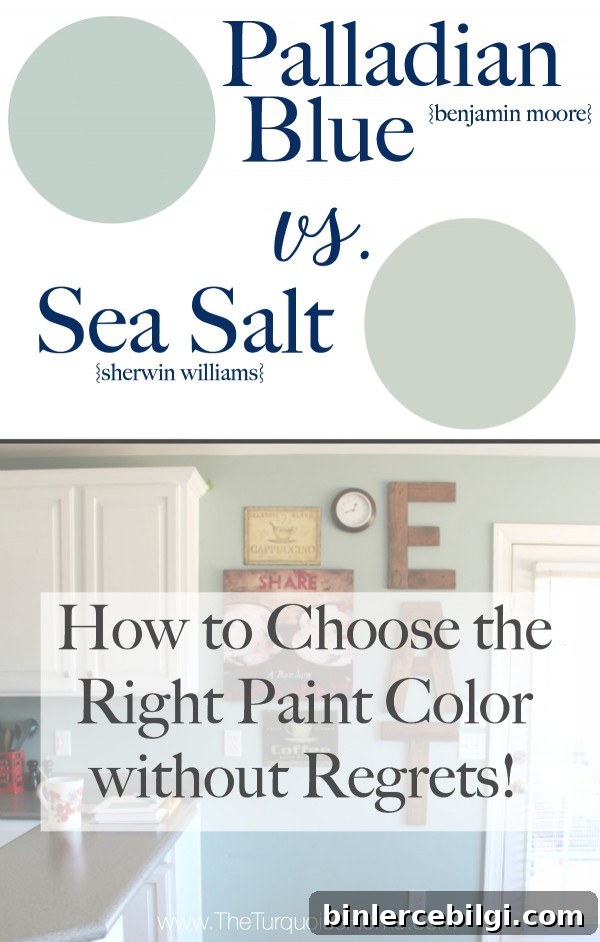
- Sherwin-Williams Sea Salt: Slightly lighter and airier, Sea Salt tends to lean more green than blue and has a slightly higher LRV. Both are soft, coastal-friendly hues, but Sea Salt can read more muted and pale in bright light.
- Wythe Blue: Darker and more saturated, Wythe Blue has a lower LRV and reads richer. If you want more depth and a stronger blue presence, Wythe Blue might be preferable in a bright room.
Where to Use Benjamin Moore Palladian Blue
Palladian Blue is extremely versatile and suitable for many areas of the home, including:
- Interior walls in living rooms, bedrooms, and hallways
- Kitchen cabinets and vanities
- Bathrooms and shiplap-clad rooms where texture enhances depth
- Ceilings for a subtle, enveloping color
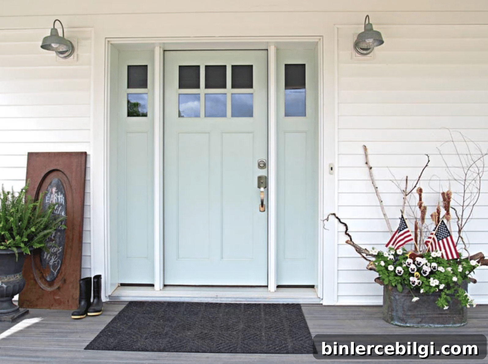
- Exterior doors as a welcoming pop of color
- Interior doors and accent walls
Home Styles that Work with Palladian Blue
- Traditional
- Transitional
- Coastal
- Farmhouse
- Classic and contemporary interiors
Room Examples Using Palladian Blue (HC-144)
Seeing Palladian Blue in real rooms helps you visualize its potential. Here are common applications:
Kitchens
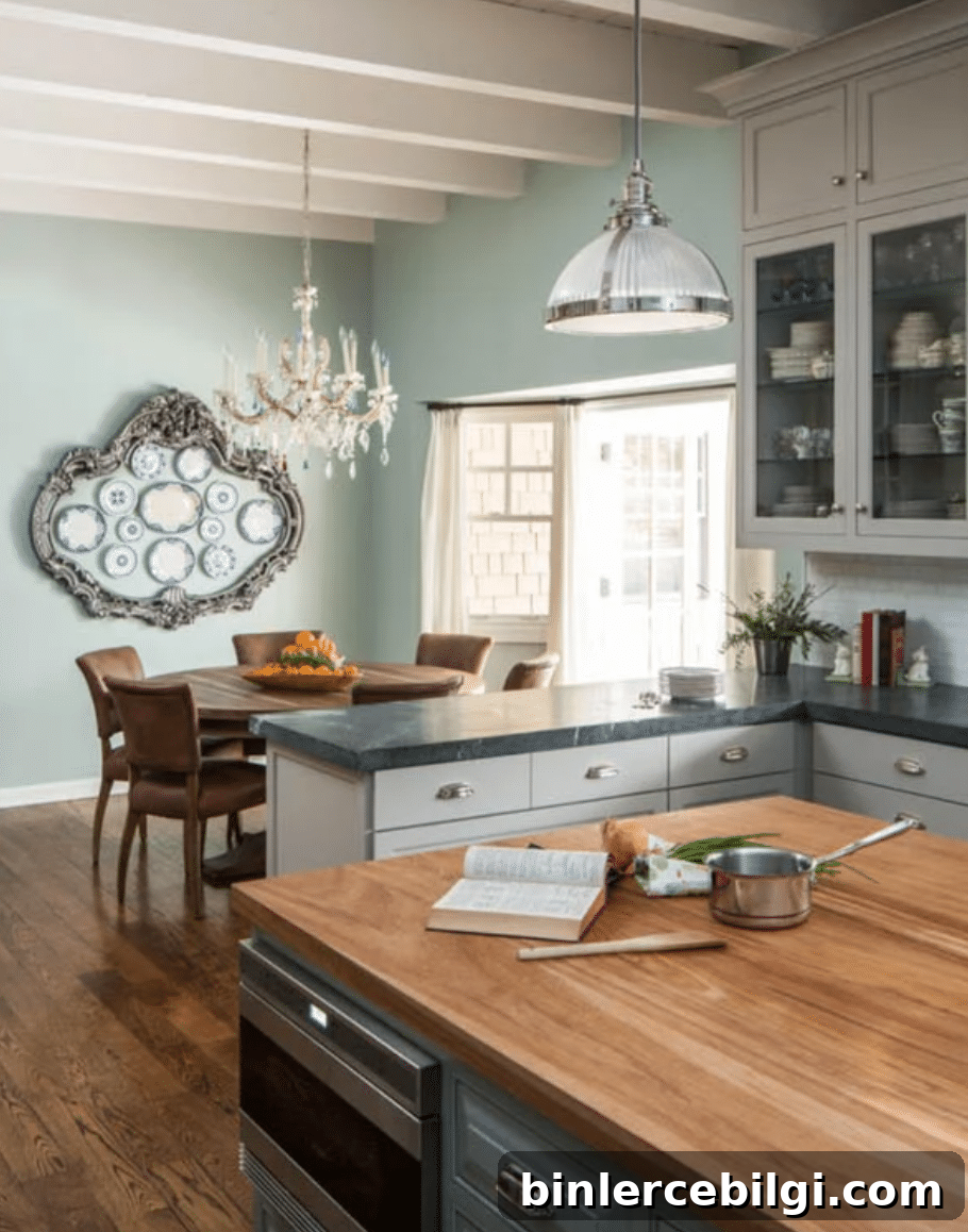
Palladian Blue can unify varied materials—wood floors, white beams, gray counters, and metallic fixtures—thanks to its gray undertones. It brings warmth and calm while still providing color.
Living Rooms
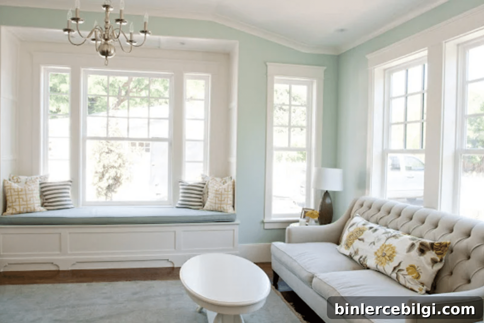
In bright, naturally lit living rooms, Palladian Blue reads soft and serene while still offering a gentle color statement. Crisp white trim enhances the contrast and keeps the look fresh.
Bedrooms
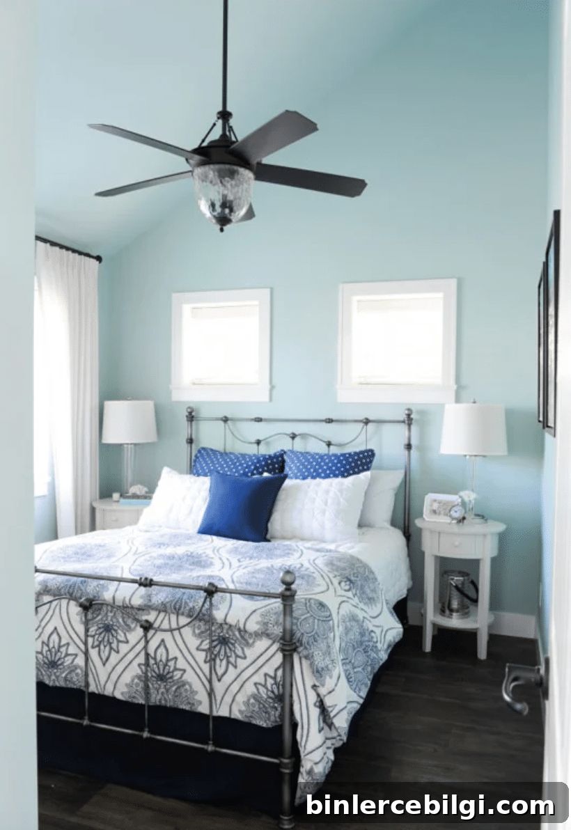
Under cool lighting, Palladian Blue can appear bluer and more muted. Darker blue accents in bedding or decor will emphasize the blue side of the hue, while lighter accessories can let the green undertones peek through.
Bathrooms
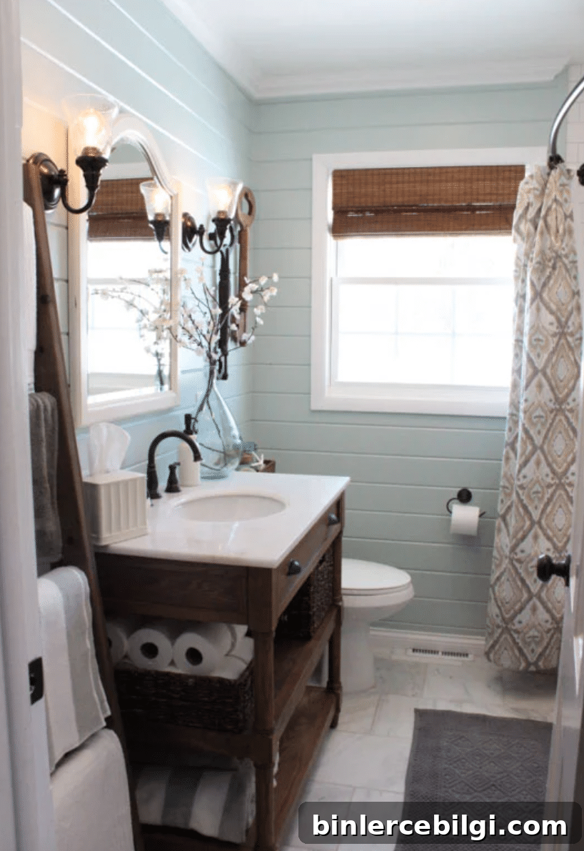
Textured surfaces like shiplap or beadboard will add dimension to Palladian Blue and make smaller bathrooms feel inviting and layered rather than flat.
Exterior Front Door
Palladian Blue makes a subtle but appealing choice for exterior doors—enough color to be welcoming without overwhelming the facade.
Frequently Asked Questions
Palladian Blue is cool-leaning, combining blue, green, and gray. It reads cool overall but retains a gentle warmth from its green undertones, so it won’t make a room feel stark or cold.
It’s a balanced mix of blue and green. Depending on lighting and surrounding colors, Palladian Blue can read more blue in cool light or more green in warm light.
How to Choose a Paint Color
Picking the right paint takes time and testing. Research several shades in the same color family, then test real paint samples on your walls and observe them at different times of day. Use those samples to build a whole-house color palette that coordinates between rooms.
Consider popular families to narrow your search: neutrals, greiges, blue-grays, blues, and greens. Once you’ve narrowed choices, test before you buy.
Tools to Help Paint a Room Yourself
For DIY painting, have quality brushes, painter’s tape, drop cloths, a good roller and tray, and an easy-to-handle paint cup. These items make the job cleaner, faster, and help deliver professional-looking results.
More Posts You Will Love
- Which interior paint finishes to use and where
- What wall colors pair well with dark wood trim
- Best living room paint colors
Palladian Blue remains a favorite for its adaptability, understated elegance, and calming presence. If you’re drawn to muted blue-greens that feel fresh yet refined, this shade is well worth sampling in your home.