

Benjamin Moore Simply White is one of the most popular white paint colors. This light off-white offers the perfect touch of warmth while still feeling bright and fresh.
Benjamin Moore Simply White (OC-117) is a warm, clean white that reads crisp without feeling cold. Named Benjamin Moore’s Color of the Year in 2016, it’s a versatile choice that complements many decorating styles and architectural types.
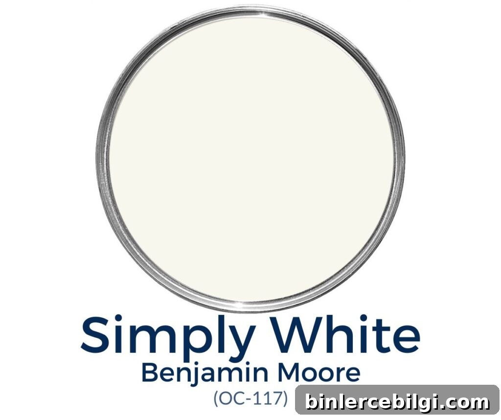
If you’re hunting for the right white, the process can feel surprisingly complicated. Simply White is a reliable option because it has just enough cream to soften the tone and prevent a stark, clinical feel. It usually reads as a bright white in most lighting while maintaining a soft, inviting presence.
Benjamin Moore describes it succinctly: “Fresh as the first snowfall, this clean, crisp, multi-purpose white is a perennial favorite for trim, ceilings, and walls.”
Below is an easy-to-scan guide to what makes Simply White a top choice, how it behaves in different spaces, and practical pairing ideas to help you use it with confidence.
What color is Benjamin Moore Simply White?
Key qualities at a glance:
- Warm off-white with subtle creamy undertones
- Bright, with an LRV (Light Reflectance Value) of 89.52
- Popular for kitchen cabinets, trim, ceilings, and walls
- Extremely versatile—works with many home styles and palettes
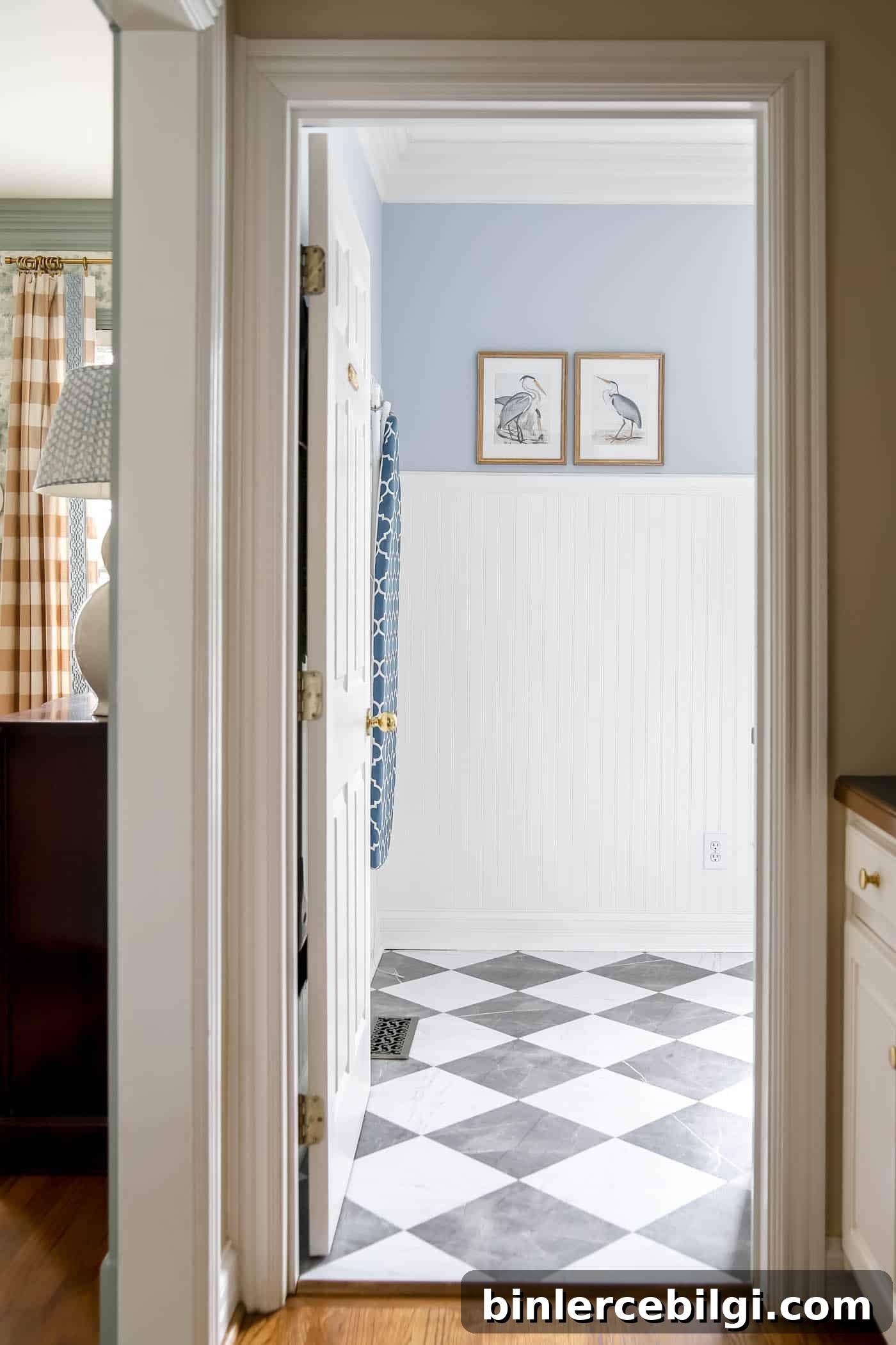
Undertones in Simply White
Simply White leans warm with a mild yellow-cream undertone. In many rooms it will appear crisp and neutral, but in warm lighting it can read as cozier and creamier. Placed next to cooler, bluer whites it will reveal those warm undertones more clearly, so always view samples in the actual space before committing.
LRV of BM Simply White
Light Reflectance Value (LRV) measures how much light a color reflects. LRV 100 is pure white; LRV 0 is black. Simply White’s LRV of 89.52 means it is very light and reflective—bright enough that most people will recognize it as white rather than off-white.
Coordinating colors for Simply White
Simply White pairs well with many shades. It offers a clean backdrop for both warm and cool accents. Recommended and complementary pairings include:
- Dove Wing
- Somerville Red
- Silver Satin
- Casco Bay
- Hale Navy (for dramatic contrast)
- Revere Pewter or Gray Owl (for soft neutrals)
- Chelsea Gray, Edgecomb Gray, London Fog
- Comfort Gray or Sea Salt for subtle cool accents
Best trim colors to go with Simply White
If you want contrast between walls and trim, choose a bright, cool white for trim—options include Chantilly Lace or Oxford White. Another way to get contrast without changing color is to use different sheens: semi-gloss on trim and eggshell on walls will make trim read brighter while walls look softer.
Simply White vs. White Dove
Both are soft, popular whites, but they differ. White Dove has subtle gray undertones that quiet any yellow, making it appear gentler and slightly darker. Simply White, lacking those grays, reads a bit brighter and cleaner in comparison.
Where to use Simply White
Because of its brightness and warmth, Simply White is appropriate for most areas of the home, including:
- Kitchen cabinets
- Trim and molding
- Interior walls
- Ceilings
- Exterior trim
Home styles that work with Simply White
- Traditional
- Transitional
- Classic
- Farmhouse
- Modern looks that want a soft white base
Room examples using Simply White
Simply White performs well across many room types. A few common uses and observations:
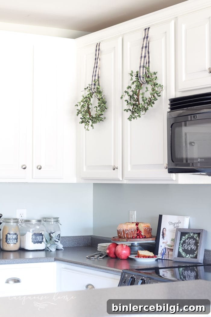
Kitchen cabinets
On cabinets, Simply White looks clean and timeless. It bridges warm wood tones and cool wall colors, creating a balanced, airy kitchen aesthetic.
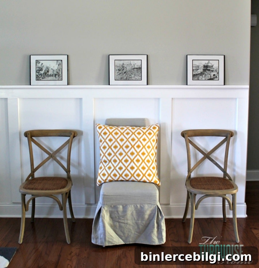
Living rooms and accents
Simply White brightens living spaces and complements architectural details like board-and-batten. Use it on lower panels or moldings to open a room without feeling sterile.
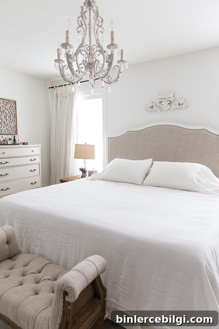
Bedrooms
For bedrooms, Simply White can create a serene, luminous background that works well with layered bedding and varied textiles. In many bedrooms it reads neutral with no obvious yellow cast.
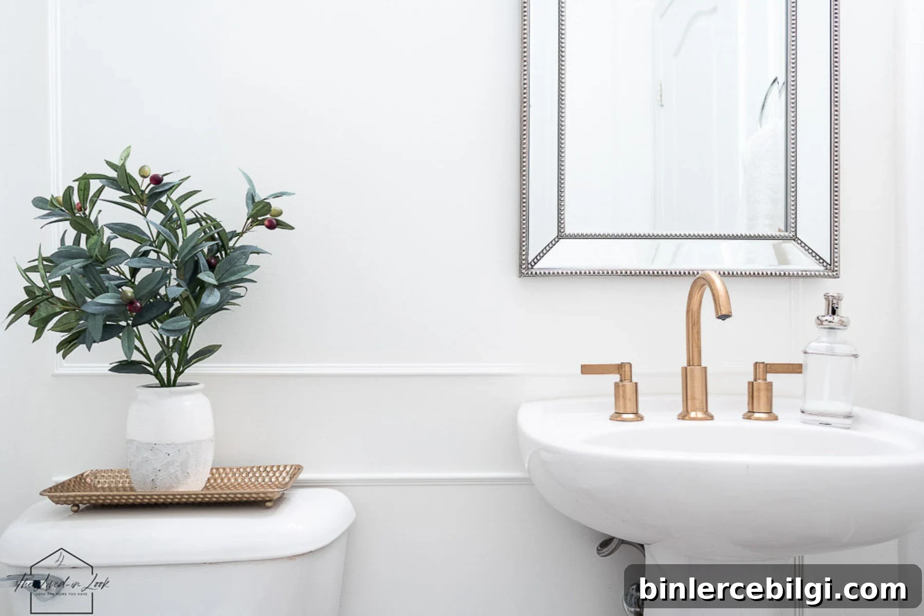
Bathrooms
Small or windowless bathrooms benefit from Simply White’s reflective quality; it helps a tight space feel brighter and more open.
Exteriors
On exteriors, Simply White is warm enough to avoid glare in direct sun while still reading crisp against darker shutters or siding. It’s a safe choice for trim and architectural accents.

Frequently asked questions
Simply White is a warm, clean white. It leans toward creaminess but generally reads neutral and versatile across many lighting conditions.
It has mild yellow undertones, which are usually subtle. In very warm lighting or when placed beside cooler whites, the yellow can become more noticeable.
Simply White generally reads brighter than White Dove because White Dove includes gray undertones that slightly soften its appearance.
How to choose a white paint color
Choosing a white requires testing in your own home. Light, exposure, and nearby colors all affect how a white reads. Sample real paint swatches and view them at different times of day and under your lighting to be sure of the result. Consider finishes too—semi-gloss trim with eggshell walls can create effective contrast without changing color.
More paint colors to consider
If you’re exploring whites and neutrals, other popular options include Sherwin-Williams Shoji White, Benjamin Moore White Dove, Benjamin Moore Alabaster, Revere Pewter, Hale Navy, and Sea Salt. Each has its own undertone profile and best uses—test samples before deciding.
Final thought: Benjamin Moore Simply White is an excellent, adaptable white. Its brightness and subtle warmth make it a reliable choice for everything from trim and cabinets to full-room paint. Always test on-site to confirm how it behaves with your lighting and surrounding finishes.