

Looking for a blue‑green paint that feels calm, cozy, and timeless? Sherwin‑Williams Oyster Bay (SW 6206) is a popular coastal‑inspired shade that balances blue, green, and gray to create a versatile, soothing tone.

In this Oyster Bay review, I cover the undertones, coordinating colors, best rooms to use it in, real‑life examples, and a few practical tips to consider before painting.
This post contains affiliate links for your convenience. See my full disclosure policy.
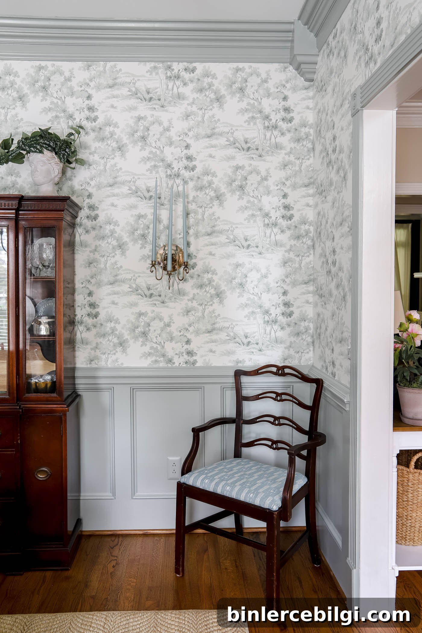
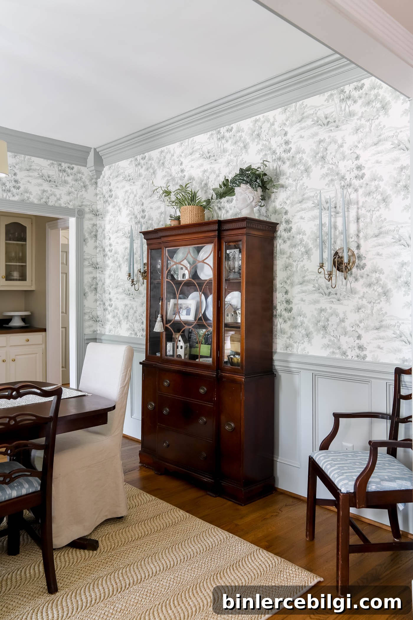
When I redesigned my dining room, I moved away from a darker palette and chose a more traditional look to complement my grandmother’s furniture. I used Oyster Bay on the board-and-batten and crown molding while keeping the wallpaper and upper walls a soft off‑white. The result is a room that feels classic, layered, and welcoming.
Oyster Bay is subtle enough to support patterned wallpaper and bold furniture while adding a calm, coastal influence that doesn’t compete with other elements in the room.
Sherwin Williams Oyster Bay at a Glance
| Detail | Value |
|---|---|
| Color Name | Oyster Bay |
| Color Number | SW 6206 |
| LRV | 44 |
| Color Family | Blue‑Green |
| Undertones | Green, Blue, Gray |
| Best Rooms | Bedrooms, Bathrooms, Kitchens, Exteriors |
Undertones of Sherwin Williams Oyster Bay
On the surface, Oyster Bay appears as a light‑to‑medium green, but the paint hides additional nuance. Gray undertones mute the green, producing a soft, spa‑like calm. Faint blue notes are also present and can become more prominent when paired with cooler colors or blues.
Because it reads differently depending on light and pairing, Oyster Bay is a nuanced, flexible choice for many styles—from coastal to traditional.
Is Sherwin Williams Oyster Bay warm or cool?
Oyster Bay is generally a cool color due to its blue and gray undertones, which help rooms feel calm and airy. That said, its green, earthy quality lets it work well with warm neutrals like tan and beige, allowing it to function almost like a soft neutral in many palettes.
What Is the LRV of Oyster Bay?
Sherwin‑Williams Oyster Bay has a Light Reflectance Value (LRV) of 44. LRV indicates how much light a paint reflects on a scale of 0 to 100. With an LRV of 44, Oyster Bay is a mid‑tone: it absorbs more light than a high‑LRV color but still reads fairly light in many rooms.
Because it’s a medium tone, Oyster Bay often works best as an accent, for built‑ins, cabinets, wainscoting, or teamed with lots of crisp whites if used on full walls. It is slightly deeper than very pale coastal greens such as Sea Salt, so it provides more visual depth without becoming heavy.
What colors go with Oyster Bay?
Oyster Bay pairs beautifully with blues, other greens, and greige tones. It complements warm neutrals like Accessible Beige or Edgecomb Gray and flows well into nearby rooms painted in mid‑gray‑greens such as Comfort Gray.
Because Oyster Bay leans cool, contrast it with a warm white for trim, ceilings, and doors to keep the overall look fresh and clean. It also looks lovely with natural materials—wood floors, butcher block countertops, and brass or gold hardware bring warmth and texture.
Sherwin Williams Oyster Bay in the home
Here are common, successful uses of Oyster Bay in real homes to help you envision how it might work in yours.
Dining room
Using Oyster Bay on wainscoting or lower walls creates a grounded, elegant feeling that still lets wallpaper or statement furniture shine. In my dining room, the color reduced the intensity of red upholstery and tied the space together with a subtle coastal note.
Bathroom
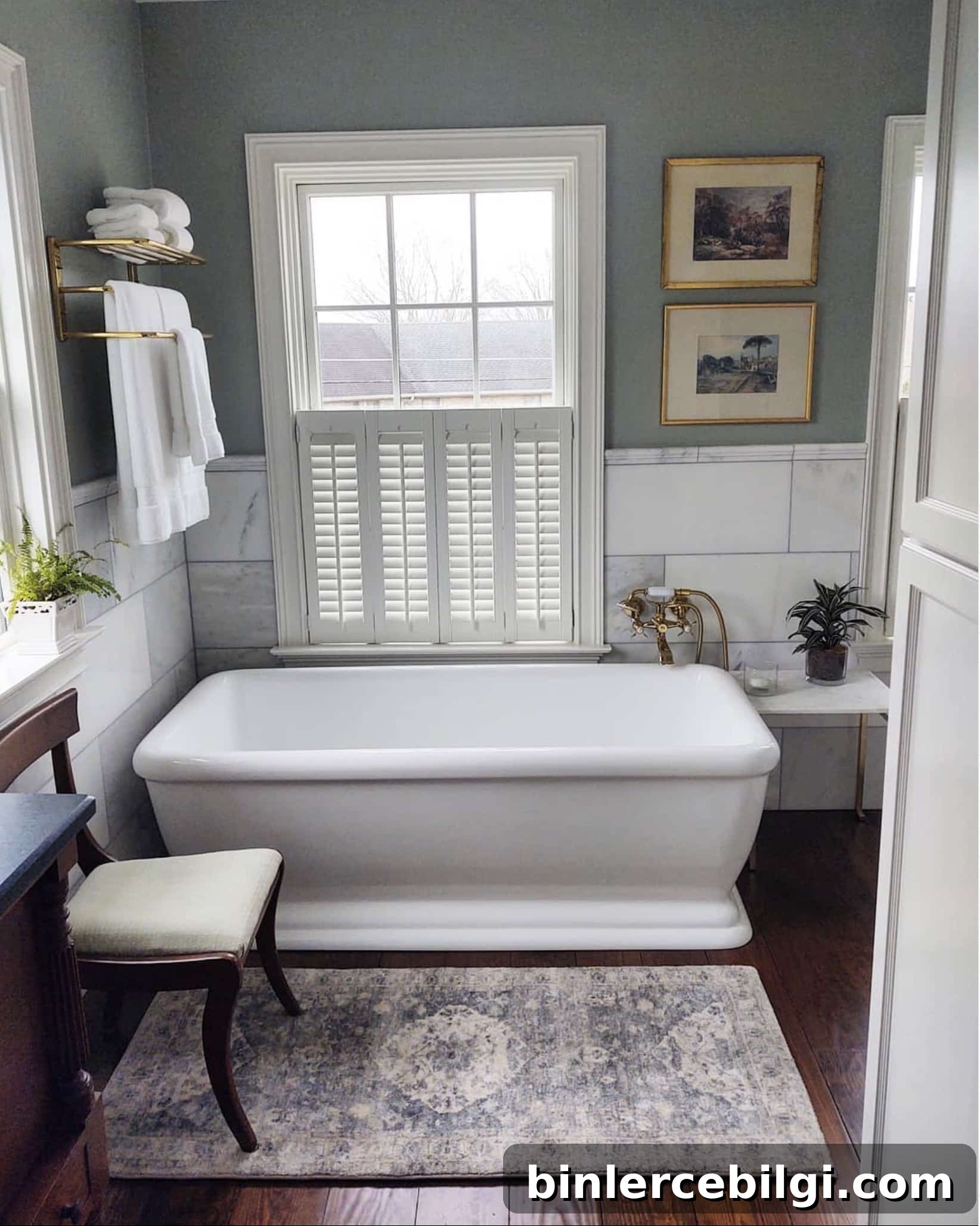
Oyster Bay makes an excellent bathroom color, bringing a calm, spa‑like atmosphere. In smaller bathrooms, be mindful of light: pair it with bright white trim or ample lighting to keep the space feeling open because its mid‑tone LRV can darken poorly lit rooms.
Bedroom
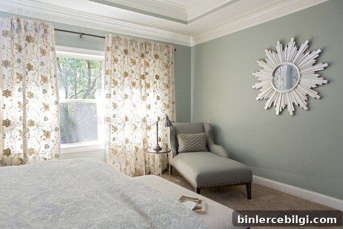
Oyster Bay is a soothing bedroom choice. Its muted, natural quality helps create a peaceful retreat and coordinates easily with linens, curtains, and personal decor without feeling trendy or fussy.
Cabinets
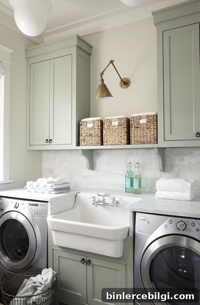
Oyster Bay works beautifully on kitchen or laundry cabinets—enough color to make a statement while remaining subtle. Pair it with natural countertops and warm metal hardware for a balanced, layered look.
Exterior Doors
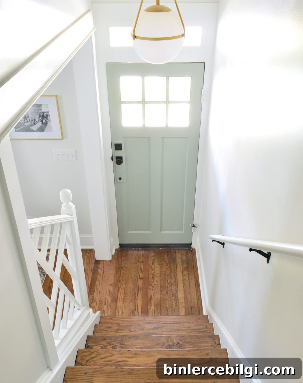
On a light‑filled entry, Oyster Bay can be a cheerful, distinctive front‑door color that pairs well with many siding and trim choices. Its slightly neutral quality helps it work across styles and seasons.
Interior Doors
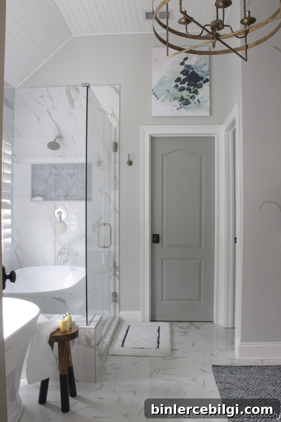
Use Oyster Bay on interior doors to add a subtle but cohesive pop of color that ties rooms together without overwhelming surrounding finishes.
Final Thoughts
Sherwin‑Williams Oyster Bay is a nuanced, adaptable choice that reads as calm and collected in many settings. It’s ideal for accent walls, trim, cabinets, and rooms where a relaxed, coastal‑inspired feel is desired. If you love gentle color with depth and flexibility, Oyster Bay is worth sampling in your home.
Pro Tip
Always test the real paint on your walls before committing. Peel‑and‑stick samples or painted swatches placed in different light conditions will reveal the true undertones and help you decide whether Oyster Bay is right for your space.
More posts you might enjoy:
- Create a Whole House Color Palette
- The Best Bedroom Paint Colors
- Paint a Room Like a Pro in 5 Easy Steps
- How to Paint Trim: A Step‑by‑Step Guide
- Sea Salt vs. Palladian Blue