
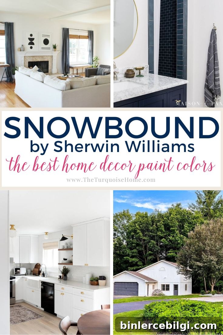
Sherwin Williams Snowbound is a widely loved white paint color. This soft, bright white lifts a room without feeling stark or overly clinical.
Choosing a white may sound simple, but subtle differences in undertone and light reflectance make a big visual impact. Rather than testing a new white for every project, many designers keep a few reliable favorites on hand—Snowbound (SW 7004) is one of those dependable options.
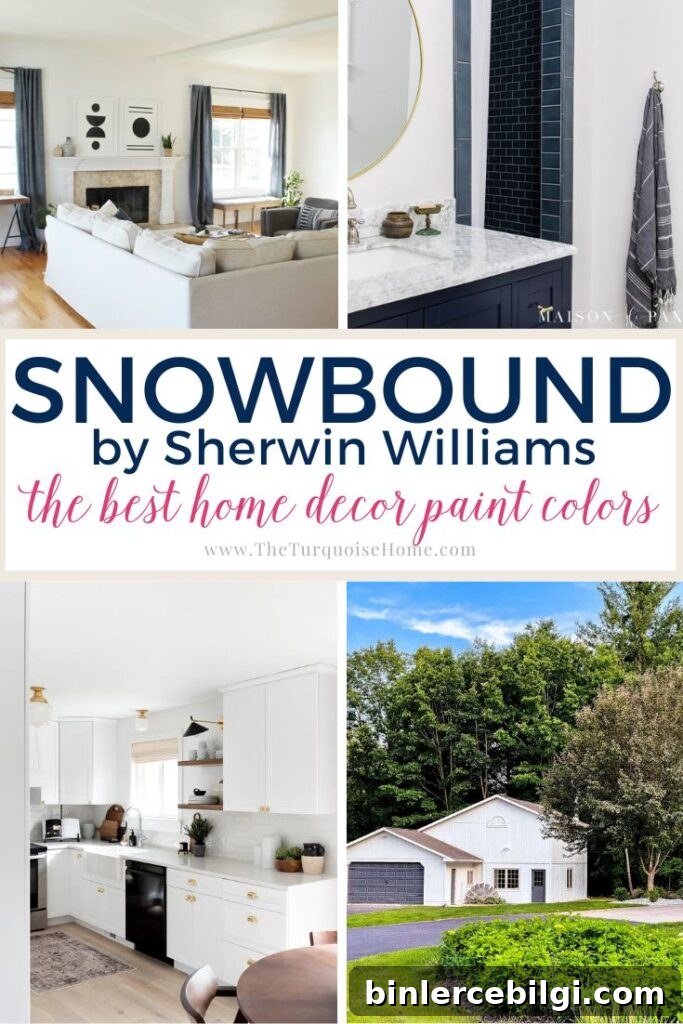
Snowbound reads as a neutral, soft white: clean and bright, yet slightly muted. That balance is why decorators often choose it for walls, trim, ceilings and even home exteriors.
PRO Tip
Always test the actual paint in your own home before committing. Real samples let you see how Snowbound behaves with your lighting and furnishings. Peel-and-stick swatches or small painted boards are simple, low-mess ways to evaluate the color at different times of day.
What color is Sherwin Williams Snowbound?
Quick highlights about Snowbound:
- Neutral off-white with subtle gray undertones
- Light and bright, with a Light Reflectance Value (LRV) of 83
- Commonly used on walls, trim, ceilings and exteriors
- Soft white that’s neither glaringly bright nor overly creamy
Undertones in Snowbound
Snowbound is a versatile white with very mild gray undertones that soften the color, preventing it from feeling icy. It also carries faint taupe (a gentle pink/purple) nuances that add a touch of warmth. These taupe hints are subtle—you likely won’t notice pink walls—but they help Snowbound feel comfortable and approachable rather than clinical.
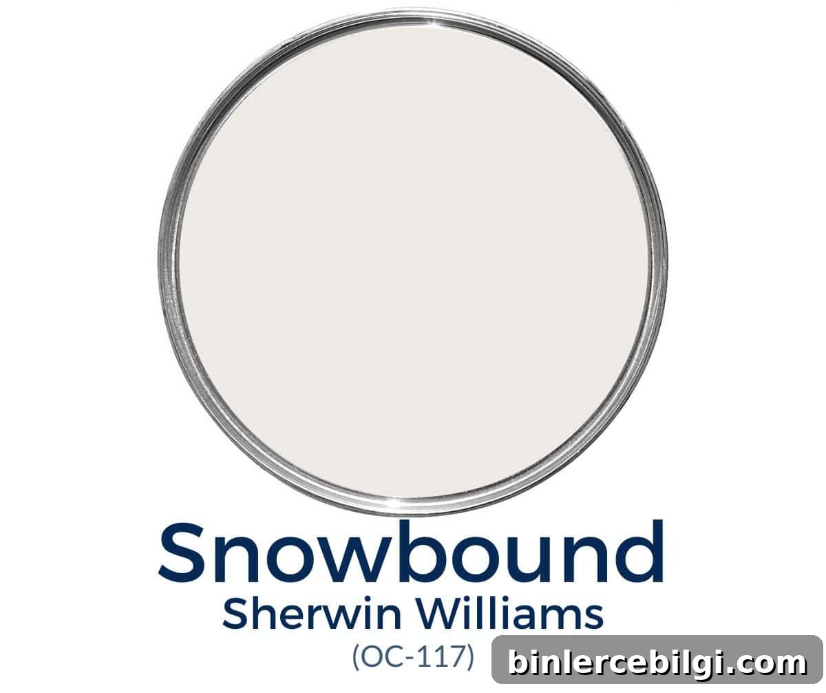
Lighting and nearby colors strongly influence how Snowbound reads. In cool, northern light it can appear more muted and gray-leaning. In warm, southern light it reads as a clean white and may show the faint taupe undertone in evening light. Snowbound does not naturally carry yellow undertones, so it won’t read creamy or buttery on its own.
LRV of SW Snowbound
Light Reflectance Value (LRV) measures how much light a paint reflects. An LRV of 100 is pure white; 0 is pure black. Snowbound’s LRV is 83, which means it reflects a lot of light and appears bright without being glaring. In low natural light it may look slightly off-white or muted, but in good light it reads clearly white.
Coordinating Colors with Snowbound
Snowbound pairs best with cooler, gray-tinged colors rather than warm beige tones. Some complementary choices include soft grays and muted blues. Popular pairings are grays like Repose Gray and Mindful Gray as well as coastal-inspired colors such as Sea Salt and Blue-Grays like Copen Blue. Darker navy shades also create striking contrast against Snowbound.
Best Trim Colors to Go With Snowbound
If you use Snowbound on walls, you can either paint trim the same color or choose a crisper white for contrast. Painting trim and walls the same shade simplifies the palette and minimizes undertone differences; using different finishes—semi-gloss for trim and eggshell for walls—adds subtle contrast. For a brighter trim, consider a pure white like High Reflective White or a crisper option for ceilings and trim.
Snowbound vs. Other White Paints
Matching white paints requires care because small undertone differences can clash or harmonize. Here are a few comparisons:
Snowbound vs. Alabaster
Alabaster leans warm with beige undertones; Snowbound is cooler with subtle gray and taupe hints. Alabaster suits warmer palettes; Snowbound works better with grays and cool neutrals.
Snowbound vs. Simply White
Simply White is creamier and warmer than Snowbound. Mixing those two can create visible contrast due to their different undertones, so they aren’t the best pair.
Snowbound vs. Extra White
Extra White reads as a cooler, bluer white. Paired with Snowbound, Extra White’s coolness can be noticeable. If you want a truer white pairing for Snowbound, consider Pure White for trim or accents.
Where to Use Sherwin Williams Snowbound
Snowbound is a timeless, flexible white suitable for many locations in the home, including:
- Wall moldings
- Trim
- Ceilings
- Interior walls
- Exterior siding
Is Snowbound a Good Color for Cabinets?
Snowbound can work for cabinets, but it’s not always the safest choice. Its undertones can conflict with countertops or backsplashes that have warm peach, pink, or greige tones. It often looks best on cabinetry paired with darker or neutral countertops that don’t carry strong warm pigments.
Home Styles That Work With Snowbound
Snowbound is adaptable and works across a variety of styles, including farmhouse, traditional and transitional interiors. Its balanced neutrality makes it a dependable background color for many design directions.
Room Examples Using Snowbound
Snowbound’s appearance varies by room and lighting. Here are typical applications and how the color behaves:
Kitchen
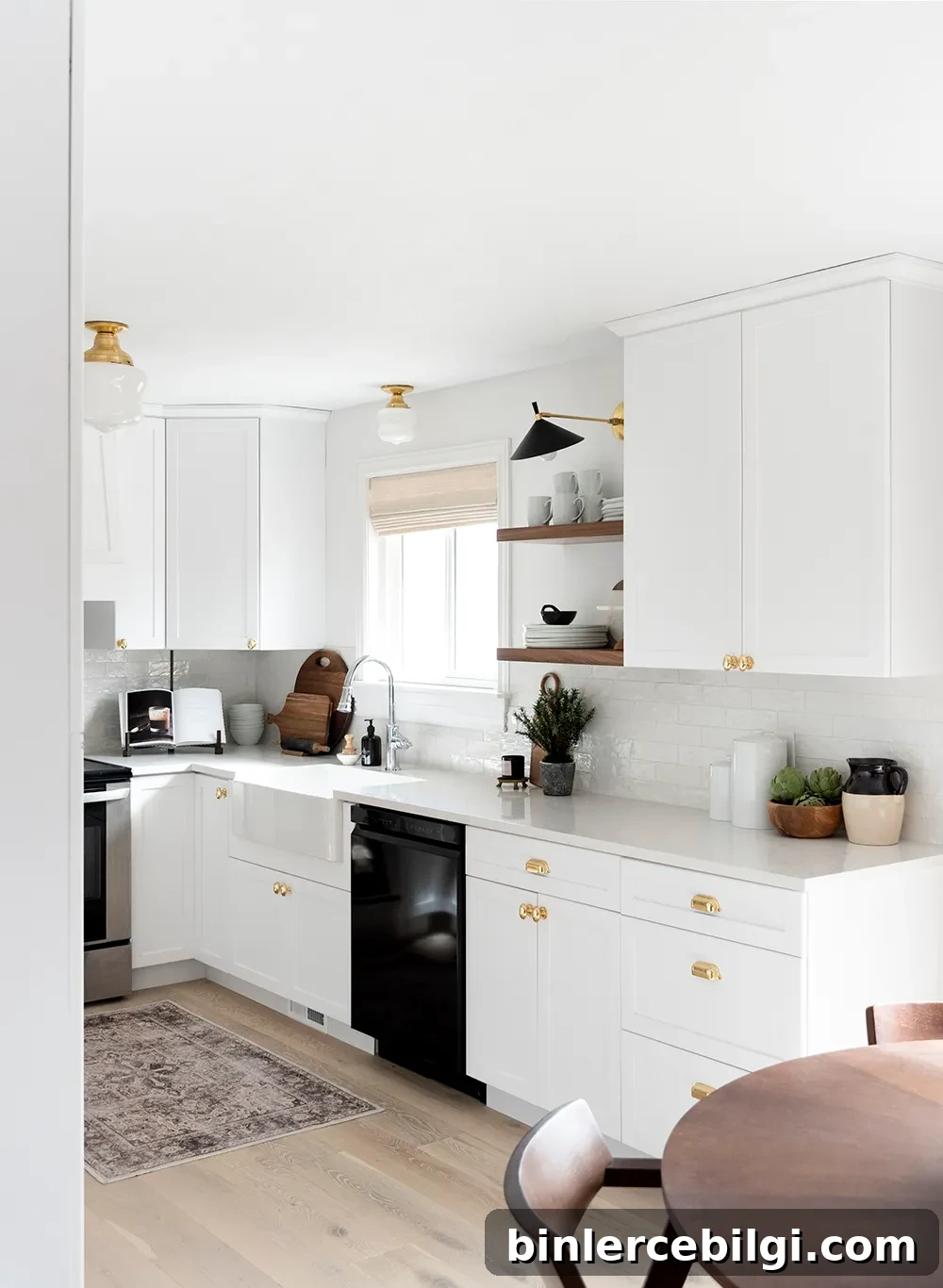
On walls and trim in an all-white kitchen, Snowbound helps unify different whites and finishes. It creates a soft, cohesive backdrop that’s bright without feeling stark.
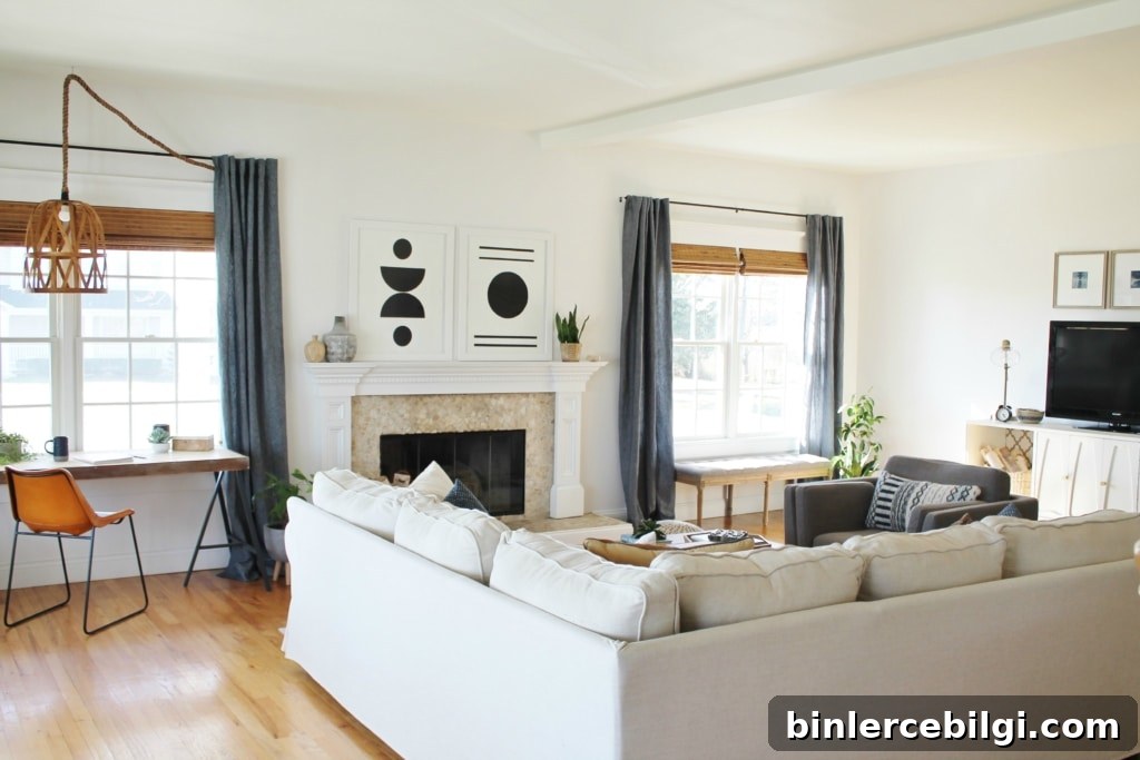
Living Room
In living spaces Snowbound reads as a soft, neutral white that reflects light well while maintaining warmth. It blends easily with layered neutrals and accent colors.
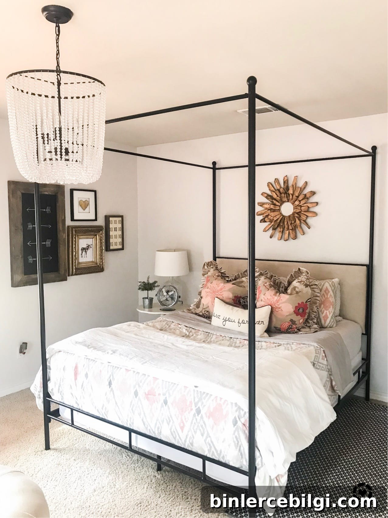
Bedroom
Snowbound is a good bedroom choice because it’s gentle and calming. It can read slightly grayer in shadows and may pick up reflected hues from textiles and decor, which can soften the overall feel of the room.
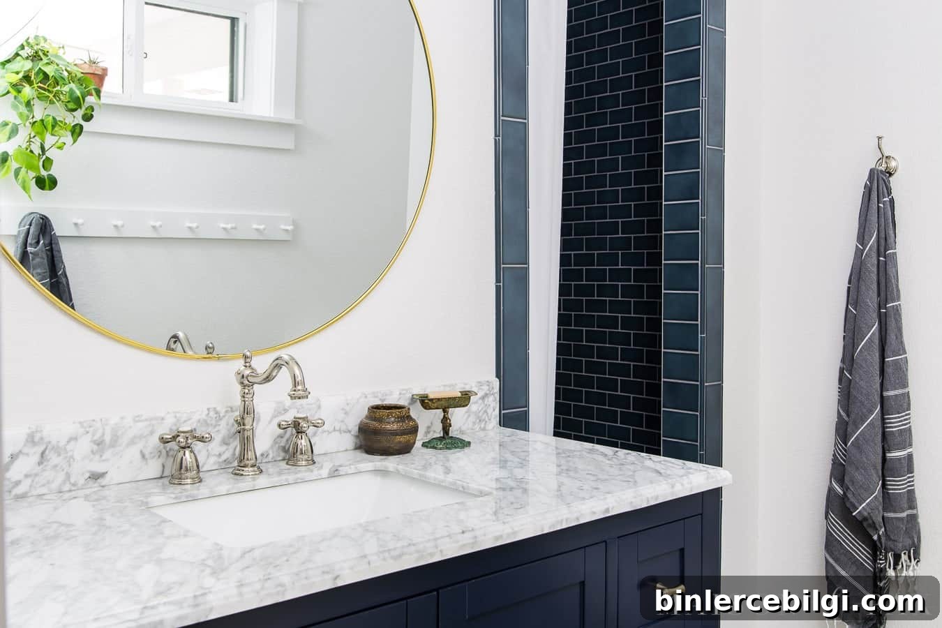
Bathroom
Snowbound works beautifully in bathrooms, even in spaces with limited natural light. It brightens the room while offering a soft backdrop that complements bold accents like navy or patterned tile.
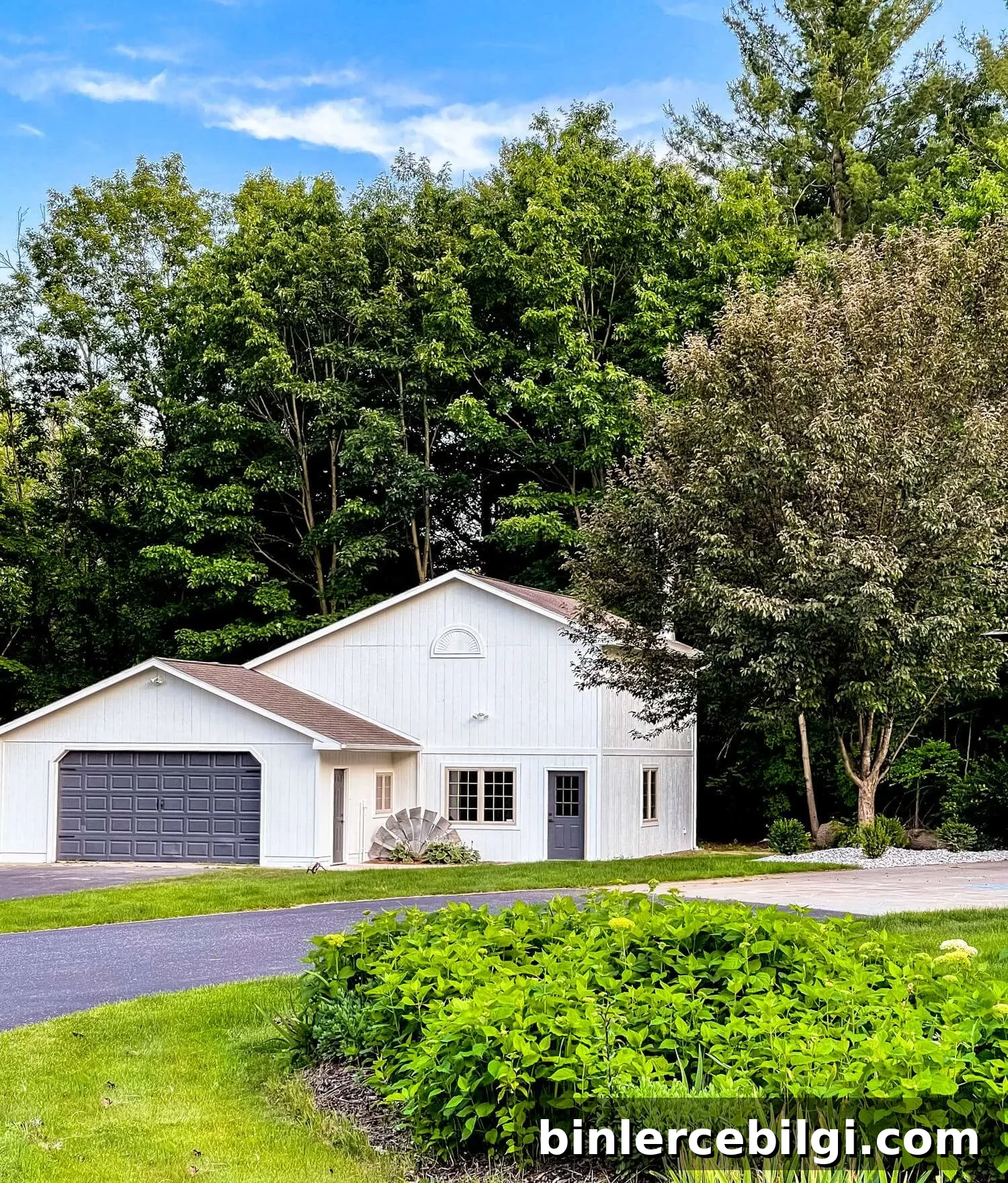
Exterior
Very bright whites can be overpowering on exteriors, but Snowbound reads as a bright yet muted white that avoids glaring reflections. Its subtle warmth and softness translate well to curb appeal.
Frequently Asked Questions
Snowbound leans slightly warm because of subtle taupe undertones, but it also has mild gray undertones that keep it feeling muted and balanced.
No. Snowbound does not have the yellow or buttery undertones found in creamier whites. It reads more neutral to slightly cool depending on light.
Test real paint samples in your home, view them at different times of day, and pair samples with your furnishings and flooring. That will reveal undertones and ensure the white you choose complements the space.
Snowbound is an elegant, restrained white ideal for anyone seeking a neutral white that’s bright but not overwhelming. With careful testing and thoughtful trim or accent choices, it can be a beautiful foundation for many design styles.
More Paint Color Suggestions
If you’re building a go-to palette, consider staple neutrals and signature accents to pair with Snowbound, such as deep navy, classic grays, and soft coastal greens.
Tools to Help Paint a Room Yourself
For DIY painting, the right tools make a difference: high-quality brushes, painter’s tape, reliable drop cloths, a comfortable paint cup and a durable roller tray help you achieve professional-looking results and simplify cleanup.