
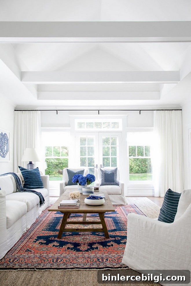
If you’ve ever stood in the paint aisle staring at row after row of “white,” you know it’s not as simple as it seems: not all whites are created equal. If you’ve never chosen a white before, it’s tempting to assume white is just white—yet whites vary widely in undertone, brightness, and how they react to light.
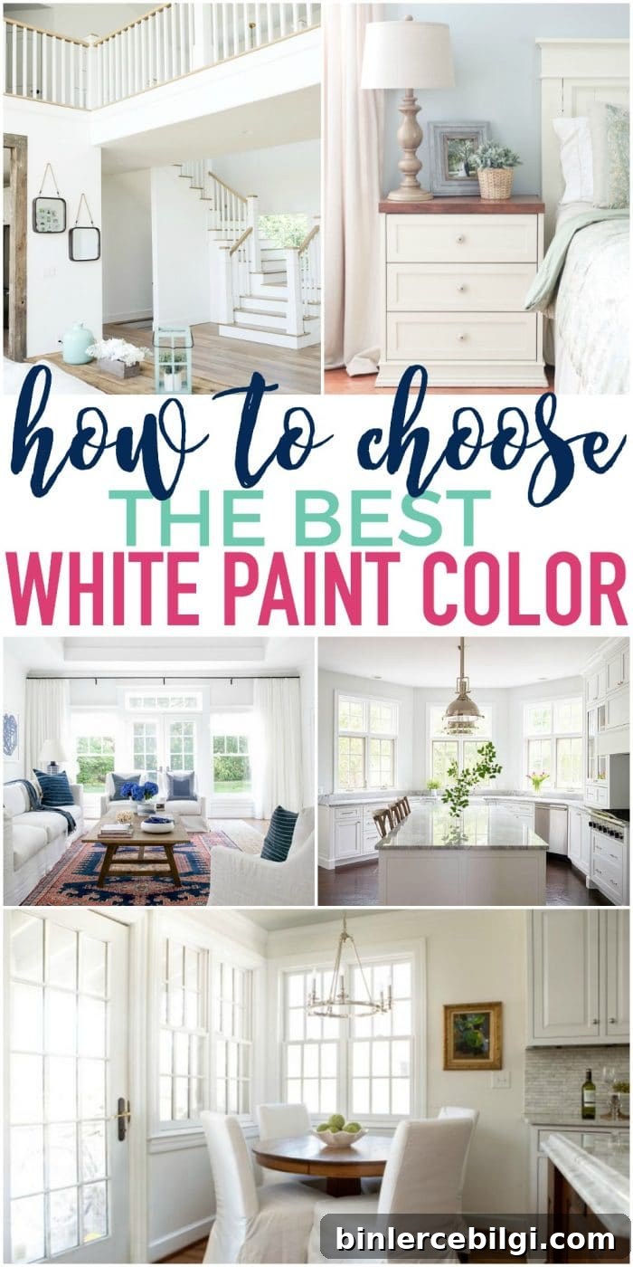
I remember the first time I picked a white for a project: I was preparing the lower portion of my living room for board and batten and wanted the wall color to match the existing trim. The trim looked like plain white, so I grabbed an off-the-shelf can and headed home. The first brushstroke nearly stopped me in my tracks—what I’d bought was a glaring, fluorescent white and not at all a match for the trim.
Disclosure: this article mentions products and services for convenience; some references may be affiliate-based.
PRO Tip
Always test the actual paint in your home before committing to a full purchase. Real paint samples, or peel-and-stick samples made with real paint, let you move and compare colors throughout the day as lighting changes. Trying several samples on your wall is the only reliable way to see how a white will read in your space.
Note: If you plan to paint yourself, the right tools make a big difference. Good brushes, painter’s tape, drop cloths, a comfortable paint cup, and a reliable roller tray speed up the job and improve the finish.
After my hardware-store mishap I learned that finding the right white is often a process. Here are practical steps to help you narrow down the choices and pick a white that complements your home.
Tips for Choosing the Best White Paint Color
1. Find Inspiration Online
Start by looking for rooms painted in the whites you’re considering. Images on Pinterest or Google give you a sense of how a color performs in a real room. While photos aren’t perfectly accurate—filters and editing can alter appearance—they’re a good place to begin.
2. Study Swatches to Spot Undertones
Whites are especially tricky because subtle undertones matter. Online swatches tend to show those undertones more clearly than room photos. Look for hints of blue, green, pink, yellow, or gray—those undertones will influence how the paint feels in different lighting.
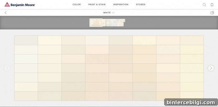
Online, swatches often don’t read as “white” at all but instead reveal the subtle hue beneath. When applied to a wall, the paint will read white but can skew toward that undertone in certain lighting conditions.
3. Take Home Samples and Paint Large Swatches
Because whites are so sensitive to light and surrounding colors, testing samples on your wall is essential. If you can’t paint the wall directly, paint several large poster boards and tape them to different walls. Observe the samples over several days and in different light—morning, afternoon, and evening—before deciding.
If you need guidance on building a cohesive palette, consult resources that explain choosing warm versus cool whites, and how to balance walls, trim, and furnishings together.
In my experience, slightly warm whites (without a pronounced yellow cast) often work best on walls because they feel inviting and coordinate well with furnishings and finishes.
Top 10 Favorite White Paint Colors for Your Home
To make your decision easier, here’s a curated list of popular white paint colors that designers and homeowners frequently choose. These suggestions are a starting point—always test samples in your own space before committing.
1. Decorator’s White (Benjamin Moore)
Decorator’s White has a very subtle cool, gray undertone that reads as a clean white in most light. It’s a favorite among builders and designers for its neutral, slightly cool appearance that works well with a variety of decor styles.
2. Shoji White (Sherwin-Williams)
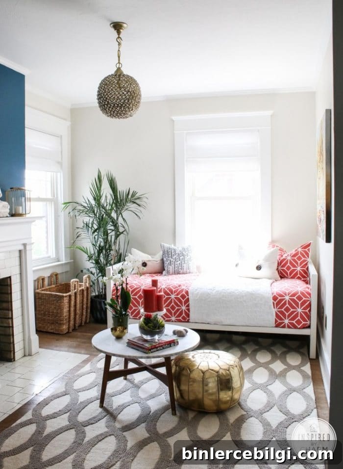
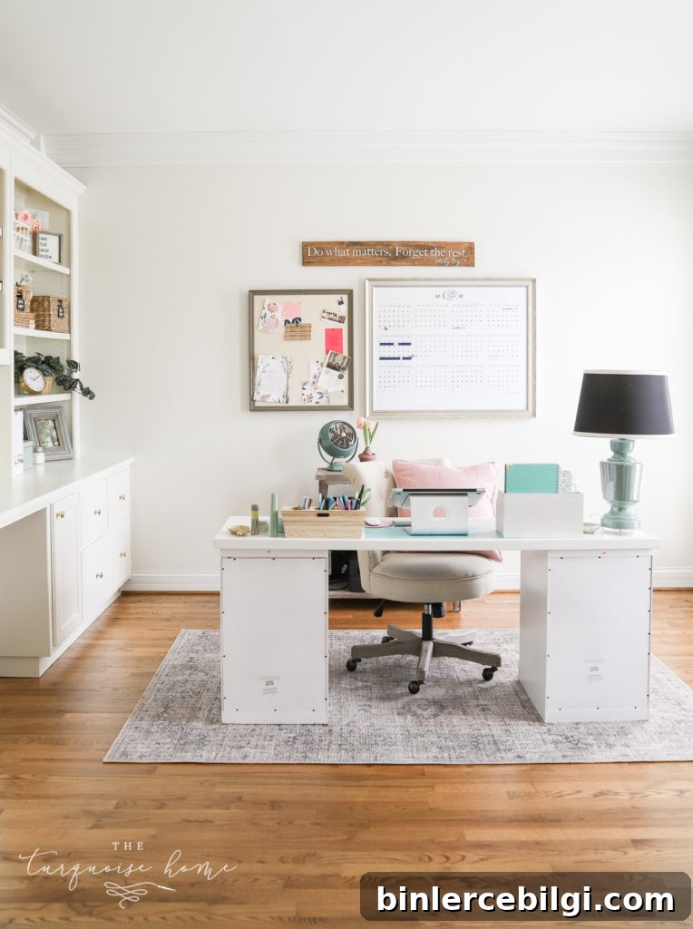
Shoji White leans toward a soft gray-white and can sometimes appear as a very pale green depending on light and surrounding colors. It’s a subtle, restrained white that pairs beautifully with richer accent colors.
I recently used Shoji White in a home office and enjoyed how it reads as a subtle gray-white—enough color to feel warm, yet still distinctly white.
3. Extra White (Sherwin-Williams)
Choose Extra White if you want a crisp, bright white that makes colors and finishes pop. It’s an excellent choice for modern looks and spaces where high contrast is desired.
4. White Dove (Benjamin Moore)
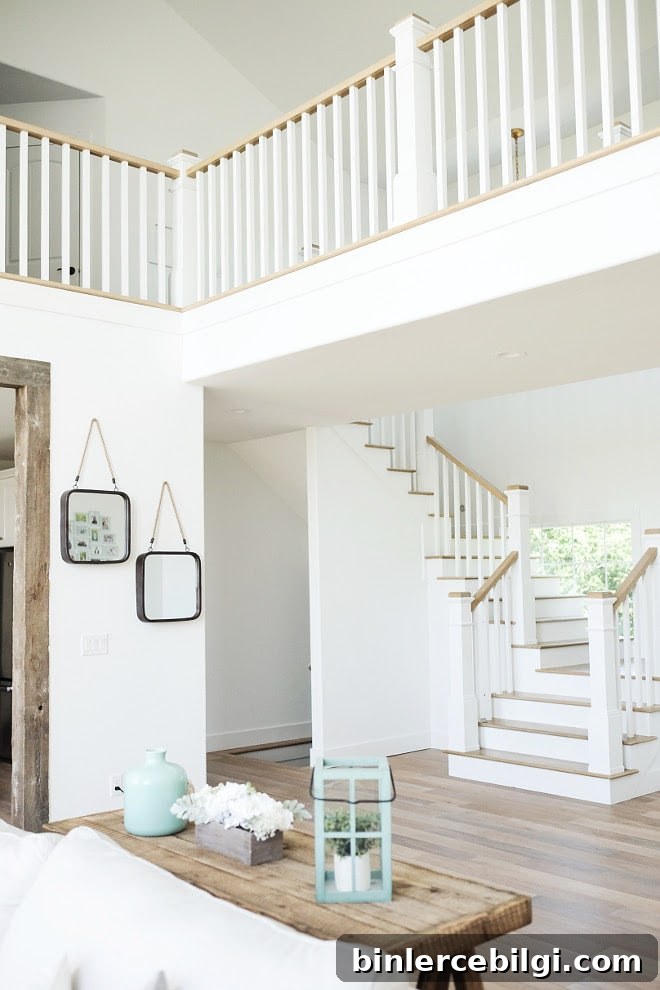
White Dove is a cool white with a faint undertone that most people don’t notice. It rarely reads yellow, often appearing as a soft, slightly grayed white. It’s a perennial favorite among designers and builders.
5. Simply White (Benjamin Moore)
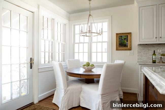
Simply White is a versatile warm white that I use throughout my home—on cabinets, board and batten, and walls. It gives a subtle glow without looking yellow and has been a reliable, timeless choice for many applications.

6. Paper White (Benjamin Moore)
Paper White reads as a pale gray-white, which pairs beautifully with cool tones like blues and grays. It works especially well when combined with crisper white trim for contrast.
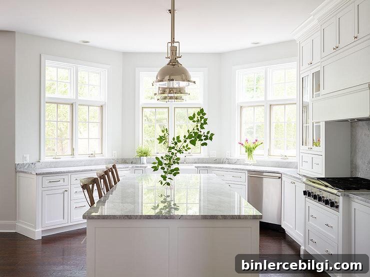
7. Dover White (Sherwin-Williams)
Dover White is a gentle warm white that looks lovely on cabinetry and furniture. If you prefer warmer whites, this is a solid option.
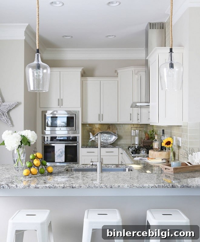
8. Alabaster (Sherwin-Williams)
Alabaster is an off-white with a soft warm undertone. It’s frequently used on walls to create an inviting, soft backdrop. Note that different brands’ “Alabaster” colors can have different undertones, so compare samples carefully.
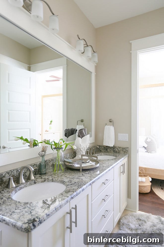
9. Antique White (Sherwin-Williams)
As the name suggests, Antique White has a warm, creamy tone. It reads as an off-white with a soft, aged quality that works beautifully on furniture or in farmhouse-style interiors.
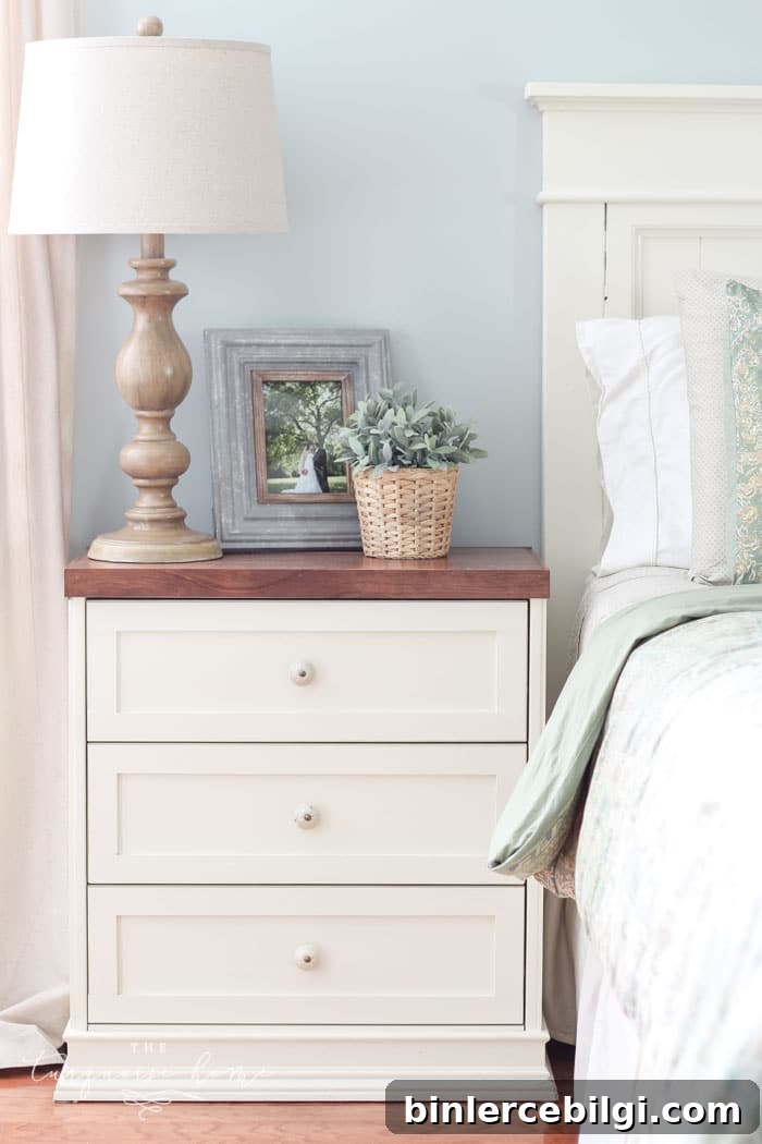
10. Snowbound (Sherwin-Williams)
Snowbound is a soft off-white with subtle gray undertones. It’s bright enough to look white without being glaring in natural light, and it’s commonly chosen for walls, trim, ceilings, and exteriors.
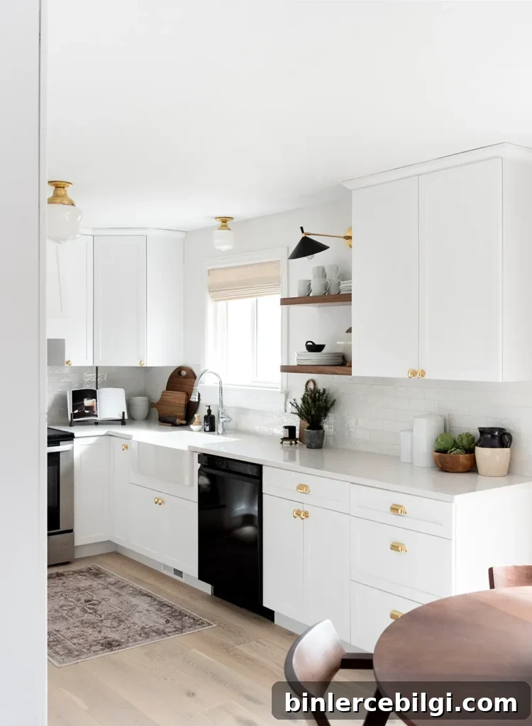
Hopefully this roundup helps you narrow the field and choose the perfect white for your home. With the right sample testing and a clear plan, you’ll find a white that complements your finishes and feels just right.
Bonus tip: Using the same paint color in different sheens—eggshell for walls and semi-gloss for trim—creates a cohesive look without making the wall and trim feel identical. The difference in sheen gives each surface the finish it needs while the color stays consistent.
More popular paint colors to consider
- Agreeable Gray
- Repose Gray
- Sea Salt
- Hale Navy
- Revere Pewter
- Gray Owl
- Wythe Blue
- White Dove
Tips for Painting a Room Yourself
Painting yourself is very doable with the right preparation. Refer to step-by-step guides for technique, and invest in quality tools to make the work easier and the finish more professional.
- Brushes: A good-quality brush will last for years if cleaned properly and will give you a smoother edge and better coverage.
- Painter’s tape: Essential for crisp lines and protecting trim or windows.
- Drop cloths: Protect floors and furniture from splatters and spills.
- Comfortable paint cup: A well-designed paint cup or handle reduces hand fatigue and keeps brushes handy between strokes.
- Roller and tray: A reliable roller and tray (plus disposable liners for easy cleanup) speed up wall coverage and reduce mess.
More posts you might enjoy:
- The Best Green Paint Colors For Your Home
- Best Living Room Paint Colors
- The Best Bedroom Paint Colors
- How to Paint Outlet Covers
- Beautiful Interior Door Paint Colors