

Today I want to introduce you to a paint color you may not know but should: Sherwin Williams Comfort Gray. Below you’ll find a complete, practical guide to this soft, versatile shade and examples of how it looks in different rooms and lighting.

When you want a straightforward, high-impact update to a room, paint is usually the best place to start. It’s affordable, reversible, and can completely change the mood of a space much faster than new furniture or structural changes. The tricky part is choosing the right shade—especially when you’re deciding between warm tones, cool tones, whites, beiges, greiges, or grays.
If you find the selection process overwhelming, this article is part of a paint color series meant to spotlight reliable, beautiful options so you can feel confident in your choice and enjoy the process.
PRO Tip
Always test the actual paint color in your home before committing. The quickest way to do that is with real paint samples you can place on different walls and move around the room. Seeing the real paint next to your lighting, trim, and furnishings is the only reliable way to know how a color will behave in your space.
Choose The Best Color For You
I’m a fan of neutrals like Edgecomb Gray, but colors in the blue-green family are getting a lot of attention for good reason. A blue-green or green-blue can bring a calm, coastal-like feeling into a room when chosen carefully.
Enter: Sherwin Williams Comfort Gray. It’s a serene, light blue-green that often reads differently depending on light and surrounding decor. Many people experience an immediate sense of calm when they see it applied—an “ahhh” moment that suggests relaxation and balance.
Comfort Gray in My Home
I recently used Comfort Gray on a pantry door and love how it adds personality without overwhelming the kitchen. Painting a door a different color is a small, high-reward way to introduce a fresh accent into a space. The shade pairs beautifully with warm hardware and classic neutrals.
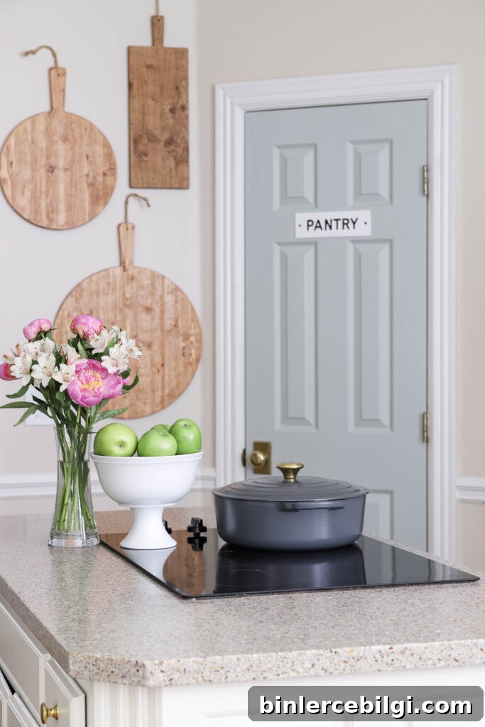
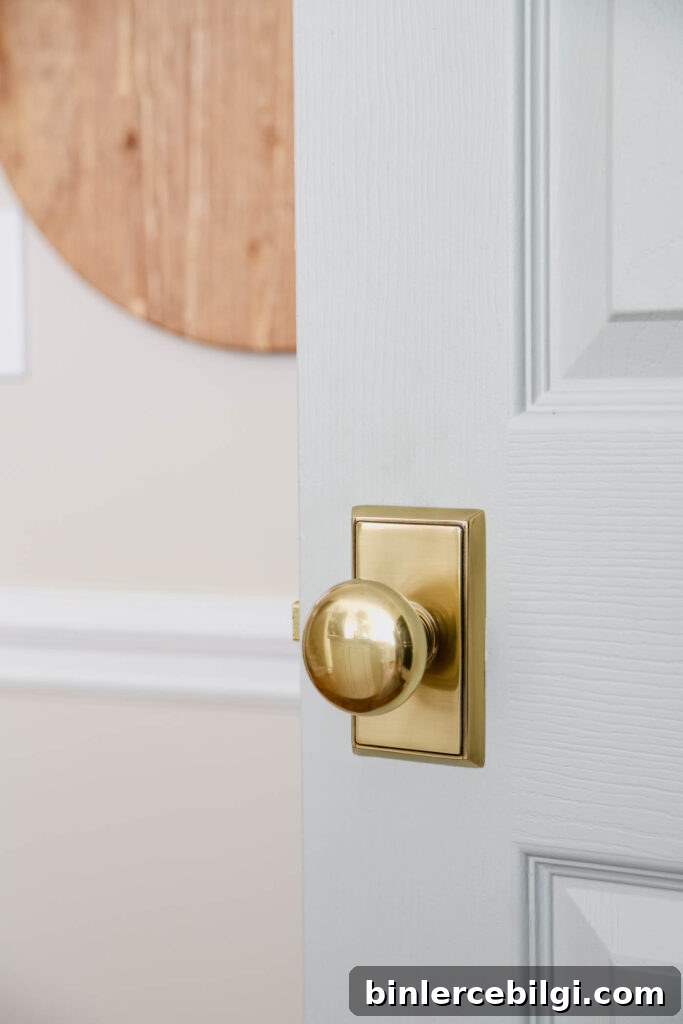
What You Need to Know About Sherwin Williams Comfort Gray
At first glance Comfort Gray might read as a minty color to some viewers, but it’s more nuanced than that. It’s a chameleon-like hue that shifts between blue-green and green-blue depending on light, room orientation, and adjacent colors.
Comfort Gray is essentially a slightly deeper sibling of Sherwin Williams Sea Salt, evoking the same sea-glass quality—cool and restorative with subtle gray undertones. It’s a cooler color, so it works especially well in warm, sunlit rooms to bring balance and a calming contrast.
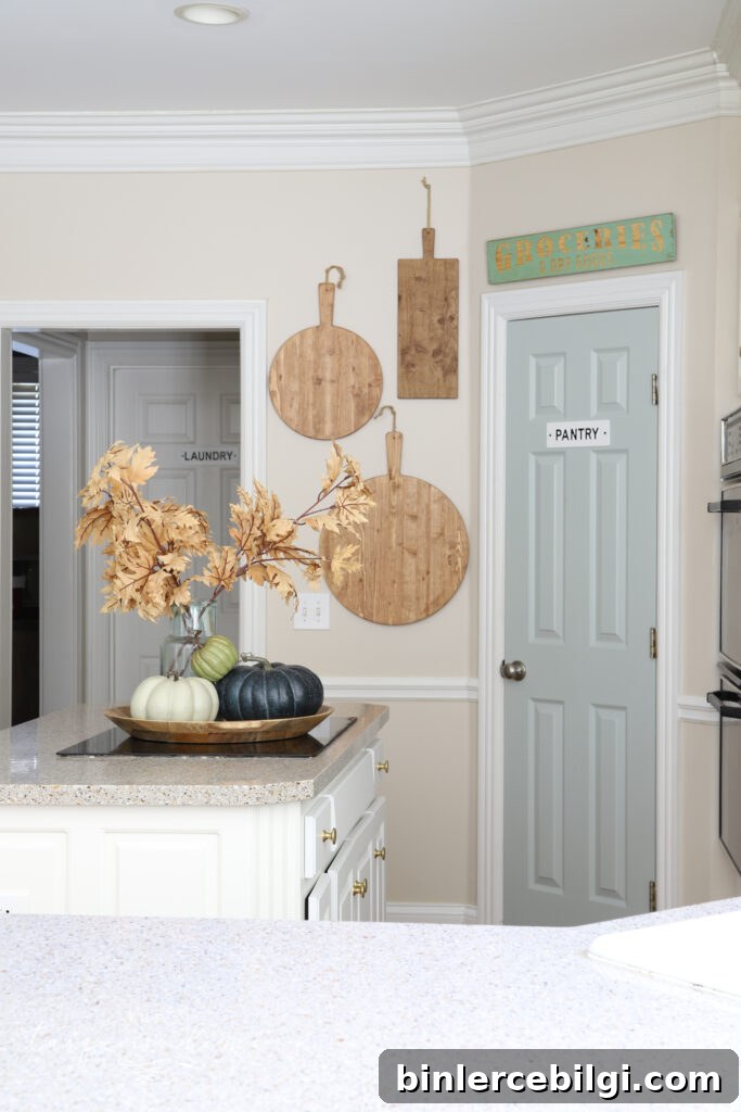
Comfort Gray Undertones
Although Comfort Gray is listed among grays, its green and blue undertones make it a perfect option if you want a neutral base with a hint of color. The undertones are subtle enough to remain neutral but noticeable enough to offer depth and personality. This adaptability makes it an excellent backdrop for varied decor styles.
What Colors Coordinate with Sherwin Williams Comfort Gray
Comfort Gray’s chameleon nature means it pairs well with a wide range of colors. It complements warm sand tones, caramel and bronze accents, teal, terra cotta, and brighter hues like coral or watermelon. It also looks beautiful with crisp whites and warm beiges.
Here are some specific Sherwin Williams colors that work nicely alongside Comfort Gray:
- Dover White (SW 6385)
- Spare White (SW 6203)
- Snowbound (SW 7004)
- Foxy (SW 6333)
- Bagel (SW 6114)
- Moody Blue (SW 6221)
- Greek Villa (SW 7551)
- Amazing Gray (SW 7044)
- Rain (SW 6219)
- Retreat (SW 6207)
- Special Gray (SW 6277)
- Balanced Beige (SW 7037)
- Virtual Taupe (SW 7039)
- Mystical Shade (SW 6276)
Comfort Gray is flexible; it will work with many other shades too. Always test the combination in your room before committing.
Comfort Gray in Action in Different Rooms
Seeing Comfort Gray in different settings helps you understand how it behaves with light and furnishings. Below are examples of how this color reads in kitchens, dining rooms, bedrooms, living rooms, bathrooms, and stairways.
Sherwin Williams Comfort Gray in Kitchens
Comfort Gray can deliver a bright, relaxed coastal look or act as a subtle accent when used on a door or island. It’s an excellent choice to introduce a soothing, breezy feel into the kitchen.
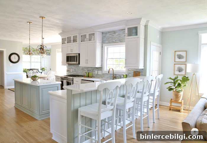
Comfort Gray in the Dining Room
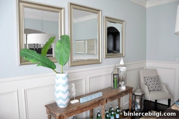
In dining rooms with cooler lighting, Comfort Gray can read more blue than green. It pairs beautifully with silver, blues, and neutrals to create a refined, calming dining atmosphere.
SW Comfort Gray in Bedrooms
Bedrooms benefit from Comfort Gray’s tranquil quality. The color provides a serene backdrop that complements golds, browns, whites, blacks, and dusty rose, making it ideal for layered, calming bedroom palettes.

Comfort Gray in Living Rooms
As a living room wall color, Comfort Gray helps unify decor from across your home. It works well with coastal, traditional, and transitional styles, and pairs nicely with warm sand tones and rich wood finishes.

Sherwin Williams Comfort Gray in Bathrooms
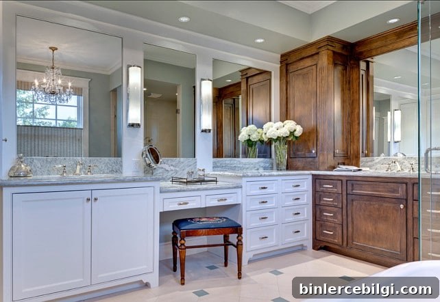
In bathrooms, Comfort Gray often appears lighter and almost pastel, depending on the lighting. It ties together whites, browns, and grays for a cohesive, spa-like feel.
Comfort Gray Stairways
Comfort Gray is an elegant, understated choice for entryways and stairwells. It complements a broad mix of tones—pewters, creams, blacks, and wood finishes—while maintaining a clean, sophisticated look.

Sherwin Williams Comfort Gray is a versatile, serene color that works across many styles and rooms. If you’re ready to introduce a calming, chameleon-like neutral into your home, Comfort Gray deserves serious consideration. Always test a real paint sample on your walls to see how the color responds to your light and furnishings.
More favorite paint colors to consider:
- Agreeable Gray
- Gray Owl
- Repose Gray
- Hale Navy
- White Dove
- Revere Pewter
- Wythe Blue