

Sea Salt by Sherwin Williams is a widely loved soft blue‑green paint with gray undertones that pairs beautifully with white and many trending home colors. Often described as a coastal neutral, it’s versatile enough to complement a wide range of design styles.
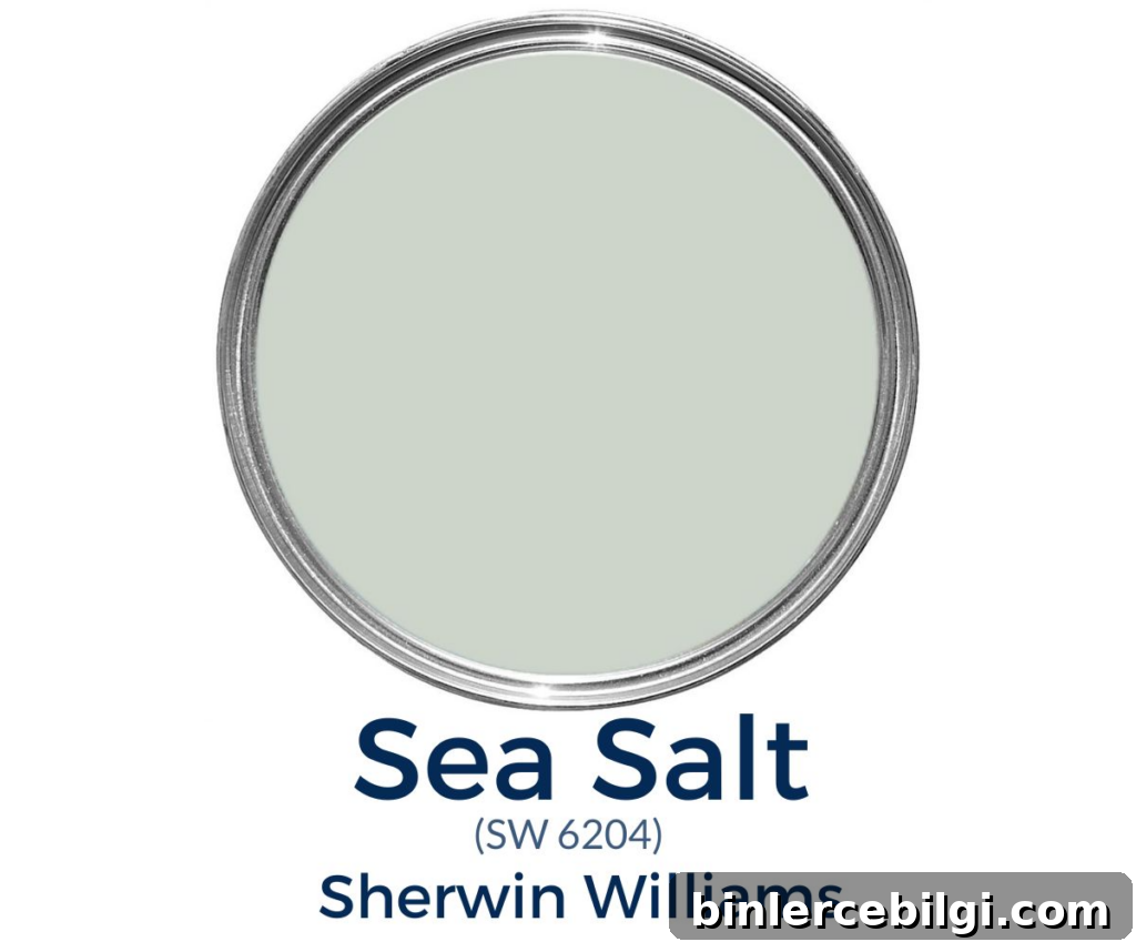
I love Sea Salt and have used it in several areas of my homes—porch ceilings, laundry rooms, kitchens, bedrooms, and bathrooms. It’s one of those colors I can always find a place for because it brings a calm, fresh feel without overwhelming a space.
Note: This article previously included affiliate content and product suggestions. If you plan to paint yourself, invest in good tools and real paint samples so you can see the color in your home before committing.
What Color is Sea Salt?
Sea Salt (Sherwin‑Williams) is a soft, muted blue‑green with subtle gray undertones. It evokes the look of ocean water mixed with the soft warmth of sand and sun. The result is a soothing, understated hue that reads as a neutral in many rooms while still offering a touch of color.
Because of its balanced mix of blue, green and gray, Sea Salt works well with whites, grays and deeper blues like navy. It’s a favorite when you want a calming, coastal-inspired mood without an obvious “beach house” theme.
Sherwin‑Williams Sea Salt Undertones
Sea Salt is primarily a green tone with noticeable blue and gray undertones. It behaves like a chameleon: different lighting and surrounding colors can shift which undertone is most apparent. In warm, incandescent light it can read greener; under cool, filtered daylight it may appear bluer or greyer.
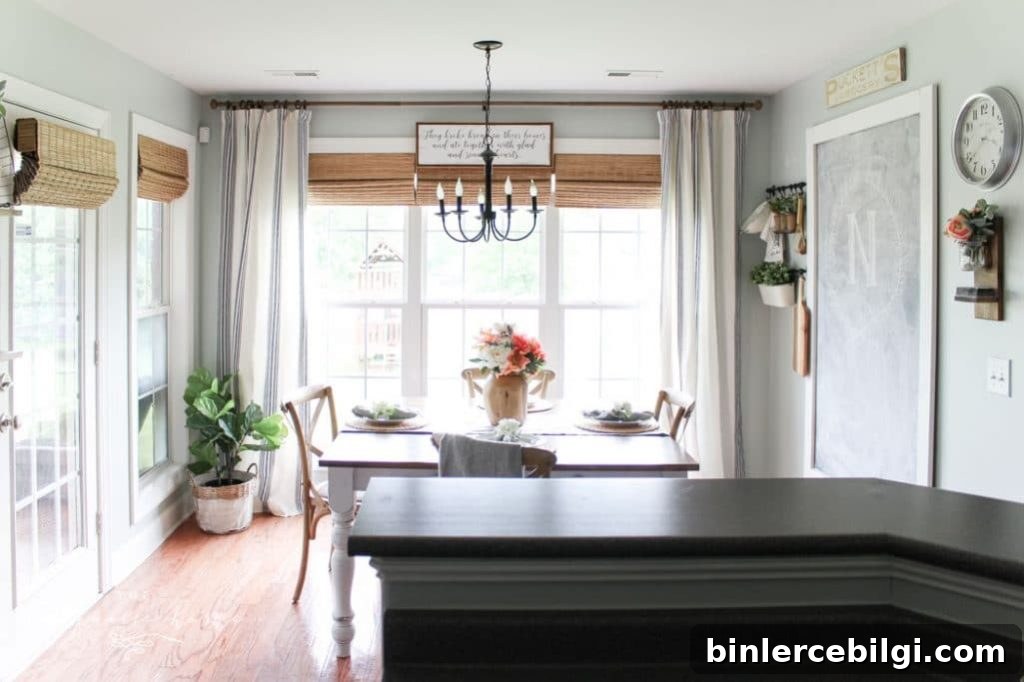
In very bright rooms Sea Salt can look washed out and almost pastel — not a problem if you prefer a light, airy look, but worth noting if you’re aiming for a deeper, moodier tone. Because the color changes with light, testing a real paint sample on your walls and observing it throughout the day is essential.
LRV of Sea Salt by Sherwin‑Williams
Light Reflectance Value (LRV) measures how much visible light a color reflects. Sea Salt has an LRV of 63, which places it on the lighter side of the scale. It won’t make a room feel dark, and it reflects enough light to help spaces feel open and calm.
Is It a Warm or Cool Color?
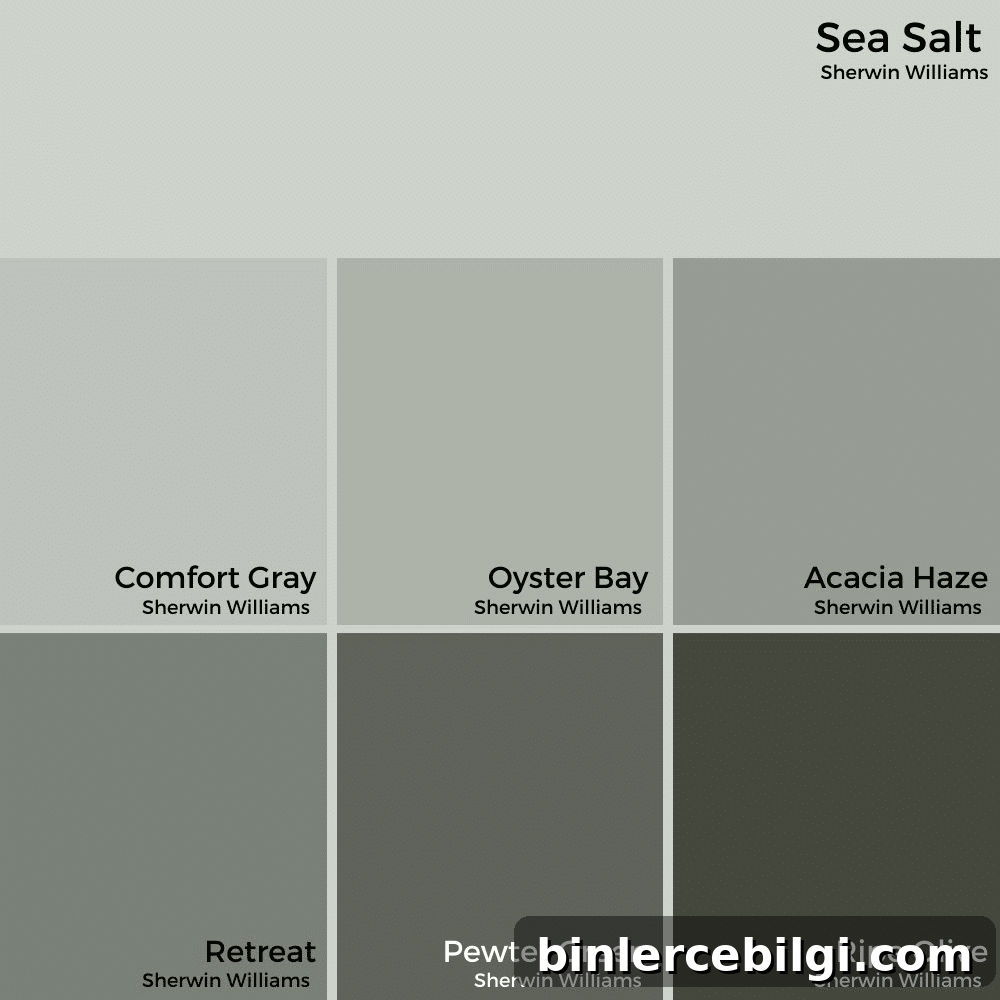
Sea Salt is fundamentally a cool color with a hint of warmth in its undertones. As a cool hue, it tends to make rooms feel calm, bright and spacious. Still, its slight warmth helps it pair nicely with warm neutrals like taupe and beige, so it’s flexible across many palettes.
What Colors Go with Sherwin‑Williams Sea Salt?
Sea Salt coordinates well with both Sherwin‑Williams and other popular neutral tones. A few excellent pairings include:
- Sherwin‑Williams Accessible Beige
- Sherwin‑Williams Agreeable Gray
- Sherwin‑Williams Comfort Gray
- Sherwin‑Williams Spare White or Fleur de Sel
- Benjamin Moore Revere Pewter
- Benjamin Moore Simply White or White Dove for trim and ceilings
Sea Salt looks great with crisp pure whites as trim, or slightly warm off‑whites for a softer contrast.
Sherwin‑Williams Sea Salt in Real Rooms
Here are some practical examples of where Sea Salt works particularly well and how it changes with context and light.
SW Sea Salt in Kitchens
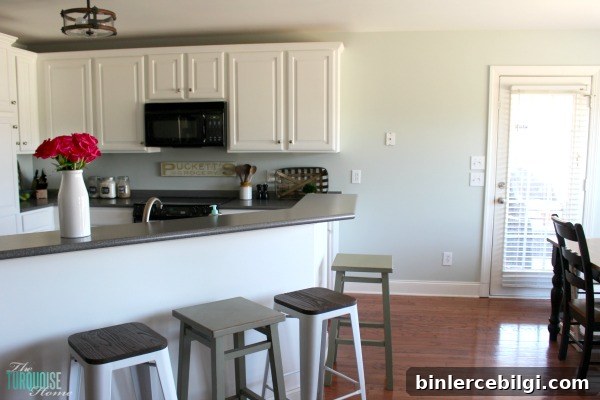
The kitchen is a favorite place to use Sea Salt. It can read blue‑gray, soft green, or a light neutral depending on the space. In eat‑in kitchens or rooms with varied light, you may notice different walls appear slightly different in tone throughout the day.
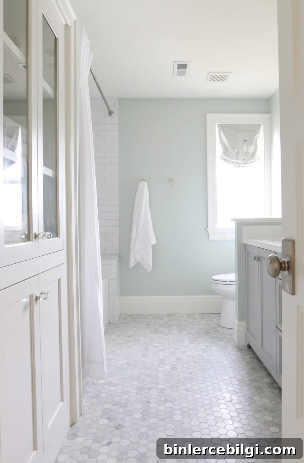
Sea Salt in Bathrooms
Sea Salt is ideal for bathrooms, where its watery, clean feel enhances the space. It brings a spa‑like serenity without being overly themed.
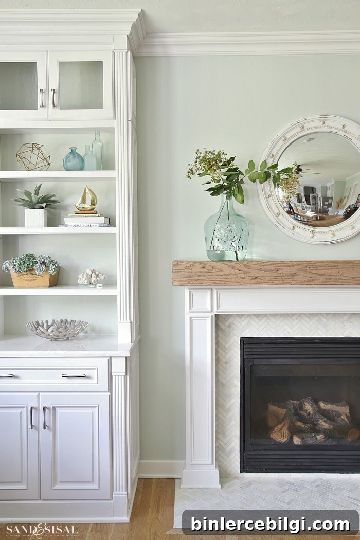
Sea Salt in Living Rooms
If you want a livable green for a living room that still feels neutral and calming, Sea Salt is a strong contender. It can act as a soft backdrop that supports both warm woods and cool metallic accents.
Sea Salt for Front Doors
Use Sea Salt on a front door for subtle curb appeal. It’s an unexpected but refined choice that adds personality without being loud.

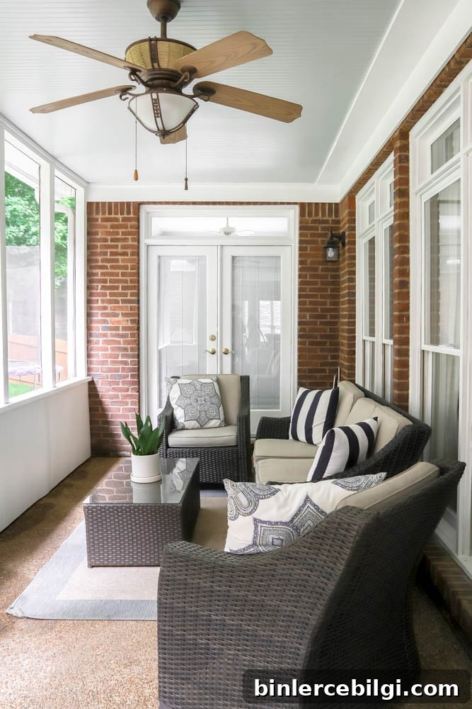
Sea Salt on the Ceiling
Sea Salt makes a lovely porch or ceiling color, often referred to in southern traditions as a “haint blue.” It reads very soft in exterior light and gives a space a fresh sky‑like feeling without dominating the palette.
What Trim Color Works Best with Sea Salt?
Both pure whites (like a bright Pure White) and slightly warm off‑whites (like Simply White) are excellent trim choices. The decision depends on whether you want a crisp, high‑contrast look or a softer, cozier finish.
When Should I Use Sea Salt?
Choose Sea Salt when you want a subtle pop of color that behaves like a neutral. It works in small rooms and large open areas alike and adapts well to many decorating styles—from coastal to modern to traditional.
Is Sherwin‑Williams Sea Salt Blue or Green?
Sea Salt is a muted blue‑green that can appear more blue, green, or gray depending on light and orientation. North‑facing rooms with cooler light may read bluer, while south‑facing or warmly lit rooms may bring out the green.
SW Sea Salt in My Kitchen
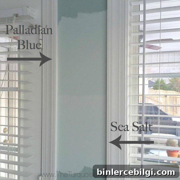
When I sampled colors for a previous kitchen update, Sea Salt and a few other shades were on the short list. After living with paint samples on the walls and observing them under different lighting, Sea Salt proved to be the perfect, soft choice—subtle, calming, and versatile.
Final Thoughts
Sea Salt is a chameleon-like, elegant color that feels at home in many rooms. It provides a fresh pop of color while keeping spaces airy and neutral. If you want a calm, versatile paint that leans coastal without being literal, Sea Salt is worth sampling in your home. Always test actual paint samples on your walls and view them at different times of day to confirm the undertones that show up in your unique light.
Other popular paint colors to explore:
- Iron Ore
- Repose Gray
- Gray Owl
- Wythe Blue
- Alabaster