
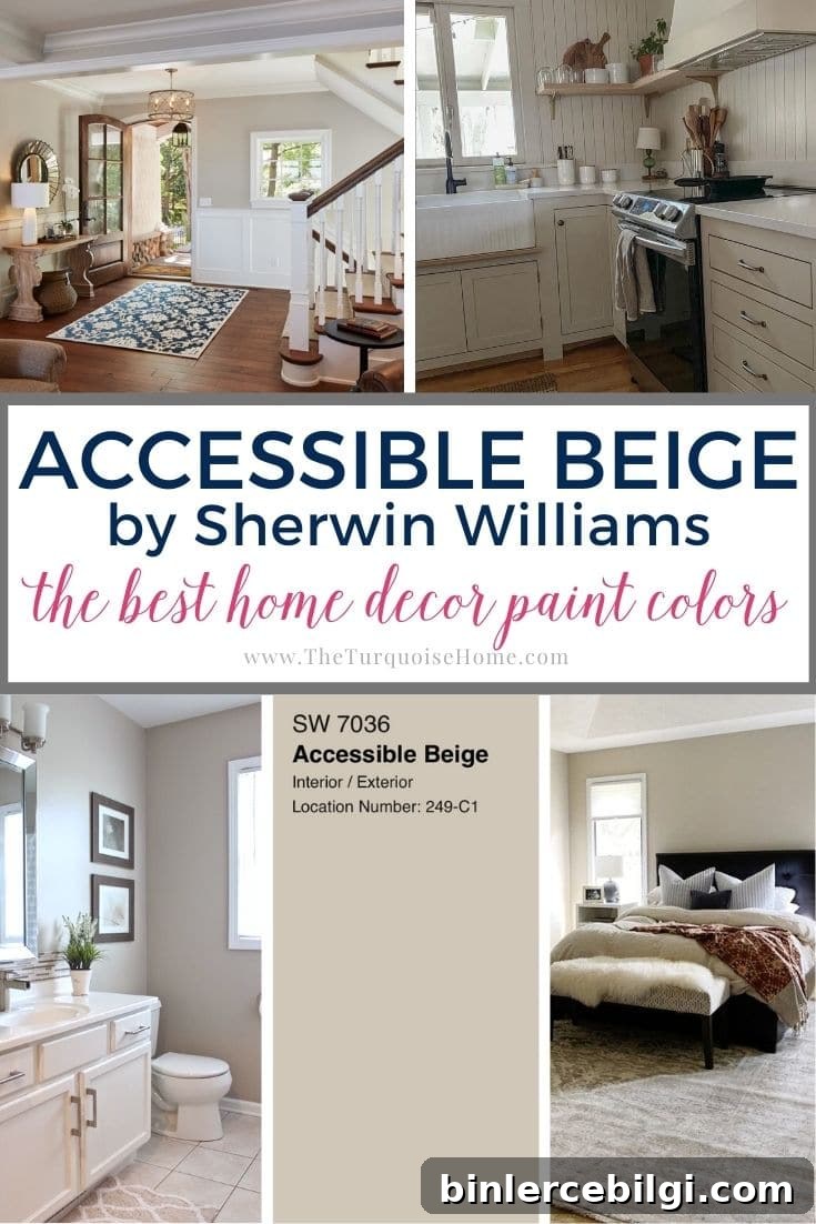
Accessible Beige is one of the rare neutral paint colors that has stayed popular through shifting design trends. Its warm greige undertones give it a timeless, adaptable quality that suits both classic and contemporary homes.
Sherwin-Williams Accessible Beige (SW 7036) may remind some of the neutral palettes from the 1990s and early 2000s, but it is a modern, updated version of beige—far from “your mom’s beige.”
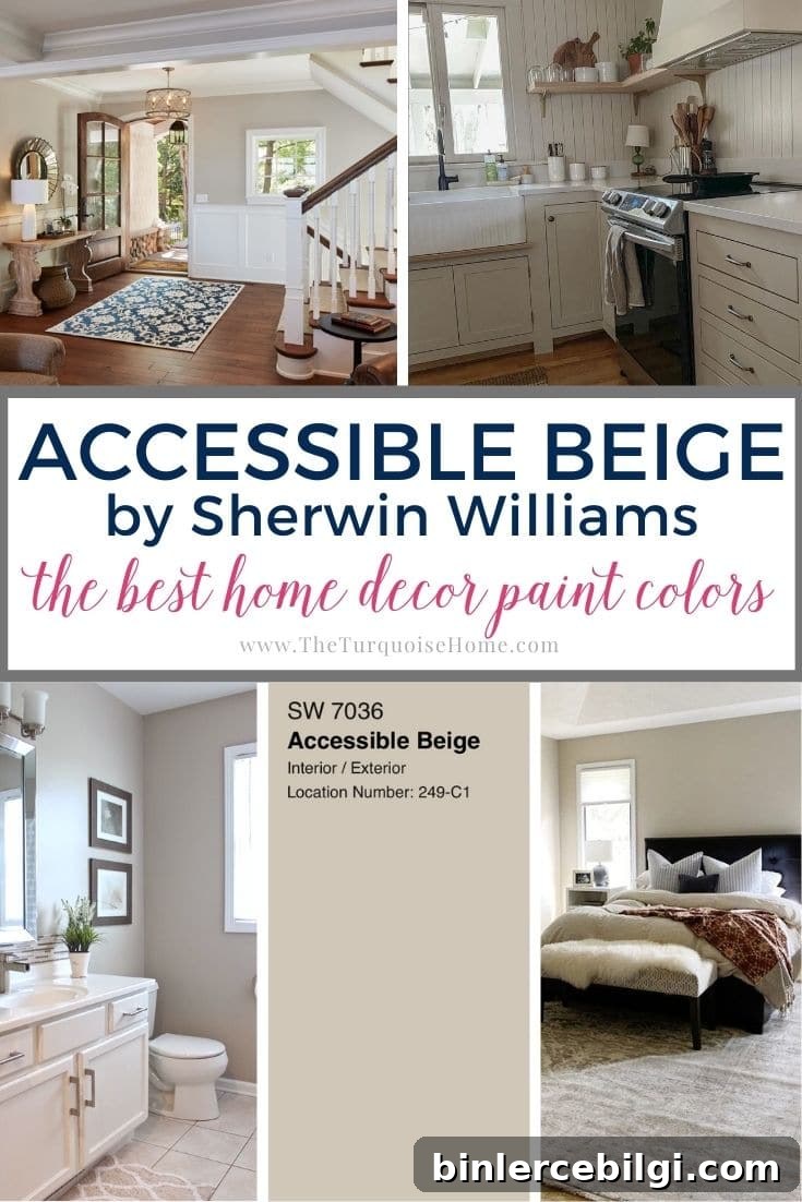
This warm, earthy greige reads as soft and sophisticated. Accessible Beige brings just the right touch of warmth without appearing overly yellow; it also carries subtle gray, taupe, and occasionally green undertones that shift with lighting and surrounding finishes.
Read on to learn how Accessible Beige performs in different rooms, what colors pair best with it, common selection mistakes to avoid, and how to test the color before you commit to gallons of paint.
This post contains affiliate links for your convenience. See the site’s disclosure policy for details.
Updated July 2026: This guide has been refreshed with new room examples, coordinating palettes, common pitfalls to avoid, and answers to frequently asked questions about Sherwin-Williams Accessible Beige.
Thinking about painting with Sherwin-Williams Accessible Beige? Here’s what you’ll learn:
- Why Accessible Beige remains one of Sherwin-Williams’ most popular neutrals
- How its beige, gray and subtle green undertones shift throughout the day
- Which rooms, decorating styles and finishes it complements best
- Common mistakes homeowners make when choosing it
- How to test the color in your home before buying paint
Accessible Beige (Sherwin-Williams): What You Need to Know
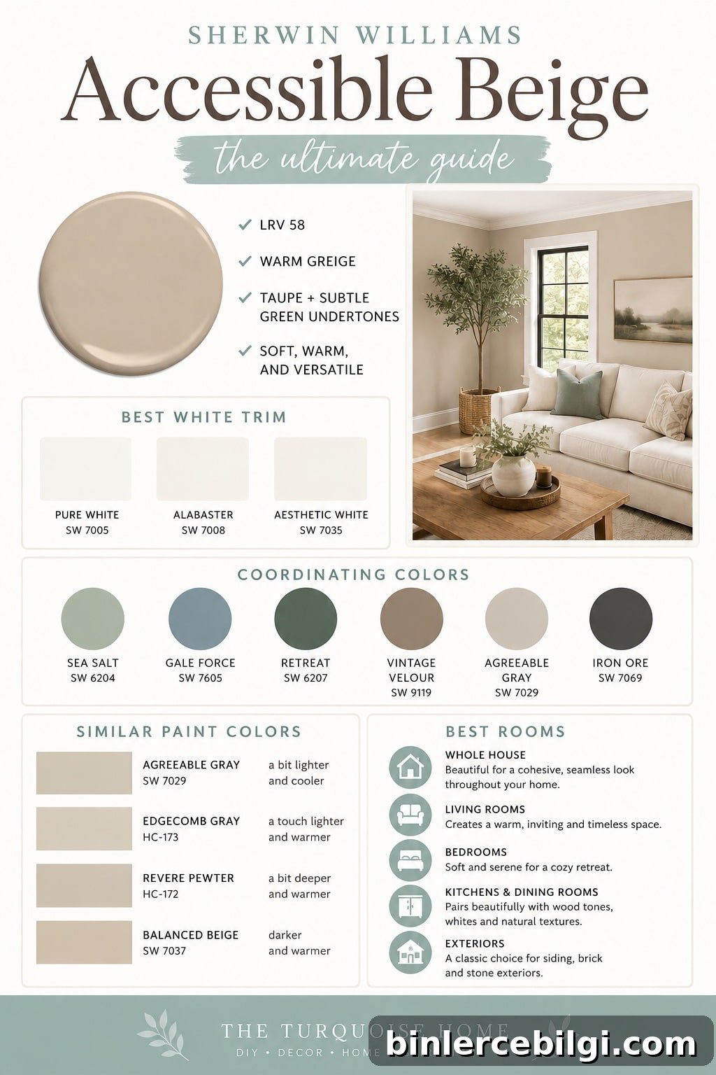
If you’re considering Accessible Beige (SW 7036), you’re in good company. This warm greige—sitting comfortably between beige and gray—has been a go-to neutral because it adapts well to many styles and finishes. It’s not a pure beige; the gray and taupe balance prevent it from feeling too yellow, and a hint of green can appear in certain lighting situations.
Accessible Beige pairs particularly well with warm wood floors, creamy white trim, natural stone, brass hardware, woven textures, and layered neutral decor. It suits traditional, transitional, farmhouse, cottage, and modern-organic interiors, making it a reliable choice if you plan to update other elements over time or decorate room by room.
Like all paint colors, Accessible Beige is influenced by natural light, room orientation, flooring, countertops, furniture, and bulbs. South-facing rooms often read lighter and warmer, while north-facing rooms may emphasize the gray side of the greige—so always test samples in your actual space.
Quick Facts about Accessible Beige
| Attribute | Detail |
|---|---|
| Color | Accessible Beige |
| Brand | Sherwin-Williams |
| Number | SW 7036 |
| LRV | 58 |
| Undertones | Warm greige with taupe and subtle green |
| Best For | Whole-house paint, living rooms, bedrooms, exteriors |
| Pairs With | Pure White, Sea Salt, natural wood, warm whites |
Accessible Beige Undertones
Accessible Beige differs from classic golden beiges. Where older beiges often read yellow, Accessible Beige’s taupe and gray elements tone down the warmth for a more modern, flexible neutral. In dimmer light or when paired with cool surfaces, the color can reveal faint green or taupe notes—giving rooms a subtle, earthy quality.
How the undertones appear often depends on what you place beside the walls: greens and pinks can pull forward the green or warm notes, while cool grays and blue-based pieces can emphasize the greige’s gray side.
Light Reflectance Value (LRV)
Accessible Beige has an LRV of 58, which places it in the light-to-medium range. It reflects a reasonable amount of light—enough to keep rooms feeling bright without washing out texture or depth. It won’t dramatically brighten a dark room, but it won’t make a space feel heavier either. Expect the color to shift as natural light changes through the day: it becomes richer and slightly more saturated in lower light and reads lighter in bright, sunlit rooms.
Coordinating Colors
Accessible Beige harmonizes with earthy, muted tones. Think warm whites, creamy neutrals, soft greens, muted blues, and natural wood finishes. Avoid pairing it with very bright, saturated colors; instead choose subdued versions of complementary hues to maintain balance. Soft blue-green shades—such as Sea Salt—work especially well alongside this greige.
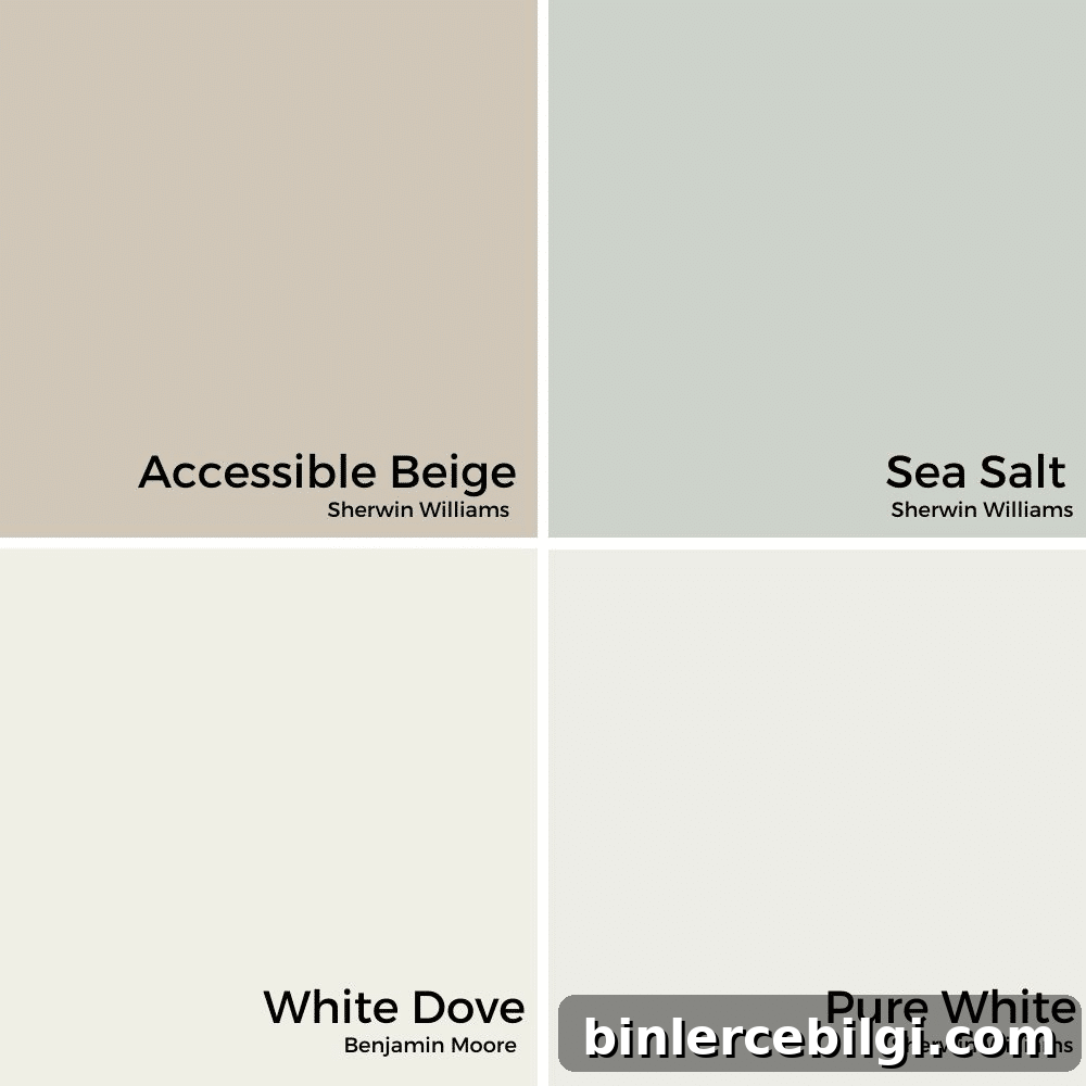
When pairing with whites, avoid stark cool whites. Warmer whites like Pure White or Alabaster create a soft, inviting contrast. For gray companions, select warm grays with an LRV below 58 to keep the palette grounded and cohesive.
Agreeable Gray vs. Accessible Beige
Accessible Beige and Agreeable Gray are both popular greige choices, but they lean in different directions: Accessible Beige reads slightly warmer and more beige, while Agreeable Gray leans a touch cooler and grayer. If you’re deciding between the two, look at the undertones in your floors, countertops, and finishes to determine which mood you prefer—warmer and cozier or lighter and more contemporary.
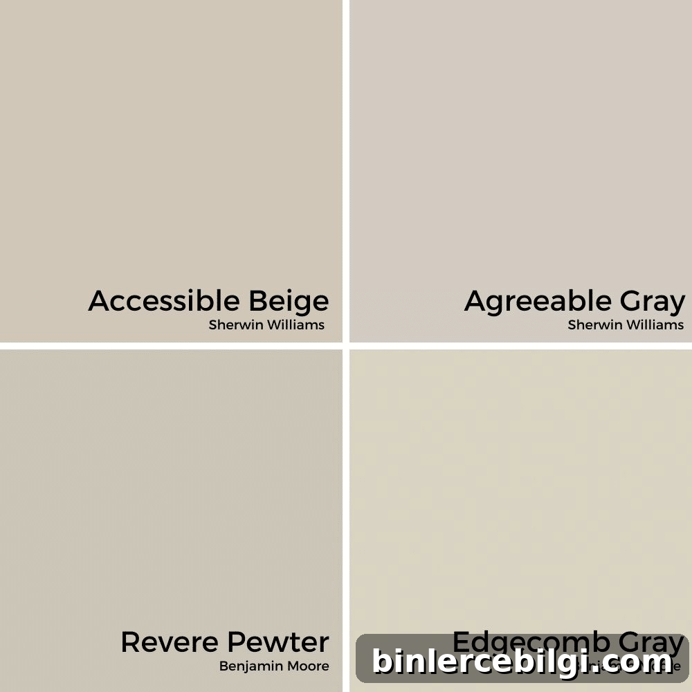
Accessible Beige in Different Rooms
Accessible Beige’s flexibility makes it suitable for almost any room. It holds enough saturation to feel substantial without dominating a space, which means it works well as a whole-house color or accent throughout individual rooms.
Kitchen
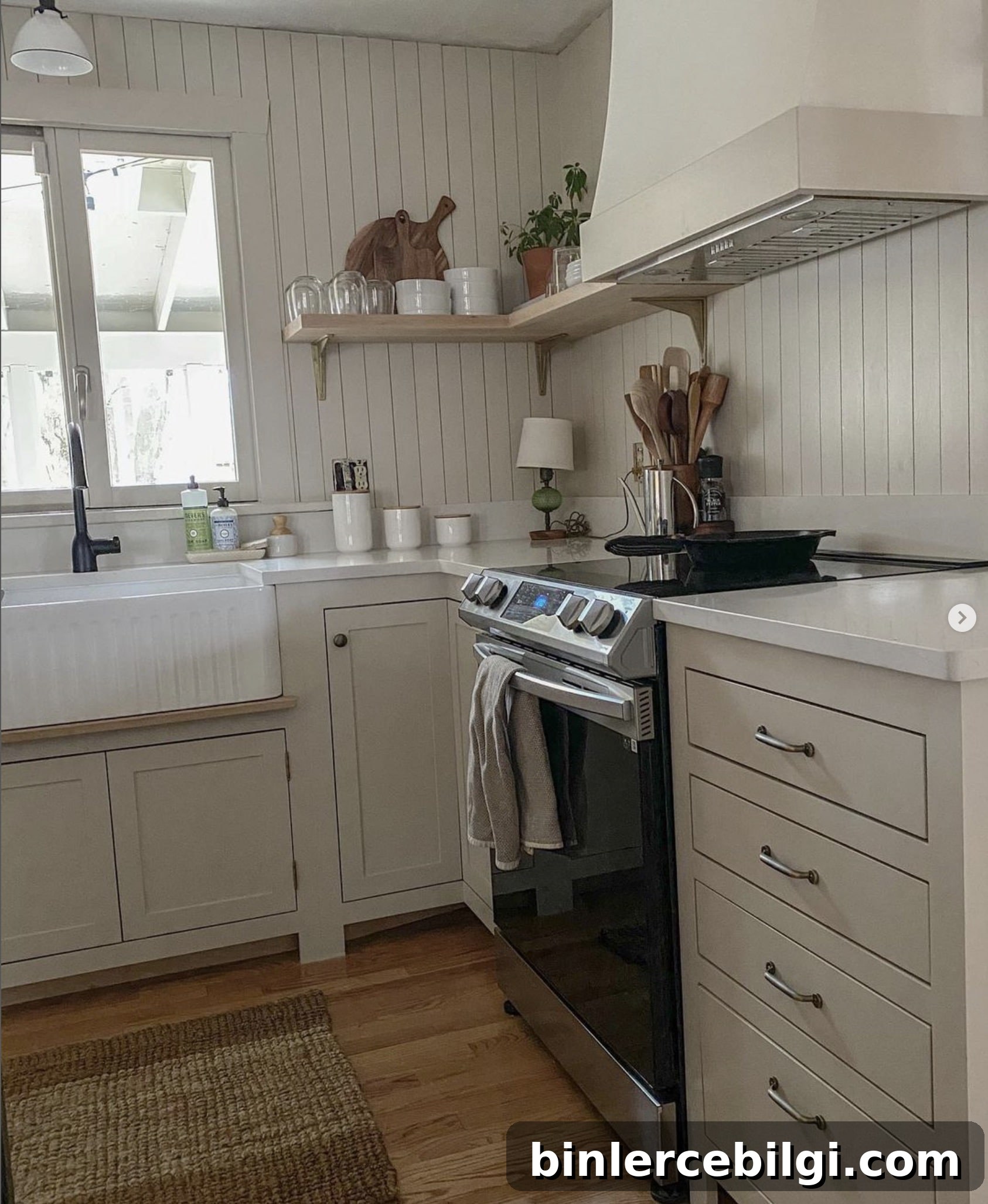
Accessible Beige is a great choice for farmhouse or transitional kitchens. It complements white cabinets, lightly stained wood floors, and warm hardware, creating a timeless, welcoming space.
Bedroom
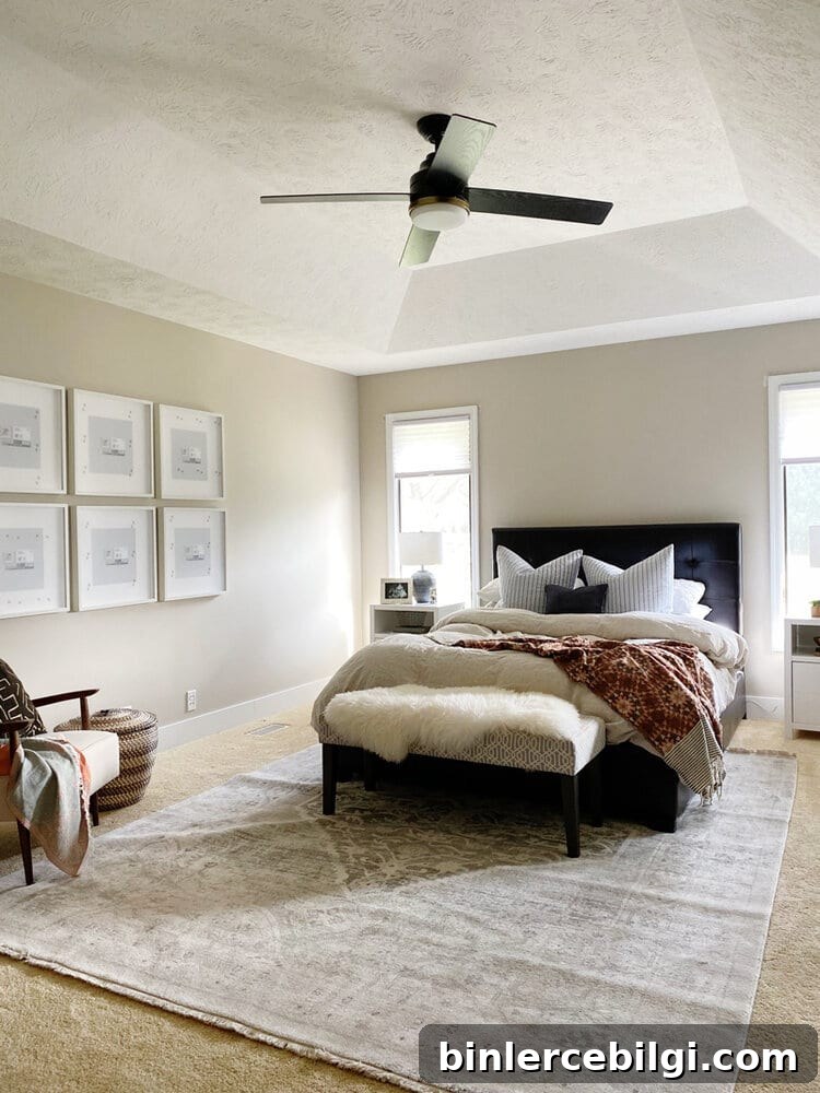
In bedrooms, Accessible Beige creates a calm, cozy backdrop that lets bedding, art, and furniture stand out. It’s an easy choice for guest rooms or master suites when you want a restful, neutral environment.
Bathroom
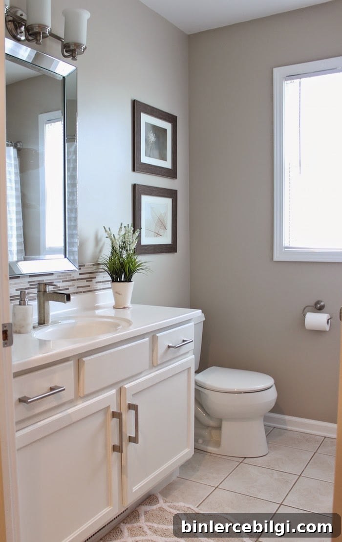
Accessible Beige gives bathrooms a spa-like, serene feel. Pair it with white vanities, natural stone, and soft textiles for a peaceful powder room or guest bath.
Living Room
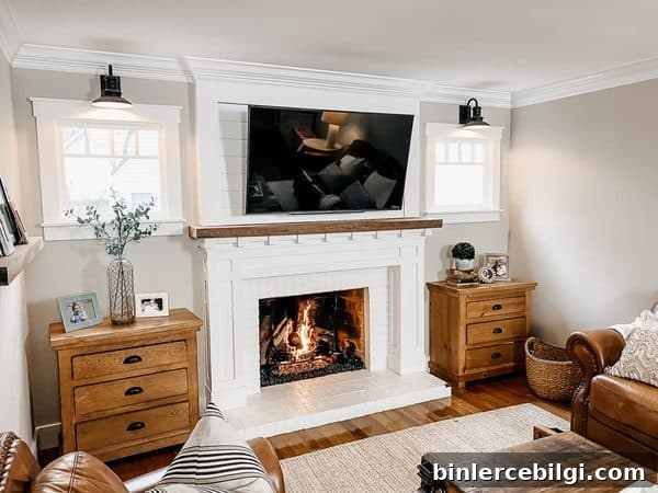
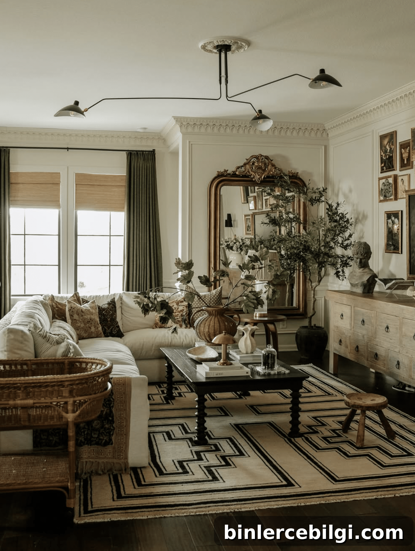
Accessible Beige is an ideal living room backdrop. Its warm greige undertones work beautifully with wood furniture, woven textures, layered neutrals, and vintage pieces, keeping the space inviting without competing with decor.
Trim and Doors
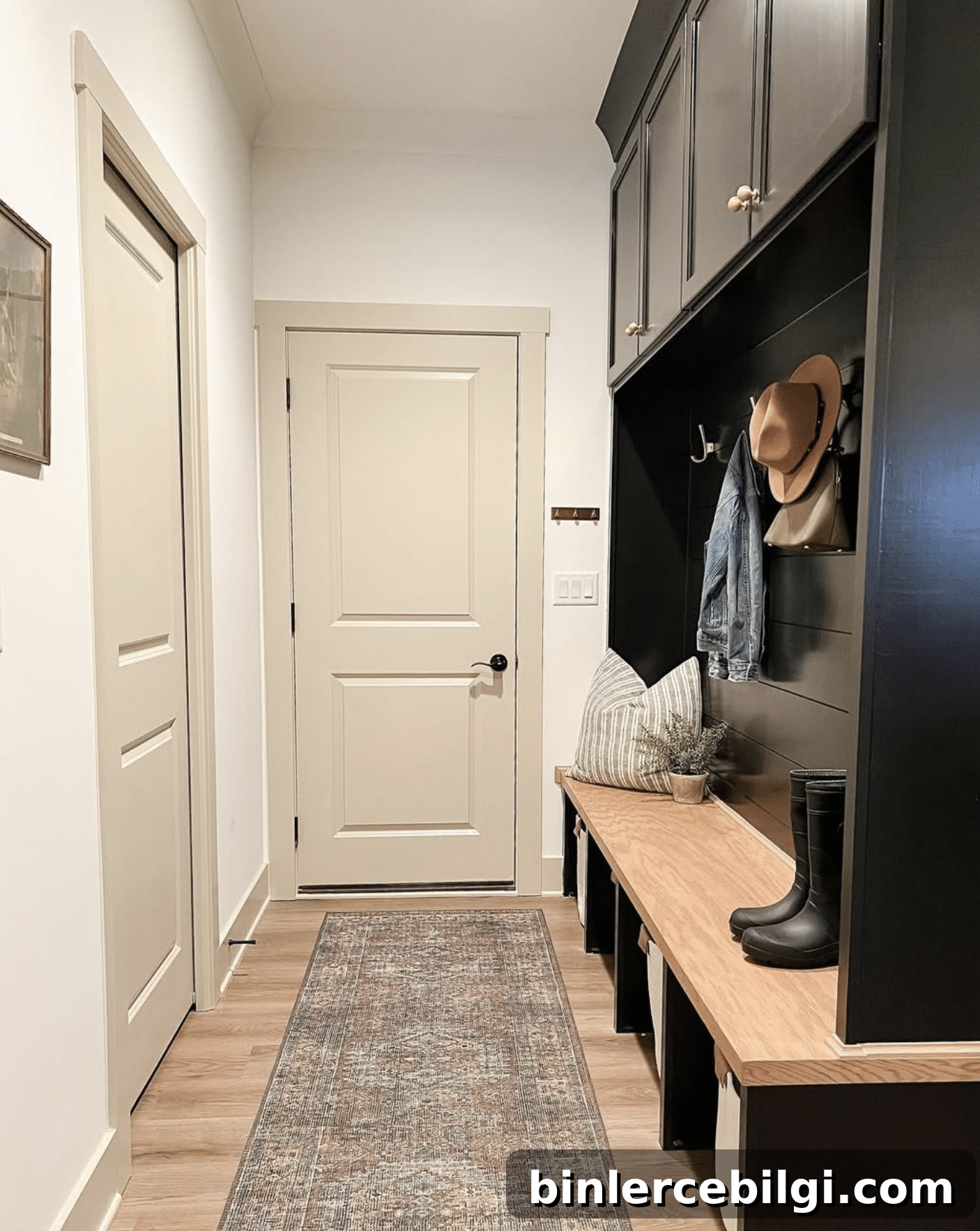
Accessible Beige can also be used on trim and doors for a cohesive, softer look—especially effective when paired with darker cabinetry or accent walls. It softens contrast while complementing natural materials like light oak or stone.
Exterior
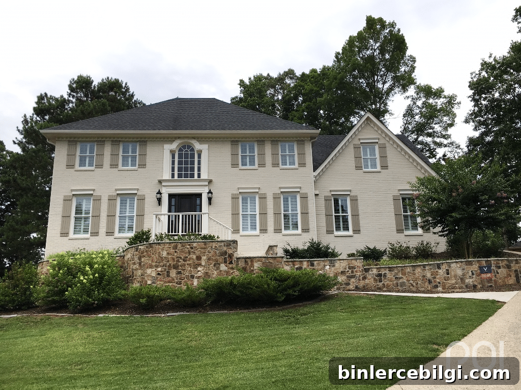
Accessible Beige also works well on exteriors. In bright daylight it can read almost off-white or light greige. When paired with dark trim, stained decks, or stonework, it creates a refined, natural curb appeal.
Common Mistakes to Avoid
1. Skipping a sample
Always test paint in your space. Paint large sample areas on poster board or use peel-and-stick real-paint samples and observe them at different times of day to see how the undertones react to your lighting and finishes.
2. Pairing with cool, icy whites
Accessible Beige looks best with warmer whites like Pure White, Alabaster, or other soft creams. Icy, blueish whites can create an undesirable contrast.
3. Ignoring flooring
Floors are major fixed elements. Warm wood floors will reinforce Accessible Beige’s warmth, while cool gray or pink-leaning flooring may shift the color’s appearance—so sample with your floors present.
4. Expecting every room to look the same
Room orientation and natural light change how the hue appears. North-facing rooms often read grayer, while south-facing rooms may emphasize warmth or green undertones.
5. Choosing the wrong sheen
Pick a sheen appropriate to the room and finish—flat or eggshell for walls, semi-gloss for trim and doors—to achieve the desired look and durability.
Frequently Asked Questions
Is Accessible Beige still popular?
Yes. Accessible Beige remains a reliable, timeless neutral because it isn’t overly tied to a single trend. Its flexibility across styles and finishes helps it stand the test of time.
Is Accessible Beige more gray or beige?
Accessible Beige leans slightly more beige than gray, but it’s best described as a warm greige—a balanced blend of both.
Does Accessible Beige look green?
Occasionally. In certain lighting or alongside cool-toned surfaces, subtle green undertones can surface. In most settings it reads as a warm greige rather than green.
Does Accessible Beige work with oak cabinets?
Yes—especially with light to medium oak finishes. Its warm greige undertones complement wood’s natural tones, creating a cohesive, updated look without repainting cabinetry. Test a sample to ensure harmony with cabinets that have strong orange or red undertones.
What trim color goes with Accessible Beige?
Warm whites like Sherwin-Williams Pure White, Alabaster, or Aesthetic White provide a clean, complementary contrast that feels fresh without harshness.
Does Accessible Beige work with black windows?
Yes. The warm greige walls soften the strong contrast of black window frames, resulting in a balanced, welcoming look.
What LRV is Accessible Beige?
Accessible Beige has an LRV of 58, placing it in the light-to-medium category—reflective enough to keep spaces feeling bright while still adding warmth and depth.
Final Thoughts
Sherwin-Williams Accessible Beige (SW 7036) is a versatile, timeless warm greige that works well throughout a home. It balances beige, gray, and subtle earthy undertones to create a neutral backdrop that complements many styles and finishes. Because lighting and fixed surfaces affect how the color reads, sampling in your own rooms is essential. With thoughtful testing and the right coordinating colors and finishes, Accessible Beige can be a dependable choice you’ll enjoy for years.
Happy painting!
Related paint color topics to explore:
- Agreeable Gray vs. Accessible Beige
- Benjamin Moore Revere Pewter comparisons
- Edgecomb Gray and other greige options
- Best warm white trim colors
- How to choose whole-house paint palettes