

If you’re considering Sherwin Williams Sea Salt for your kitchen, you’re in good company. This soft, muted color keeps appearing in design conversations for a reason: it’s calm, versatile, and quietly distinctive.
When I painted my kitchen Sea Salt, my goal was simple — a soft, airy backdrop that wasn’t stark white or overly bright. I wanted color that felt gentle and layered: a lived-in, calm atmosphere rather than a loud, saturated statement.
One thing I learned living with Sea Salt is that it behaves like a chameleon. Depending on natural light, surrounding finishes, and cabinetry, it can lean more blue, more green, or read as a soft gray. That shifting quality is exactly why many people have questions before committing. Below I share real-life photos of my Sherwin Williams Sea Salt kitchen, describe the paint’s undertones, and explain how it reacts in different lighting so you can make a confident choice.
I’ve also used Sea Salt in other areas of the house, including a haint-blue porch ceiling and my primary bathroom. It’s a beautiful, adaptable color that works in a variety of spaces where you want a serene, coastal-but-modern feel.
This post contains affiliate links for your convenience.
What Color and Undertones are in Sherwin Williams Sea Salt Paint Color?

Sherwin Williams Sea Salt is best described as a soft blue-green with a gentle gray base. That gray anchor keeps the color muted and grounded rather than bright or overly beachy. In bright, northern or west-facing light it can read more blue and airy; in warmer, lower light it leans into its green undertones. The gray undertone ensures it always feels subdued and livable — a balance of coastal freshness and classic neutrality. Because it shifts with light, it’s important to sample Sea Salt in the rooms and at different times of day where you plan to use it.
Why I Chose Sherwin Williams Sea Salt for My Kitchen
My kitchen now wears Sea Salt on the walls, and the change brightened the space in a way I’d hoped for. We had recently painted the cabinets Benjamin Moore Simply White, and the previous wall color — a deeper Benjamin Moore Stratton Blue — felt too stark with the lighter cabinets. I wanted a lighter blue-green that would harmonize with the Simply White cabinets without losing character.
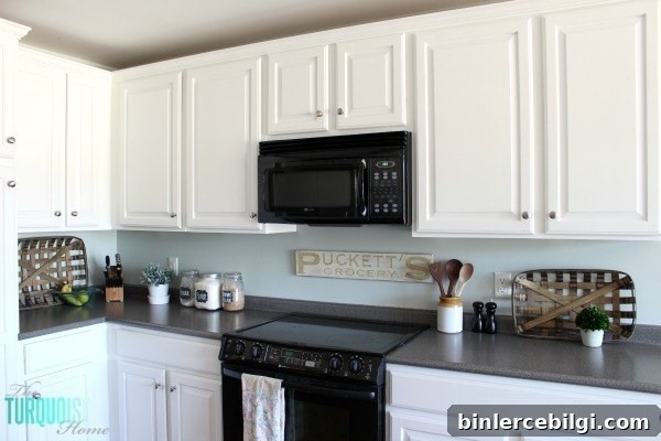
I narrowed my choices down to Sea Salt (Sherwin Williams) and Palladian Blue (Benjamin Moore). To avoid buyer’s remorse, I followed a color-selection process that involves sampling and viewing paint chips and swatches in the actual space, at different times of day. Doing this exercise saved me from choosing the wrong tone and helped me land on Sea Salt with confidence.
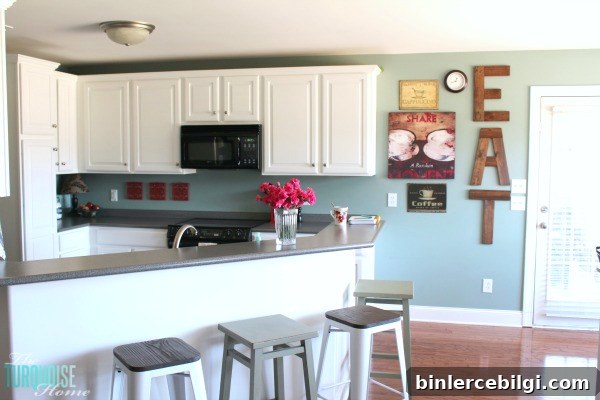
The cabinet painting and wall refresh went quickly — my mom came to help while my husband watched the kids, and we completed the walls in a day. The result is a lighter, more cohesive kitchen that feels both fresh and cozy.

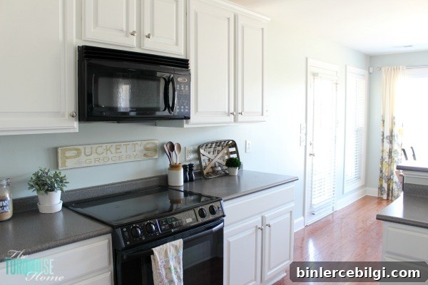
Before the refresh, my countertops felt out of place — dark gray laminate that didn’t complement the previous oak cabinets or the new white ones. With Sea Salt on the walls, the countertops read much better and feel more integrated into the overall palette. For now, I’m comfortable leaving them in place until we’re ready to invest in new surfaces, sink, and faucet.
One detail I’ve long wanted is a classic white subway tile backsplash. Right now I’m deciding between two approaches:
- Install the subway tile now using the existing countertops, accepting that I’ll need to patch or finish the backsplash later when the counters are replaced.
- Wait to install the subway tile until new countertops and a new sink/faucet are in place, enjoying the Sea Salt on the walls in the meantime.
I’d love your input: which option would you choose? I’m leaning one way right now, but hearing what others have done and how they handled similar transitions has changed my mind in the past.
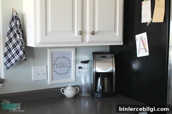
There are a few small finishing touches I’m still considering: new curtains that better match the Sea Salt walls, a refinished table and chairs (a summer project I hope to tackle with my mom’s help), and a few decorative accents for the wall near the clock. I recently added a galvanized-finish clock that ties in nicely with the light, airy farmhouse feel.
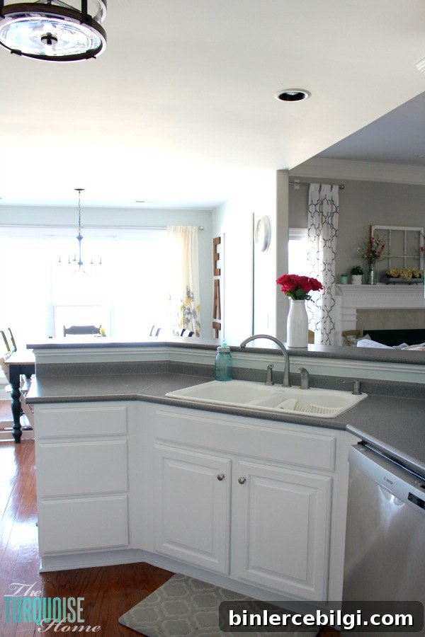
Sea Salt has been an excellent choice for bringing a serene, layered look to the kitchen. It offers enough color to feel intentional while remaining soft enough to let furnishings and finishes stand out. If you’re sampling this shade, view it in the space at different times of day and next to your cabinetry and countertops — it truly does change with its surroundings.
More posts you may enjoy:
- Sherwin Williams Sea Salt (paint color spotlight)
- How to Decorate the Kitchen for Christmas (3-Step Formula)
- 7 Ways to Refresh a Kitchen