

Discover Benjamin Moore Davenport Tan (HC-76), a rich dark taupe with warm brown and gray-green undertones. See how it transformed our bright primary bedroom into a cozy retreat, plus coordinating palettes, undertones, and decorating tips.
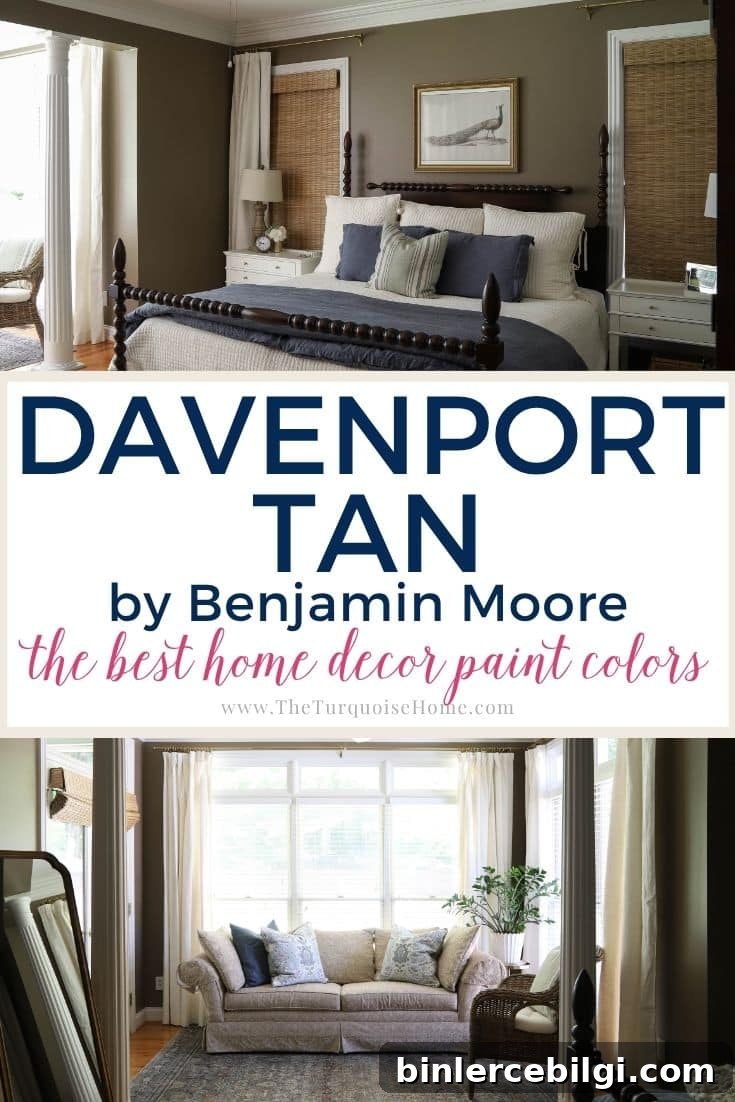
When we moved into this house five years ago, the walls were painted in every dated shade of green and yellow you can imagine. I immediately repainted several rooms with two safe neutrals: Revere Pewter for the bedroom and Sea Salt for the bathroom. Those colors were comfortable placeholders while I considered larger updates like new bedroom floors and a bathroom remodel.
As the years passed and the big renovations kept getting pushed back, I decided not to wait any longer—time to truly decorate the space we already have. That decision led me to a darker, moodier choice: Benjamin Moore Davenport Tan (HC-76).
This post contains affiliate links for your convenience.
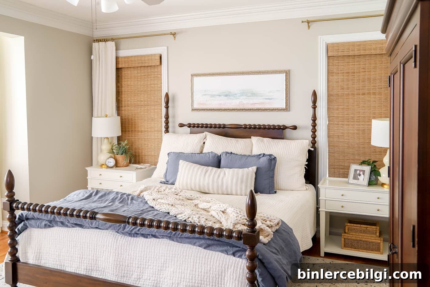
Why I Chose a Darker Paint Color
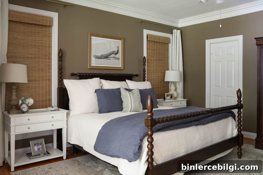
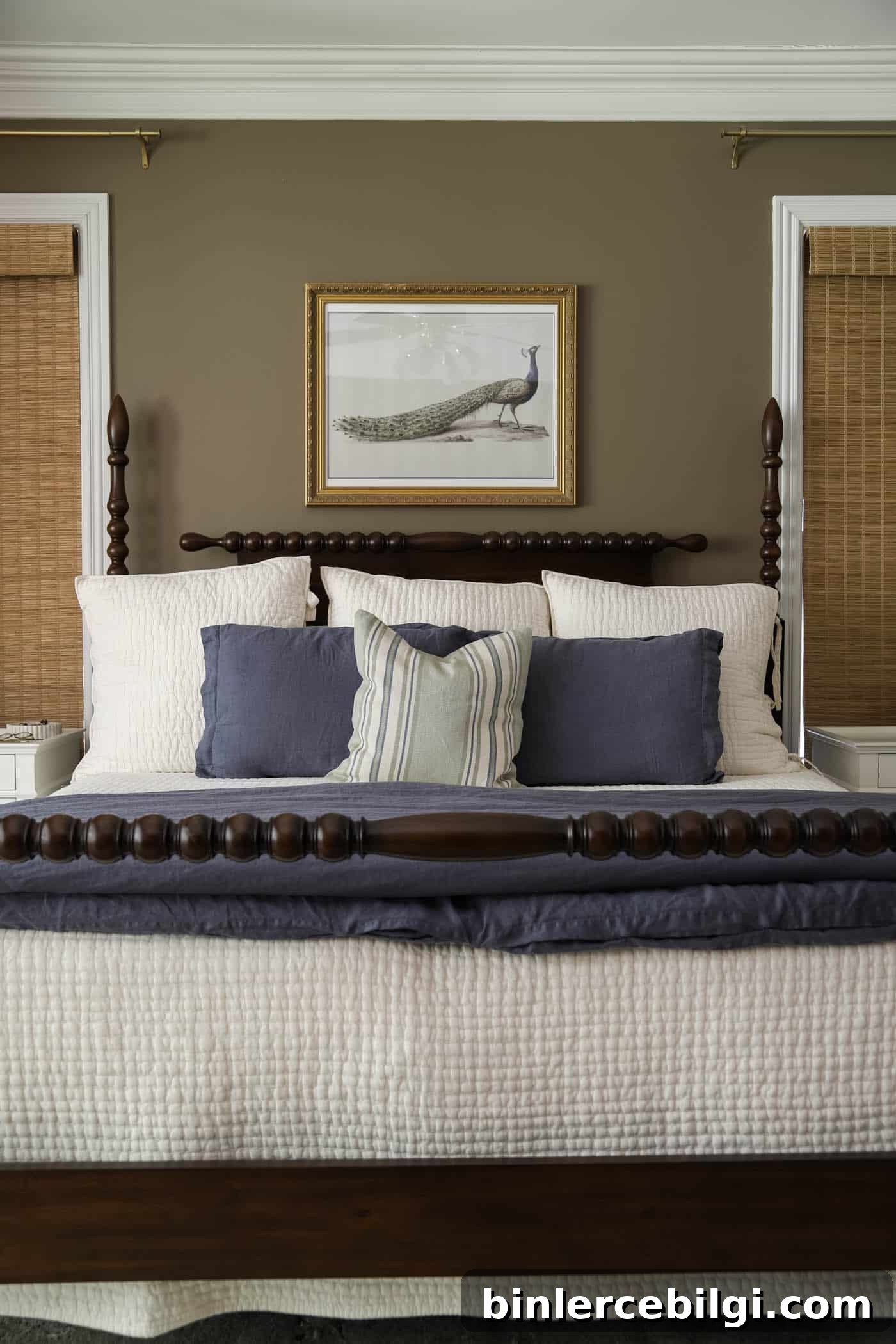
After years of neutral, light walls I wanted something that felt moodier and more layered. Our primary bedroom has nine windows plus transoms, so natural light is abundant. In a bright room like that, a deeper, warmer neutral can add contrast and a cozy, grounded feeling without making the space feel closed-in.
I narrowed the choices to a deep taupe or warm brown tone. In the end, Davenport Tan won for its earthy richness and muted green-gray undertone—it felt like the right balance of warmth and subtlety for our bedroom.
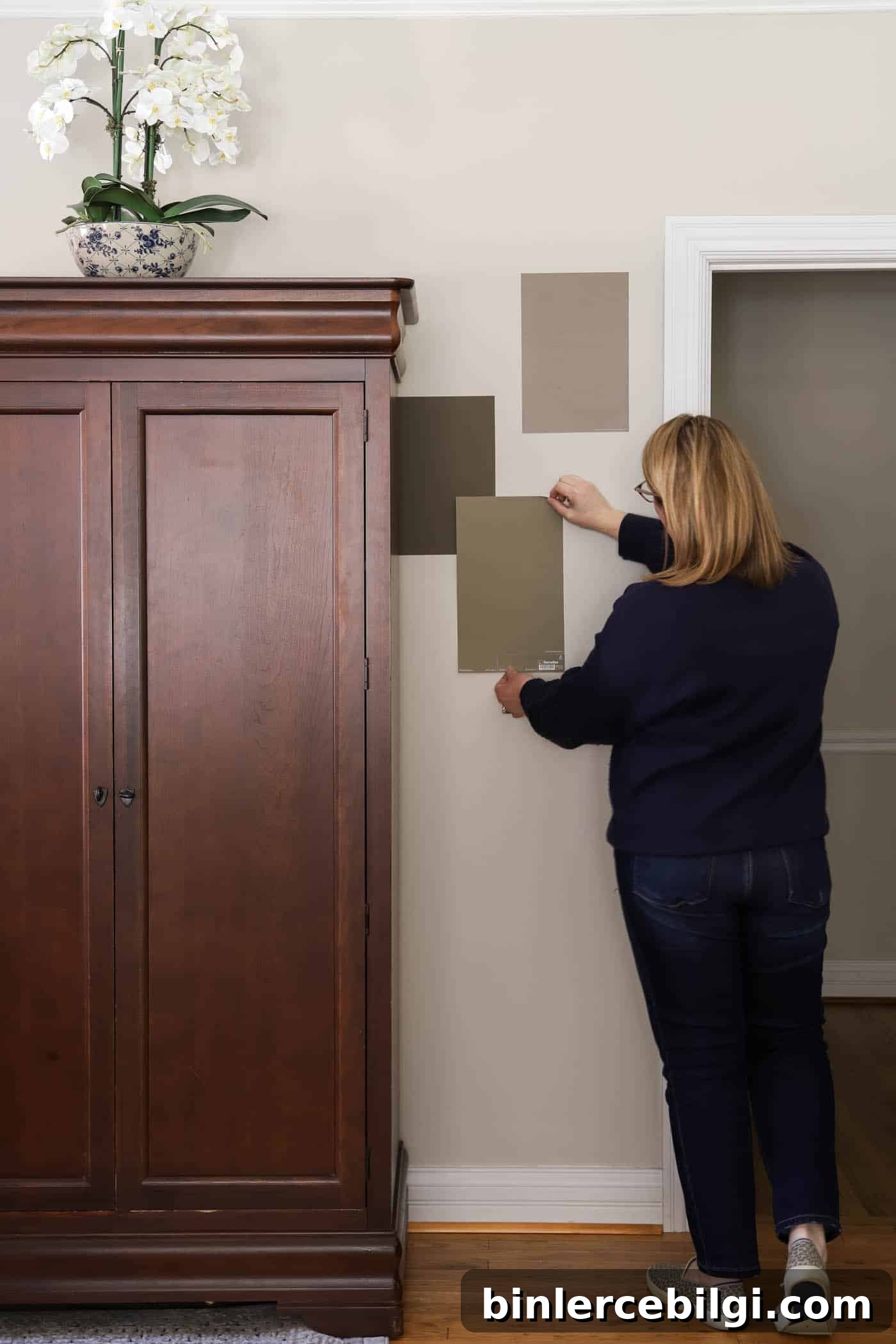
The New Look in Progress
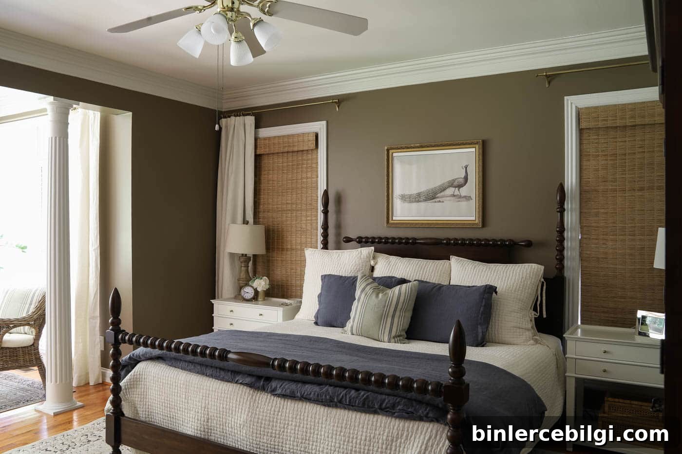
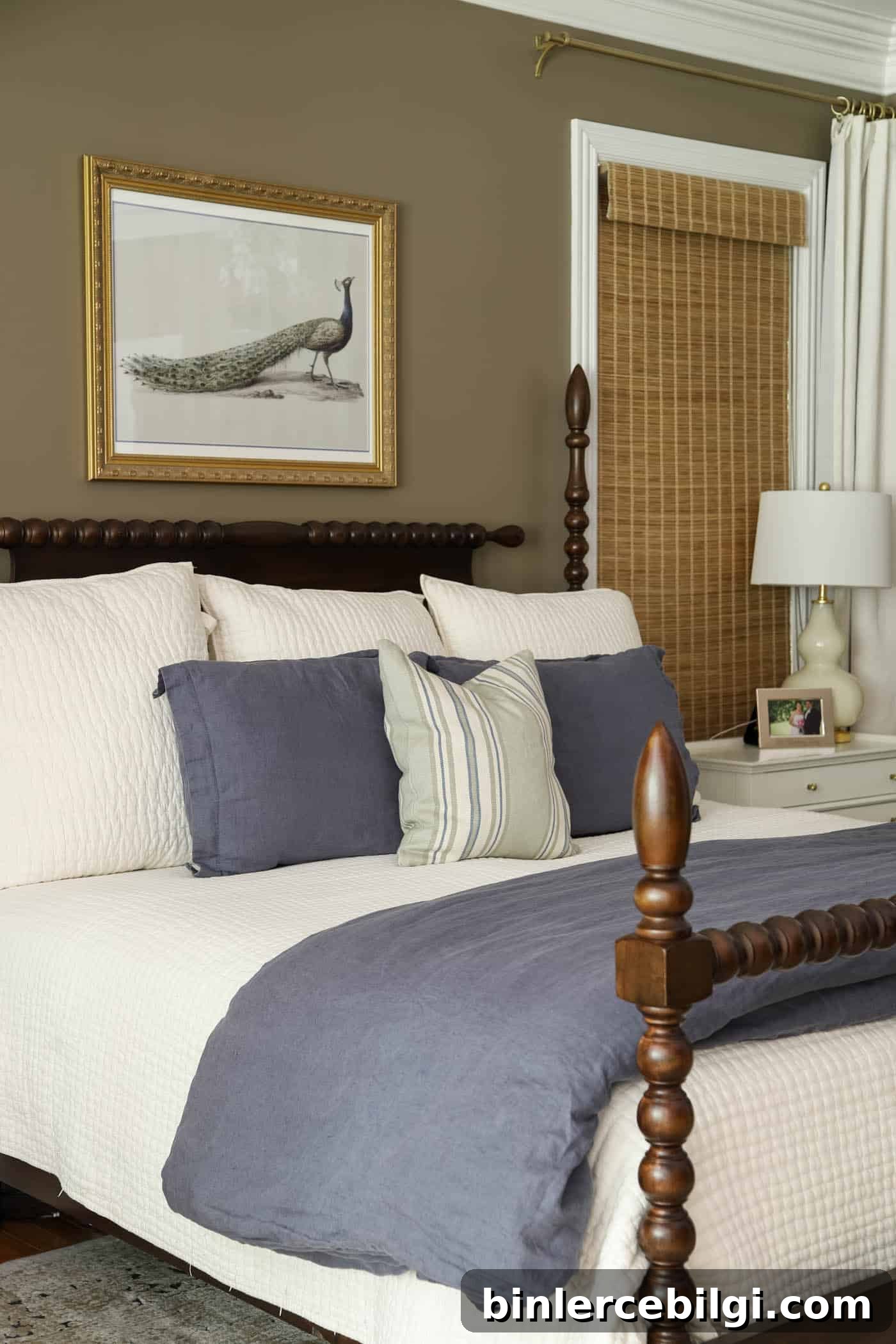
I began layering decor that feels richer against the warm taupe walls: peacock artwork, blue-green pillows, and textured linens. I’m still hunting for the perfect lamps and planning trim details, but even mid-process the room already feels transformed. Painting the walls Davenport Tan created the cozy foundation I wanted and made me eager to add artwork, trim, and varied textures.
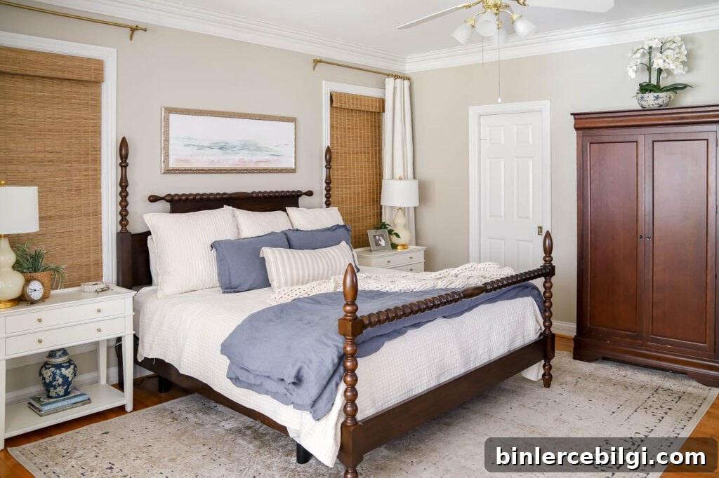
What’s Next
Someday we’ll still tackle the bathroom remodel and bedroom flooring, but for now I’m embracing this cozier chapter with a brown, blue, and green palette. The room finally feels layered, warm, and restful. I’ll continue adding finishing touches—lighting, trim, and a few larger decor pieces—and I’ll share updates as they happen.
Benjamin Moore Davenport Tan HC-76: Paint Color Review
If you want a warm, timeless neutral that adds depth without feeling too dark, Davenport Tan is worth considering. Part of Benjamin Moore’s Historic Collection, it reads as a mid-to-dark tan with gray and green undertones. It brings a grounded, earthy richness that works in both traditional and contemporary rooms.
Use it on walls, cabinetry, or built-ins for an inviting, composed backdrop. Below I break down undertones, LRV, and pairing suggestions so you can decide if it will work for your space.
What Color Is Davenport Tan?
Davenport Tan is a mid-to-dark tan that leans toward gray and green rather than warm orange or pink. That muted quality keeps it versatile: it feels warm without becoming golden or muddy, and it pairs well with crisp whites as well as deeper, moody accents.
Davenport Tan Undertones
The dominant undertones are gray and green, which prevent the color from appearing too golden. In bright natural light it can read slightly olive-beige; in lower light it becomes a deeper, warmer neutral. If you’re sensitive to undertones, test the color on large swatches in different parts of the room before you commit.
Is Davenport Tan Warm or Cool?
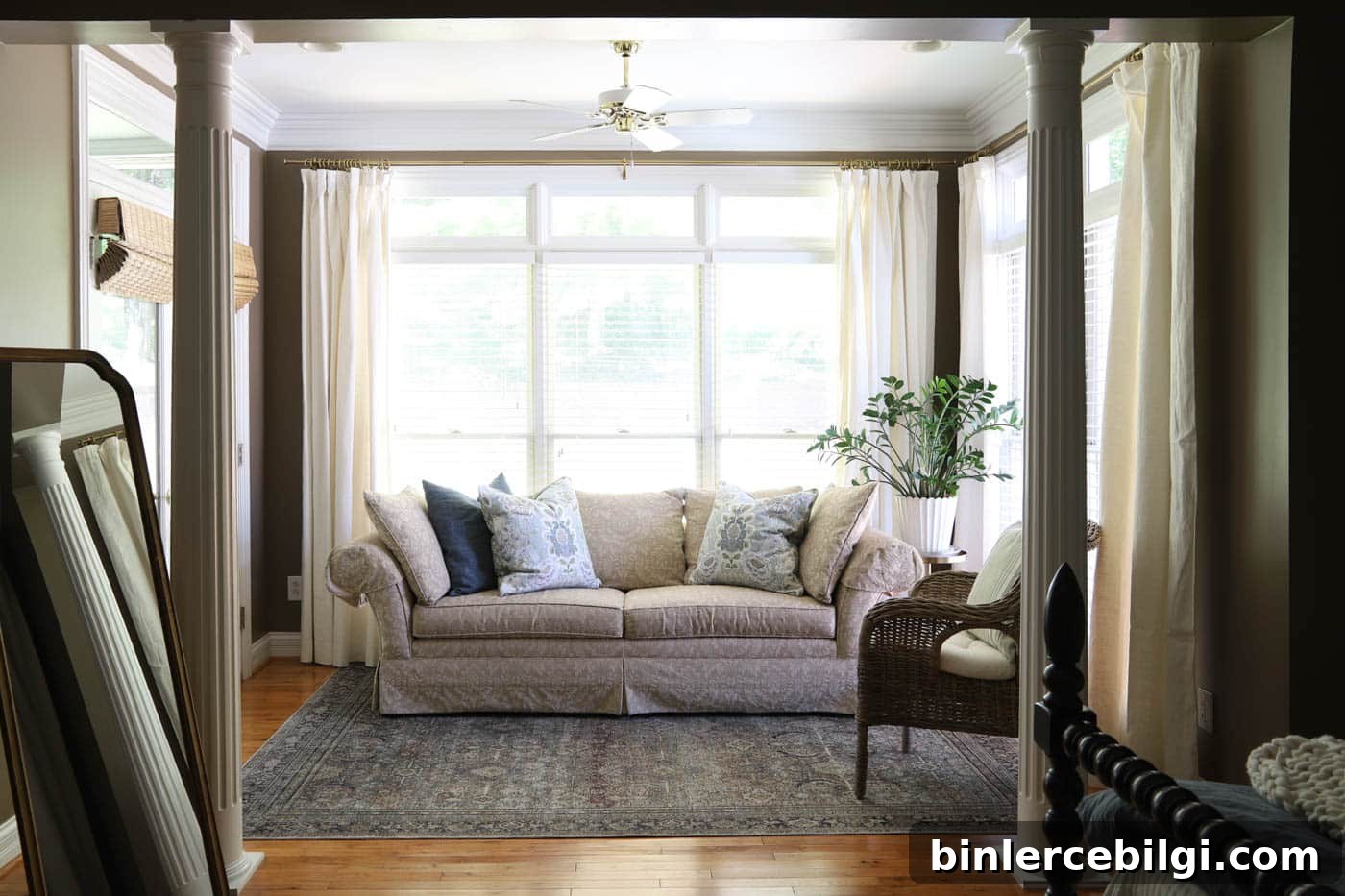
Davenport Tan is primarily a warm color. In north-facing rooms or shaded areas it may read more muted and gray-green; in south-facing, sunlit rooms the warmth will be more pronounced. The color is cozy and inviting overall.
Light Reflectance Value (LRV)
Davenport Tan has an LRV of 20.35, placing it in the medium-dark range. This makes it substantial enough to create contrast against light trim or furniture, while still working as a whole-room color without feeling cave-like. Remember: LRV ranges from 0 (black) to 100 (white).
Where to Use Davenport Tan
- Bedrooms: Warm and grounding—ideal for a restful retreat.
- Living rooms: Adds depth, especially when natural light is abundant.
- Dining rooms: Creates a welcoming backdrop for gatherings.
- Offices or libraries: Pairs beautifully with wood tones and classic decor.
- Cabinets or built-ins: A sophisticated option for kitchens or mudrooms.
- Exteriors: Timeless curb appeal when combined with crisp white trim and a darker accent.
Coordinating Colors for Davenport Tan
Davenport Tan pairs effortlessly with a variety of palettes. Try these combinations:
- Crisp white trim: Soft whites such as White Dove or Chantilly Lace create a classic, clean contrast.
- Soft neutrals: Layered greiges like Revere Pewter or Edgecomb Gray make a cohesive, calm palette.
- Blues & greens: Sea tones and muted blues add freshness against the warm tan.
- Rich accents: Deep navy, forest green, or teal bring dramatic contrast and depth.
Davenport Tan vs. Similar Colors
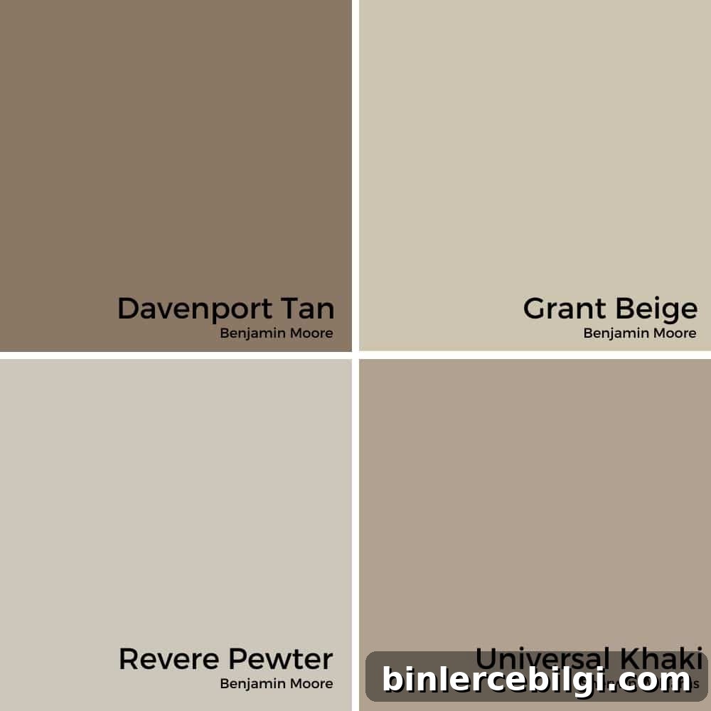
Compared with lighter and more neutral tans, Davenport Tan offers more depth and a noticeable gray-green tint. It’s deeper than Grant Beige and Revere Pewter, and slightly different than Universal Khaki, which tends to be a touch lighter and less green.
Final Thoughts
If you’re looking for a warm, earthy paint color that feels timeless and layered without calling too much attention to itself, Benjamin Moore Davenport Tan is an excellent option. It works well across room types and pairs beautifully with both crisp whites and deep accent tones.
Always test large paint samples in multiple areas of your room to observe how the color shifts through the day. If you love an earthy, historic, cozy vibe, Davenport Tan is likely to deliver.
More posts you may enjoy:
- How to Paint Outlet Covers
- Samplize Peel and Stick Paint Samples Review
- The Best Bedroom Paint Colors