

Agreeable Gray by Sherwin Williams is an extremely popular soft, warm gray paint color. It’s a beautiful hue and remains one of Sherwin Williams’ top-selling paint choices for good reason.

Agreeable Gray Undertones
Agreeable Gray is often described as the “perfect greige” — a balanced blend of gray and beige. Its base is a warm, creamy gray that reads as neutral and inviting in many settings. Like all paint colors, however, Agreeable Gray will change with lighting and surrounding finishes.
In north-facing rooms or areas with cooler light, the color can lean slightly toward a blue-gray or cooler gray, softening the beige presence. In south-facing rooms or spaces with abundant natural light, it often appears as a warm, creamy gray without the green undertones that can show up in some greiges. The result is a very liveable, versatile neutral that complements many styles.
PRO Tip
Always test the real paint color in your home before committing to a full paint job. Use actual paint samples applied to large cards or peel-and-stick sample swatches that come from the real paint, and move them around the room at different times of day. Seeing the color in your specific light will help you avoid surprises and ensure you get the undertone you want.
What Colors Coordinate with Agreeable Gray?
Because Agreeable Gray is so neutral, it pairs well with a wide range of colors and finishes. It acts as an excellent backdrop for both warm and cool palettes. Some colors that coordinate particularly well include:
- Incredible White
- Extra White
- Divine White
- Aloe
- Oyster Bay
If you want a pop of brighter color, a coral or warm accent—often labeled as Coral Reef in some paint lines—can provide a lively contrast against Agreeable Gray’s subdued neutral tone.
Rooms That Use Agreeable Gray
Agreeable Gray works beautifully in many rooms and with many decorating styles. Below are examples of how the color behaves in real rooms and how different lighting and surroundings affect its appearance.
Agreeable Gray in Bedrooms
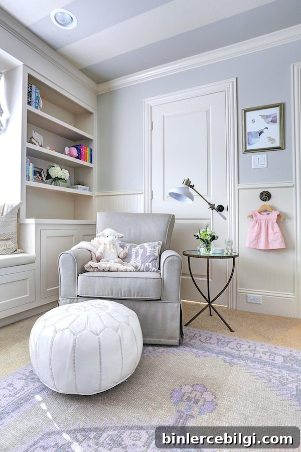
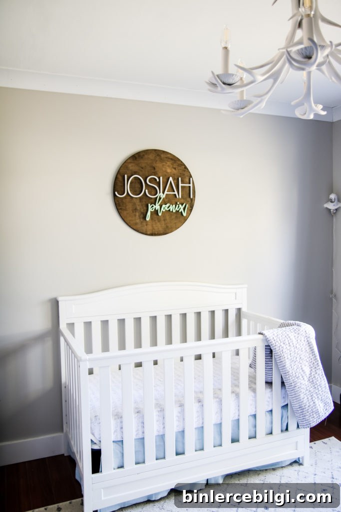
In bedrooms, Agreeable Gray often creates a calm, soothing backdrop. In one nursery example, the top half of the wall was painted with Agreeable Gray while complementary creams were used elsewhere; the shade read as a soft, neutral gray on well-lit walls and took on a slightly cooler, more purple-gray tone in shadowed corners. In another nursery example with less direct light, the color appeared creamier and warmer on the main wall but cooler where light was limited—showing how the same paint can look subtly different across a single room.
Agreeable Gray in the Living Room
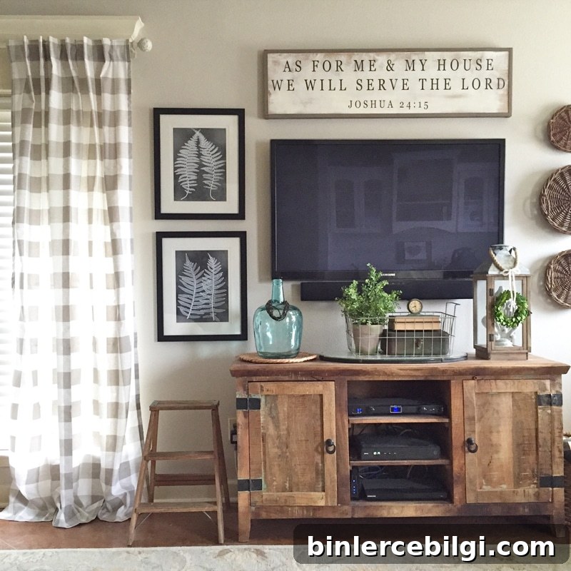
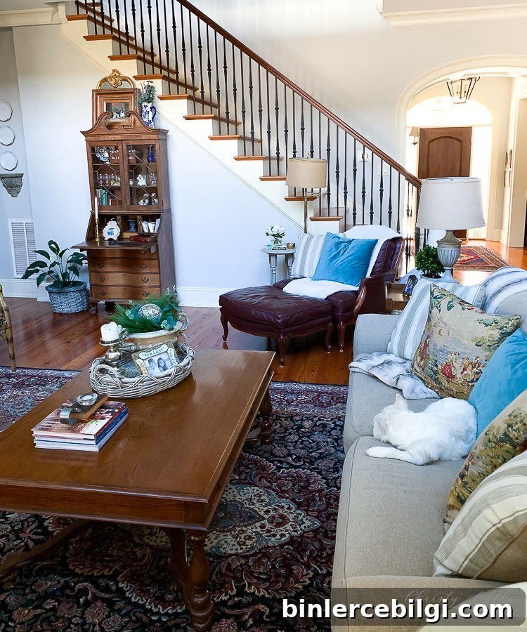
In living rooms, Agreeable Gray sets a relaxed, cohesive tone. When paired with different decor styles—from modern to traditional—the color consistently provides an understated neutral that allows furnishings and artwork to stand out. In rooms with bright natural light, it can read as a creamy greige, while in more shaded living spaces it may lean slightly cooler.
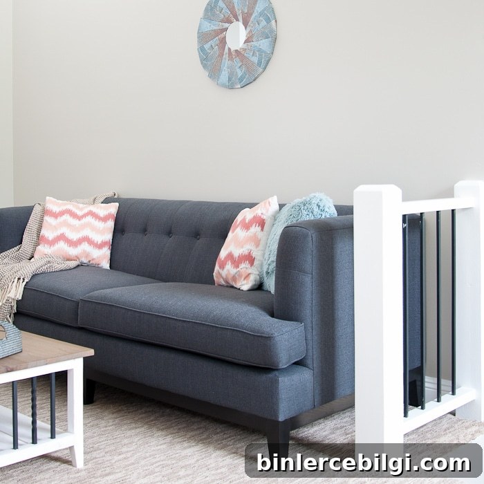
Agreeable Gray in the Dining Room
In dining rooms Agreeable Gray provides a neutral canvas that complements everything from farmhouse to contemporary decor. Used on walls and even ceilings, it creates a cohesive, inviting space that lets furniture and textiles take center stage. The color’s warmth helps dining areas feel comfortable and lived-in while still appearing fresh.
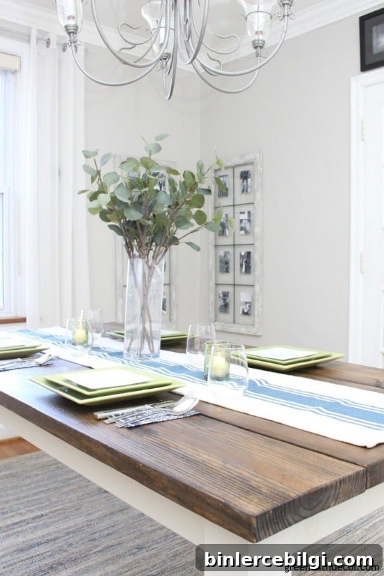
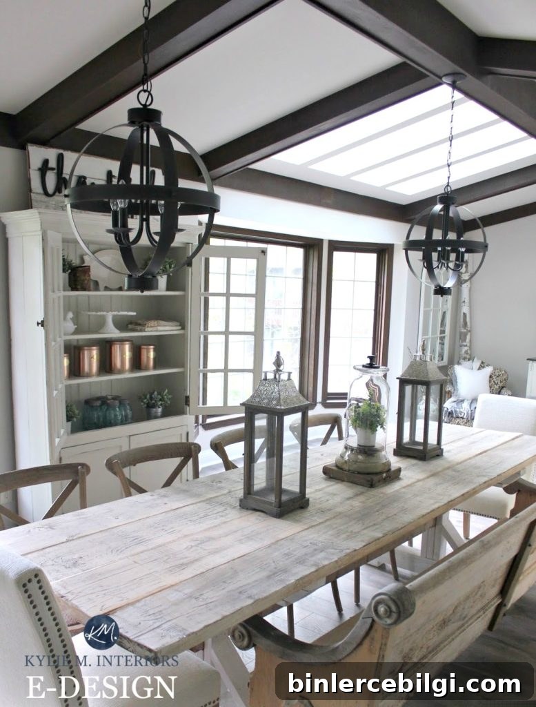
Across bedrooms, living rooms, and dining areas, Agreeable Gray proves itself as a versatile, warm neutral that adapts to different styles and lighting conditions. If you’ve used this color in your home, consider sharing how it looked in your space to help others visualize its versatility.
More Popular Home Decor Paint Colors
- Repose Gray
- Sea Salt
- Hale Navy
- Revere Pewter
- Gray Owl
- Wythe Blue
- White Dove
Tips for Painting a Room Yourself
Painting your own room can be straightforward with the right tools and preparation. Start by testing the color in your room at different times of day. Use large sample swatches from the actual paint and observe them under morning, midday, and evening light.
Essential tools that make the job easier include high-quality brushes, painter’s tape for crisp edges, drop cloths to protect floors, a good paint cup or handle to reduce hand strain, and a reliable roller and tray—liners can speed up cleanup significantly. Taking time to tape, prep, and cut in carefully will produce professional-looking results even for a DIYer.
Final Thought: Agreeable Gray is a dependable, adaptable greige that works in many rooms and styles. Test it in your space, pair it with complementary whites and accent hues, and you’ll likely find it to be a timeless neutral choice for your home.