

Benjamin Moore Van Deusen Blue (HC-156) is a striking medium-to-dark blue with gray undertones that often reads as a neutral. Could it be the perfect paint for your home? Read on to find out.
Neutrals have ruled interior design for years because they feel safe, versatile, and easy to pair. Lately, designers are shifting toward richer, bolder colors that can still function like neutrals—deep shades that anchor a room while coordinating effortlessly with other tones. Navy and deep blues are prime examples: bold, moody, and surprisingly adaptable, much like a favorite pair of denim that goes with almost anything.
If Hale Navy feels too dark for your space, consider Benjamin Moore Van Deusen Blue (HC-156). It’s a timeless pick from Benjamin Moore’s Historical Collection that offers depth without unwanted undertones. The result is a sophisticated blue that feels intentional rather than overpowering.
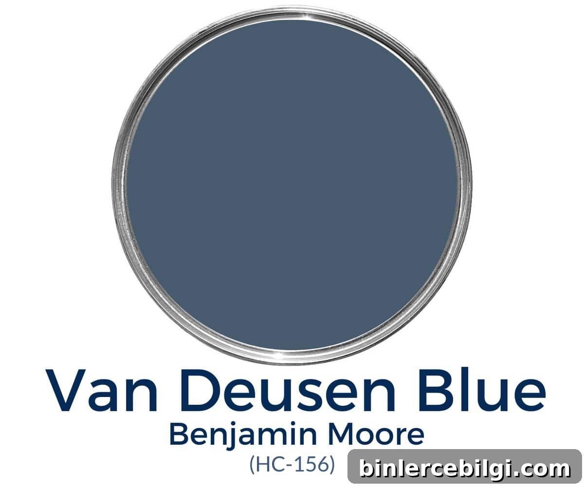
What color is Benjamin Moore Van Deusen Blue?
Van Deusen Blue is a rich, neutral-leaning navy with subtle gray undertones. Key characteristics:
- Bold, neutral blue that leans cool without feeling icy
- Dark blue—commonly described as a navy—with a Light Reflectance Value (LRV) of about 12
- Well-suited for walls, cabinetry, doors, and accent elements
- Free of strong green or purple casts; pairs exceptionally well with many palettes
Undertones in Van Deusen Blue
Van Deusen Blue reads primarily as a muted blue because of its gray undertones. Those gray notes keep the color from becoming too bright and give it a moody, grounded quality. Occasionally, depending on lighting and surrounding finishes, you might notice the faintest hint of green—but this is subtle and rare.
Lighting strongly affects how those undertones appear: north-facing or cool light will emphasize the gray, while warm, south-facing light tends to bring out the bluer aspect and balance the shade.
LRV of Benjamin Moore Van Deusen Blue
Light Reflectance Value (LRV) measures how much light a color reflects. White is 100 and black is 0. Van Deusen Blue has an LRV of approximately 12, which places it on the darker side but slightly lighter than very deep navies like Hale Navy (LRV around 8).
Because of its LRV, Van Deusen Blue can make a room feel cozy and intimate. In spaces with ample natural light, it can read beautifully without feeling oppressive. Finish choice also matters—glossier finishes reflect more light and can make the color appear lighter than a flat finish.
Coordinating colors with Van Deusen Blue
This blue plays well with a wide range of tones. It looks especially striking beside lighter blues, blue-greens, warm and cool grays, soft pinks, warm yellows, beiges, and classic whites. Natural materials—wood, stone, and brass—complement it beautifully, adding warmth and texture.
Official Benjamin Moore pairings often include soft greens and muted grays. Popular complementary choices in real-world design include:
- Simply White, White Dove, or other clean white trims
- Revere Pewter or similar warm grays
- Gray Owl for a lighter cool contrast
- Cloud White or Silver Mist for softer contrasts
- Accents in papaya, muted yellow, or wood tones for warmth
Best trim colors to pair with Van Deusen Blue
Crisp white trim provides the cleanest, most classic contrast with Van Deusen Blue. Choices like Simply White, Chantilly Lace, or a similarly bright white will make architectural details pop and keep the overall look fresh and modern. For a softer feel, consider a warm off-white or light gray trim.
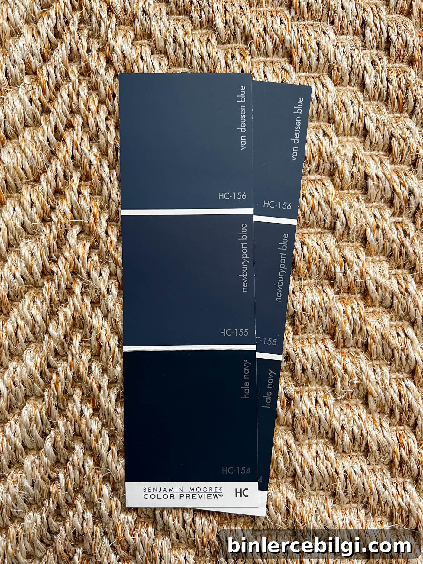
Van Deusen Blue on a color strip
On a paint color strip, Van Deusen Blue sits among other classic blues such as Newburyport Blue and Hale Navy, offering a middle ground in depth and intensity between softer blues and very deep navies.
Where to use Benjamin Moore Van Deusen Blue
Van Deusen Blue is versatile and works well wherever you want a bold, elegant statement. Good applications include:
- Kitchen cabinets and islands
- Interior doors and trim accents
- Bathroom vanities and powder rooms
- Accent walls or entire rooms in well-lit spaces
- Exterior siding or shutters, with the caveat that dark paints can fade faster in strong sun
Is Van Deusen Blue a good choice for cabinets?
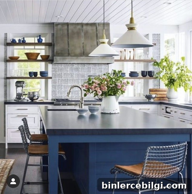
Yes. It adds depth and personality to cabinetry without overwhelming the space. On lower cabinets or an island, the color reads as sophisticated and grounding, especially when paired with lighter countertops or brass hardware.
Home styles that work with Van Deusen Blue
- Farmhouse
- Traditional
- Transitional
- Coastal
- Contemporary interiors that need a classic anchor color
Room examples using Van Deusen Blue
Below are common ways designers use this hue. Note how lighting and surrounding finishes change its appearance.
Van Deusen Blue kitchen
Used on lower cabinets or an island, Van Deusen Blue creates a focal point and reads striking against lighter walls and stone countertops. Dark gray or marble counters provide a chic, balanced contrast.
Van Deusen Blue living room
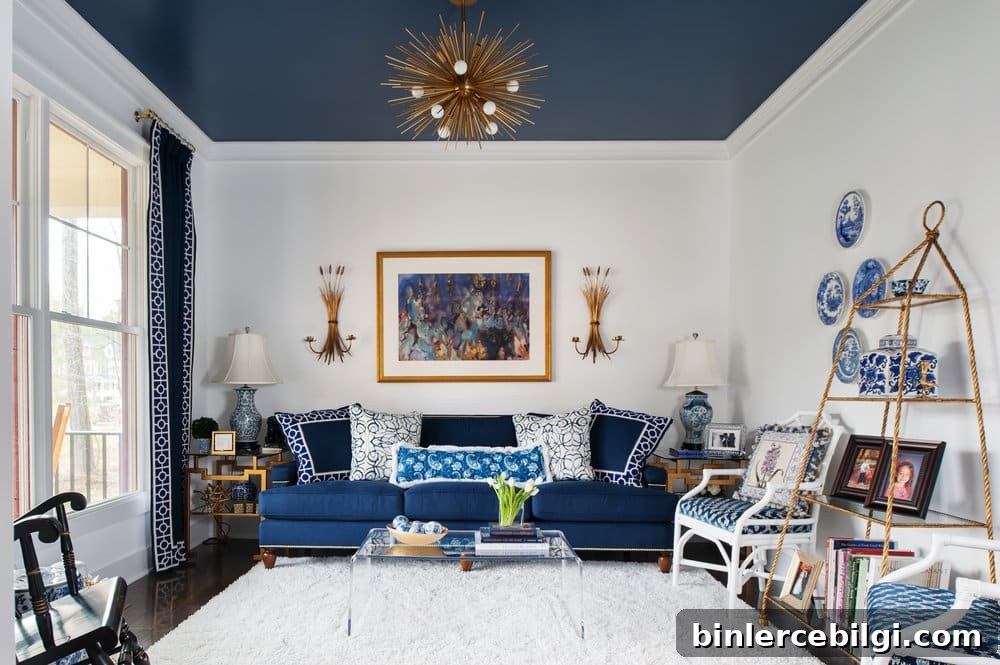
Painting an accent ceiling or introducing the color through textiles and pillows brings drama without closing in the room. Pair with white walls and coordinated navy accents for a cohesive look.
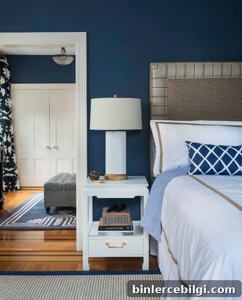
Bedroom in Van Deusen Blue
In bedrooms, the color creates a calm, enveloping atmosphere. White bedding and warm woods keep the space from feeling too heavy while maintaining an elegant, restful palette.
Home office
Blue tones can boost focus and calm. Van Deusen Blue makes a refined backdrop for a productive home office, especially when paired with warm woods, brass hardware, and crisp white shelving.
Bathroom
When a bathroom has good natural light, Van Deusen Blue can create a luxurious, classic look. Pair with white tile, marble, or brass fixtures for contrast and polish.

Frequently Asked Questions
Is Van Deusen Blue warm or cool?
Van Deusen Blue leans cool due to its blue base and gray undertones, though it can feel warmer or cooler depending on lighting and surrounding finishes.
Can I use Van Deusen Blue on my exterior?
Yes. It’s a sophisticated exterior option, but be mindful that darker paints can show fading more quickly in strong sun. It often works best on shaded facades or in cooler climates where sun exposure is limited.
Summary: Benjamin Moore Van Deusen Blue (HC-156) is a versatile, timeless navy with gray undertones that reads as a neutral in many settings. With an LRV around 12, it’s dark enough to add drama but flexible enough to pair with a wide range of colors, finishes, and home styles. Test real paint samples in your space to see how the shade reads in your lighting before committing.
More paint color ideas
If you enjoy Van Deusen Blue, you might also consider neutrals and complementary blues and grays when planning a whole-house palette. Pairing a bold anchor color with soft neutrals helps create cohesion and flow throughout the home.