

Wythe Blue by Benjamin Moore is a lovely blue-green paint with soft gray undertones. From the Historic Colors collection, Benjamin Moore Wythe Blue works beautifully in farmhouse, coastal, and traditional interiors.
I’m excited to share why Wythe Blue is one of my favorite paint colors. I used it in a recent room makeover, and it also greets you the moment you walk into my home. After reading the overview and seeing the photo examples, you’ll likely understand why it’s so popular.

Wythe Blue entered Benjamin Moore’s Historic Color collection in 1976 and has remained a timeless favorite. The company even selected Wythe Blue (HC-143) as its Color of the Year in 2012, highlighting blue’s calming and enduring appeal:
Much more versatile than you may think, blue is truly a classic color. It evokes the sea and sky, calms us physically, and symbolizes trust and commitment. Wythe Blue is a beautiful, calming hue with a sense of heritage and grounding rootedness, offering comfort and stability.
Benjamin Moore
Wythe Blue is a calm, balanced blue-green that can cover an entire room or serve as a striking accent. Below is a practical guide to its undertones, compatible colors, comparisons to similar shades, and real-room examples to help you decide where it might work in your home.
Benjamin Moore Wythe Blue Undertones
On a small swatch, Wythe Blue shows noticeable gray and green influences. Once applied to walls, though, the blue often becomes the dominant impression while the green or gray undertones appear depending on light and surrounding finishes.
If a room contains many gray elements—furniture, flooring, or cool accessories—Wythe Blue will lean more gray. In rooms with warm, yellow light, especially west-facing spaces, the green undertones will come forward. Lighting, time of day, and neighboring colors make a big difference in how this shade reads.
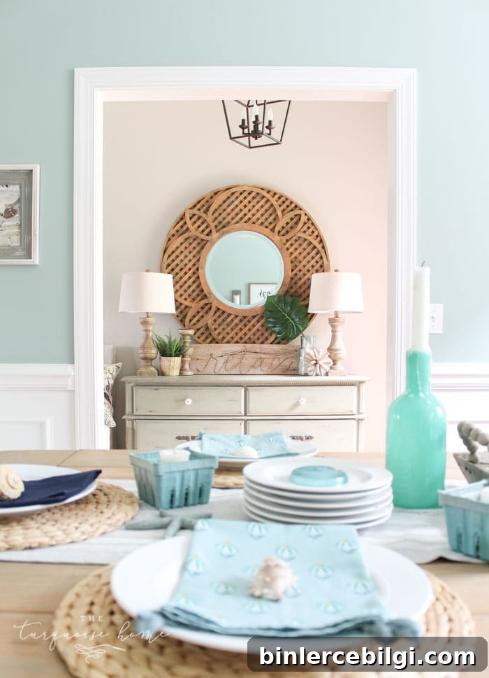
To emphasize Wythe Blue’s green side, pair it with light blues or bring in natural greenery and warm wood tones. In lower light or at night the color can deepen, revealing richer green-gray nuances.
Colors That Pair Well with Benjamin Moore Wythe Blue
Wythe Blue sits near the middle of the Light Reflective Value (LRV) scale, so it pairs easily with many colors. It pairs especially well with soft neutrals, warm grays, and subtle greens. Some Benjamin Moore options that complement Wythe Blue include:
- Olivetint 519
- Shaker Gray 1594
- Van Buren Brown HC-70
- Distant Gray 2124-70
- Palladian Blue HC-144
- Edgecomb Gray HC-173
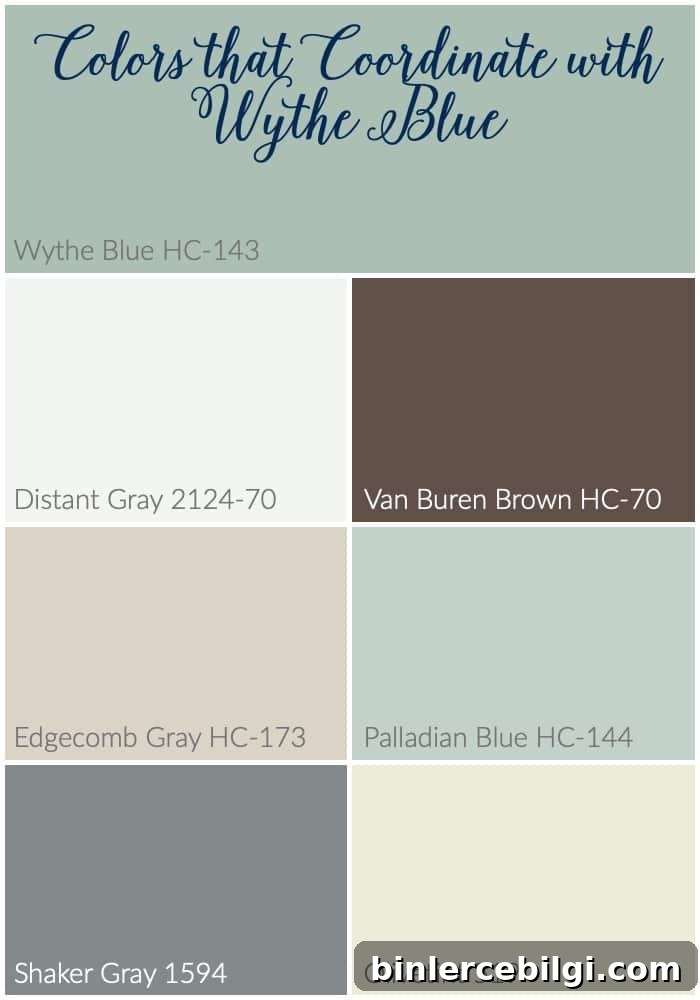
Wythe Blue also looks great with most whites, from crisp bright whites to softer, creamier tones. It makes a wonderful accent against bold colors like red or tangerine, and it enhances yellows, greens, and natural wood tones.
Wythe Blue vs. Other Blue-Green Paint Colors
Wythe Blue vs. Palladian Blue
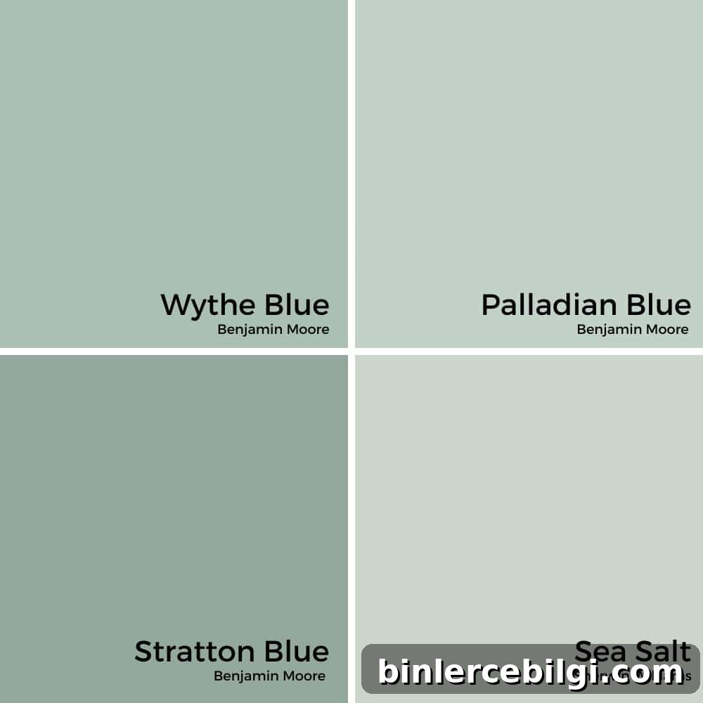
Wythe Blue and Palladian Blue share that soft blue-green family resemblance, but they read differently. Palladian Blue is lighter, airier, and leans more green—ideal for a coastal or breezy look. Wythe Blue contains more gray and feels deeper and more grounded, making it a sophisticated, “grown-up” choice.
- Palladian Blue: lighter, fresher, coastal vibe
- Wythe Blue: deeper, more muted, timeless charm
Tip: Rooms with abundant natural light will keep Palladian Blue bright, while Wythe Blue works well for cozier, more intimate spaces.
Wythe Blue vs. Stratton Blue
Stratton Blue is richer and more saturated, with stronger green undertones. It’s a dramatic choice for accent walls or moody rooms. Wythe Blue is softer and more versatile—perfect for painting all four walls when you want color with restraint.
- Stratton Blue: deeper, bolder, greener
- Wythe Blue: lighter, softer, versatile
Tip: Choose Stratton Blue for statement spaces; choose Wythe Blue for calm, inviting rooms.
Wythe Blue vs. Sea Salt
Sherwin-Williams Sea Salt is lighter and more green-leaning, often reading like a soft sage in certain lights. Wythe Blue has more depth and gray, offering a classic, historic feel compared to Sea Salt’s breezy look.
- Sea Salt: light, airy, green-leaning
- Wythe Blue: deeper, more neutral, blue-gray-green balance
Tip: Use Sea Salt for a fresh, beachy bathroom or laundry room; use Wythe Blue for dining rooms, entryways, or doors where you want more grounding color.
Rooms Painted with Benjamin Moore Wythe Blue
Wythe Blue’s versatility makes it suitable for many areas: bedrooms, bathrooms, kitchens, living rooms, and even exteriors. Below are examples and notes on how the color performs in different rooms.
Wythe Blue in Bedrooms
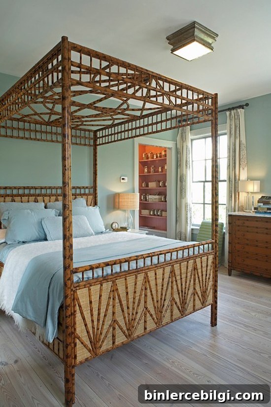
In bedrooms, Wythe Blue can feel crisp and serene. It sometimes reveals a subtle green cast without becoming muddy, especially when paired with lighter linens and warm wood accents.
Wythe Blue in Bathrooms
Wythe Blue creates a spa-like feel in bathrooms, especially when paired with white fixtures, marble, or natural wood. In darker bathrooms, the paint can swing toward green or gray depending on the lighting.
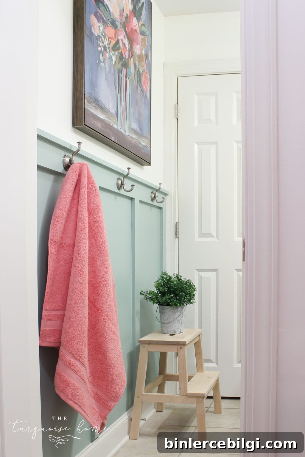
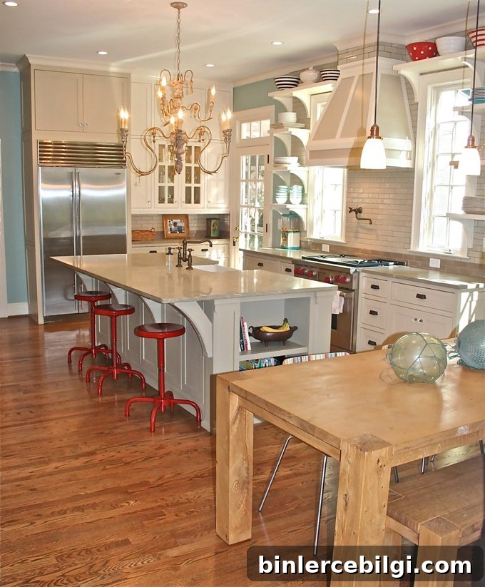
Kitchens with Wythe Blue
In kitchens, Wythe Blue works equally well as an all-over color or as an accent. It pairs beautifully with white cabinets, deep gray islands, and vibrant accent colors like red or tangerine.
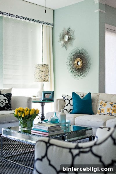
Living Rooms Painted with Wythe Blue
Living rooms show Wythe Blue’s full range—from soft and neutral to green-leaning depending on natural light and wood tones. It can make a living room feel calm, refined, and slightly nostalgic.
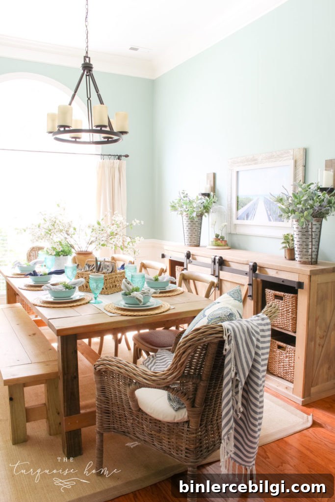
My Dining Room with Wythe Blue Walls
My dining room is painted Wythe Blue. Facing west, it picks up warm yellow light and leans slightly green, which I love. The color adds depth and personality without overwhelming the space.
Exteriors with BM Wythe Blue
As an exterior accent—especially front doors or shutters—Wythe Blue is welcoming and timeless. A door painted this shade adds charm and instant curb appeal.
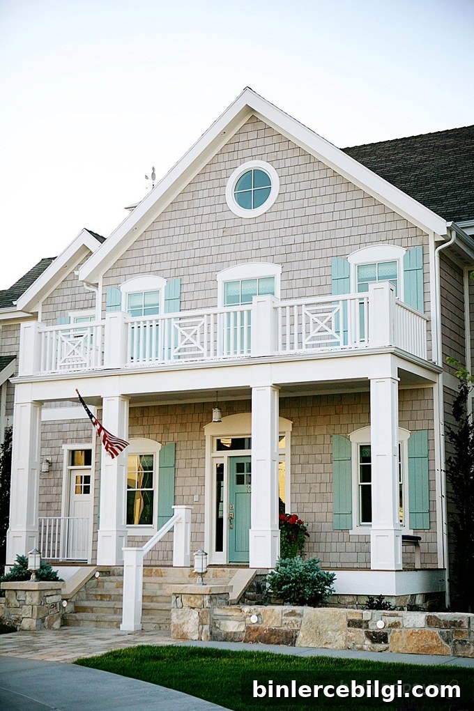
Which room will you try Wythe Blue in? It’s especially lovely in bathrooms and on front doors, but it truly works in many applications.
Other paint colors to consider:
- Benjamin Moore Gray Owl
- Benjamin Moore Revere Pewter
- Benjamin Moore Hale Navy
- Sherwin-Williams Repose Gray
- Sherwin-Williams Agreeable Gray
- Sherwin-Williams Sea Salt
Tools to Help Paint a Room Yourself
If you plan to paint Wythe Blue yourself, a few quality tools make the job smoother. My go-to essentials include a good paint brush, reliable painter’s tape, drop cloths, a comfortable paint cup, and a sturdy roller tray with liners. Using real paint samples in your home before committing will help you see the undertones across different lighting conditions.
- Paint brushes – invest in a good set that holds shape and cleans well.
- Painter’s tape – essential for crisp lines around trim and ceilings.
- Drop cloths – protect floors and furniture for an easier cleanup.
- Paint cup – a comfortable, well-designed cup saves wrist strain and keeps brushes handy.
- Roller tray and liners – liners speed cleanup and make the process more efficient.
Before you buy gallons, test Wythe Blue in your actual room with real paint samples. That step will reveal whether the blue, green, or gray undertones will dominate in your specific lighting and décor.