
It’s beginning to feel like fall here, and the cool air has me smiling. At Miss A’s soccer game last night the temperature dipped enough that I reached for my favorite sweater. There’s something about that first hint of chill that makes me want to bring cozy layers and autumn touches into the house—boots, warm throws, and simple seasonal decor.
Quick parent life note: four-year-old soccer is an entertaining mix of excitement and unexpected drama. One minute everyone’s running toward the ball, the next a tiny meltdown ensues. It’s our family’s first taste of organized sports, and we’re all learning the rhythm—parents included.
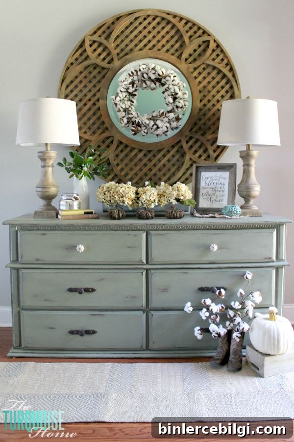
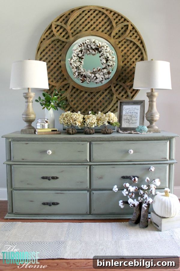
Now, back to decorating. To celebrate the season I created a neutral fall vignette in my entryway. I usually gravitate toward a favorite blue-green hue and brighten it with pinks and yellows in spring and summer, or with reds and oranges come autumn. This year I challenged myself to pare everything down and work within a quieter, more neutral palette.
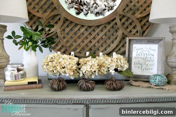
I’m really pleased with how it turned out. The look keeps a hint of color—muted yellow, soft turquoise and mossy green—but everything is toned down and harmonious. Rather than relying on bright hues, I focused on texture and layers: a burlap square for warmth, grapevine pumpkins for rustic shape, varied florals and leaves for dimension, and cotton bolls for unexpected softness.
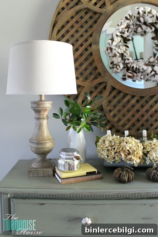
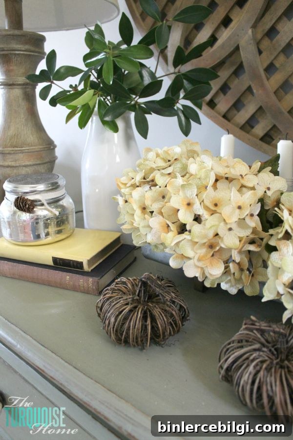
A few practical touches helped keep the arrangement feeling natural and effortless. The dried leaves came straight from the little bush by my front door—an easy, free way to add color and authenticity. I clustered items in odd numbers, layered heights with candles and vases, and left some empty space so the vignette doesn’t feel crowded.
When working with a neutral palette, texture becomes your best friend. Burlap, woven grapevine, distressed metal, weathered wood, and soft botanicals all add interest without introducing bold colors. A metallic or mercury glass candleholder catches the light and adds subtle shine. Natural elements—pinecones, cotton stems, and dried hydrangea—feel autumnal while keeping the overall tone gentle.
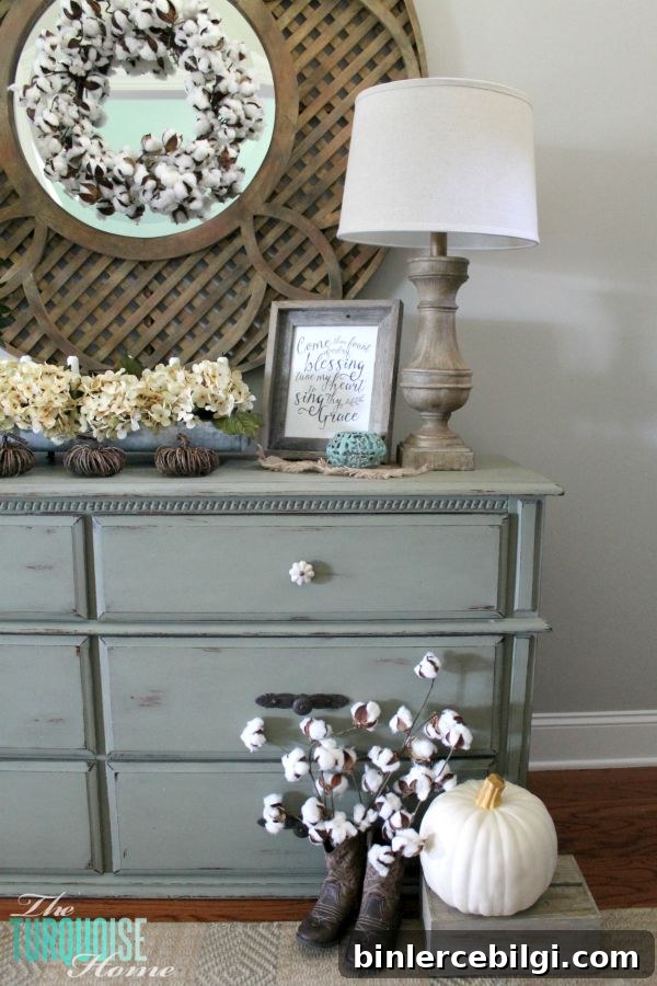
I’m keeping the neutral theme going into the mantel as well. The mantel feels like the perfect place to build on this softer autumn aesthetic—mixing simple frames, a neutral print, layered mirrors, and natural accents. I’ve made a good start, and I’ll refine it as I gather a few more pieces that fit the look.
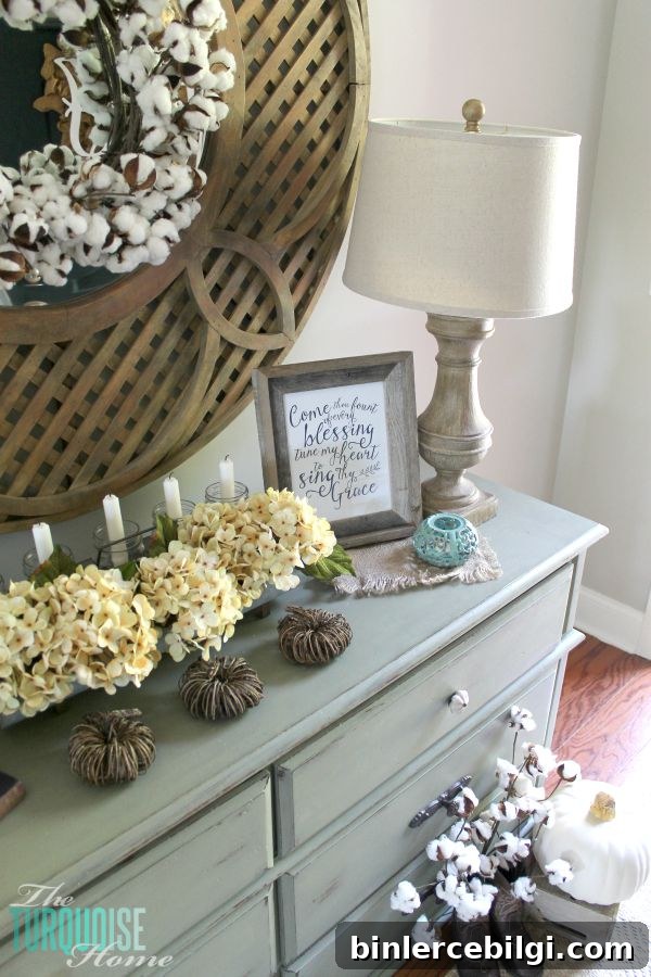
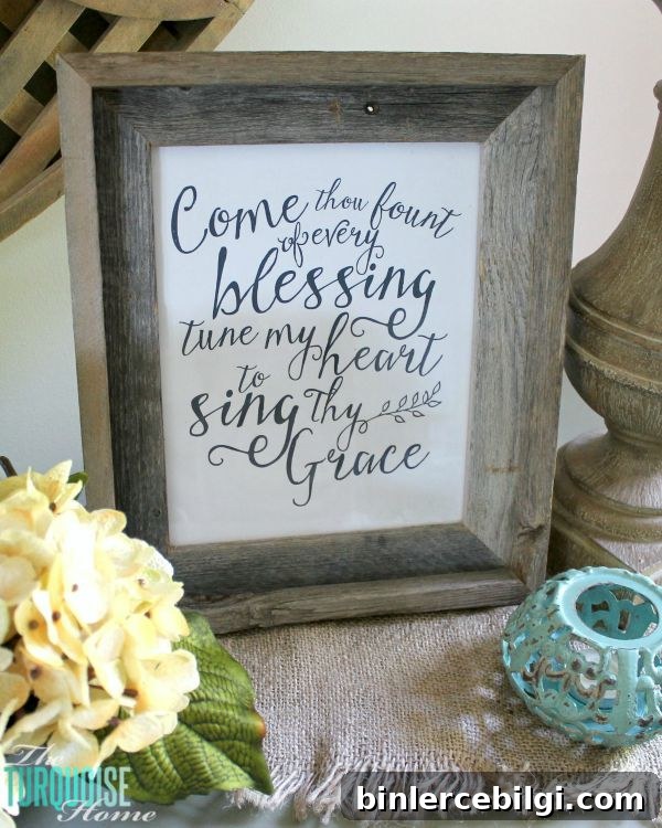
One simple element I included is a printable of the hymn “Come Thou Fount.” The lyrics feel timeless and comforting, and the print adds a personal, meaningful touch to the vignette. It’s an easy way to introduce artwork without competing with the textures and shapes around it.
Do you decorate for fall where you live? If so, are you drawn to bold oranges and reds, or do you prefer a softer, neutral approach like this one? I find that a calmer palette feels refreshing after a summer of bright color, and it’s surprisingly cozy.
Wishing you a lovely sweater-weather day—may your entryway and mantel bring you a smile every time you walk by.

Sources and styling notes:
Come Thou Fount printable used in the vignette; cotton boll wreath and faux botanicals for texture; mercury glass candleholder for subtle shine; large round mirror or similar reflective piece to add depth; lamps for soft ambient lighting; white vase and galvanized container for rustic elements; grapevine pumpkins and faux hydrangeas to emphasize seasonal shape and form; turquoise tea light holder and a rustic frame to round out the composition.
More posts you may enjoy:
- 25 Amazing DIY Fall Wreaths
- 25+ Free Fall Printables to Decorate Your Home
- Cream Cheese Caramel Apple Dip